
Fiduciaria Sura offers a wide portfolio of investment products in traditional and alternative assets, which seeks to increase the retention rate of clients through a self-management portal.
-
Role: UX/UI Designer
-
Collaborators: Product Manager, Engineering, QA.
-
Company: Sura Fiduciaria
-
Timeline: September 2021
Background
Fiduciaria Sura is one of the largest investment companies in Colombia with more than 20 years in the national market. Within its portfolio it has 27 funds and a fund value of more than 140 M USD.
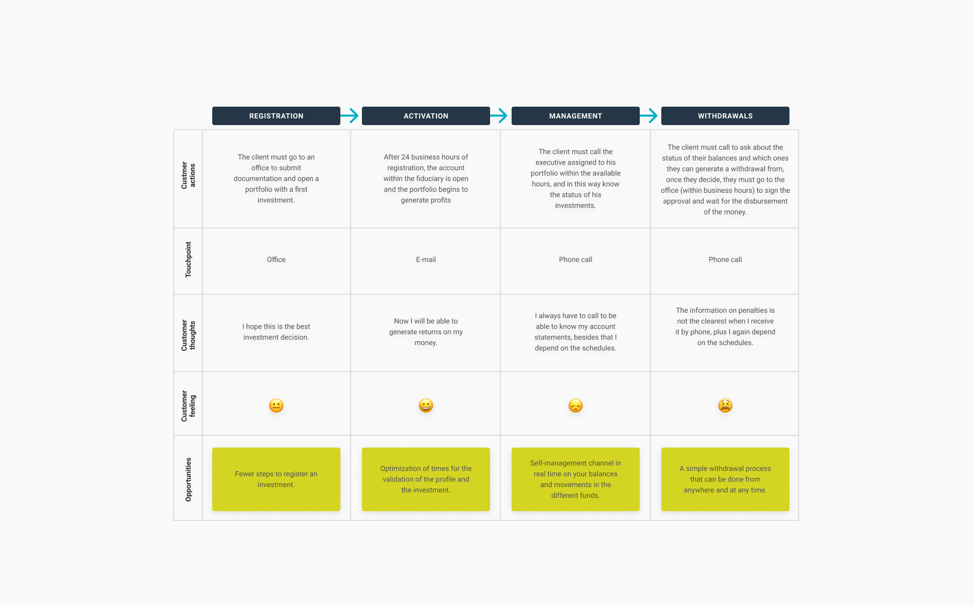
From its beginnings and until 2021, Fiduciaria Sura worked in a traditional way, telephone calls, mail and a commercial executive in charge of user movements.
A Latin American asset manager specialized in the management of assets and investments of individuals and companies.
The problem
Fiduciaries are traditional investment models, as are their investment management processes.
The processes to manage investments in the fiduciary encountered many barriers that prevented users from managing their finances autonomously.
Business hours, long phone calls, physical signatures... all this generated pain for users who wanted to have control of their investment portfolios within the fiduciary.
Opportunity
Self-management of investments in one place
The pandemic had an impact on the investment funds within Sura, in addition to the dependence on schedules and third parties to be able to manage the investments, which made users tend to withdraw their investments from the Fiduciaria, since they felt that they did not have control of what was happening.
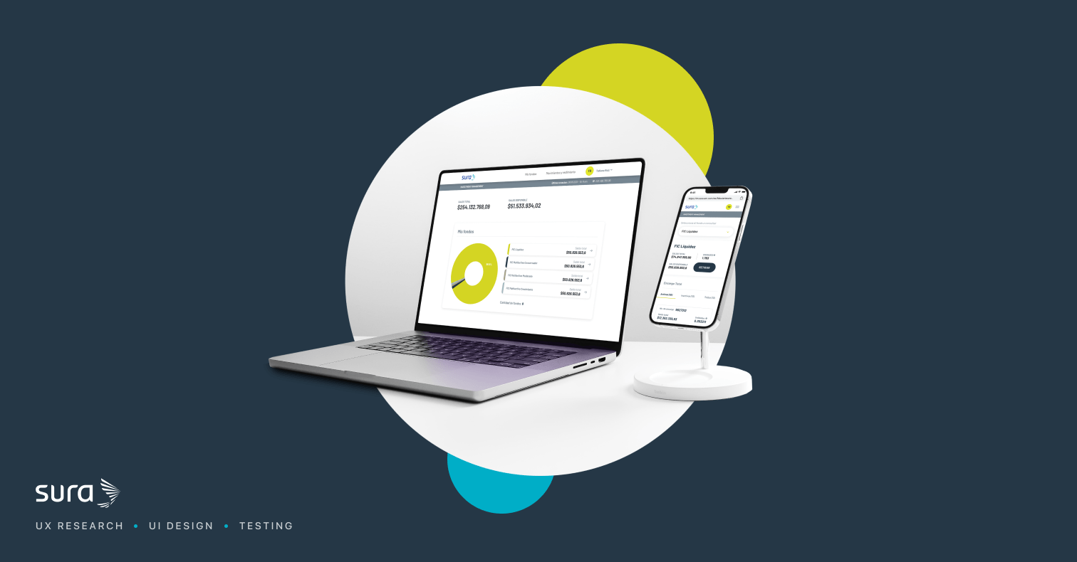
Taking into account the barriers that users went through to manage their investments, a platform is created that will allow customers to see balances, movements and also be able to generate total or partial withdrawals of their funds.
Research
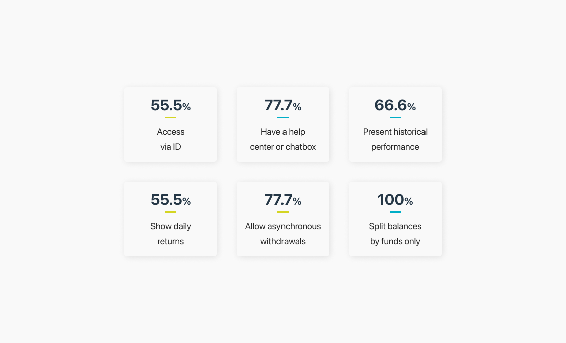
- Benchmark: We identify patterns of behavior and content of private investment sites. We standardized comparison criteria that later helped us create the structure of Sura Fiduciaria's private site.
- Interviews (Understanding user needs): We conducted interviews with 9 current users of the Fiduciary, all of them opened their portfolios and managed them for years through traditional channels, so their observations and pain were of great value for the development of the new private portal.
We were able to conclude that the current process was very frustrating and that users did not have control over their investments.

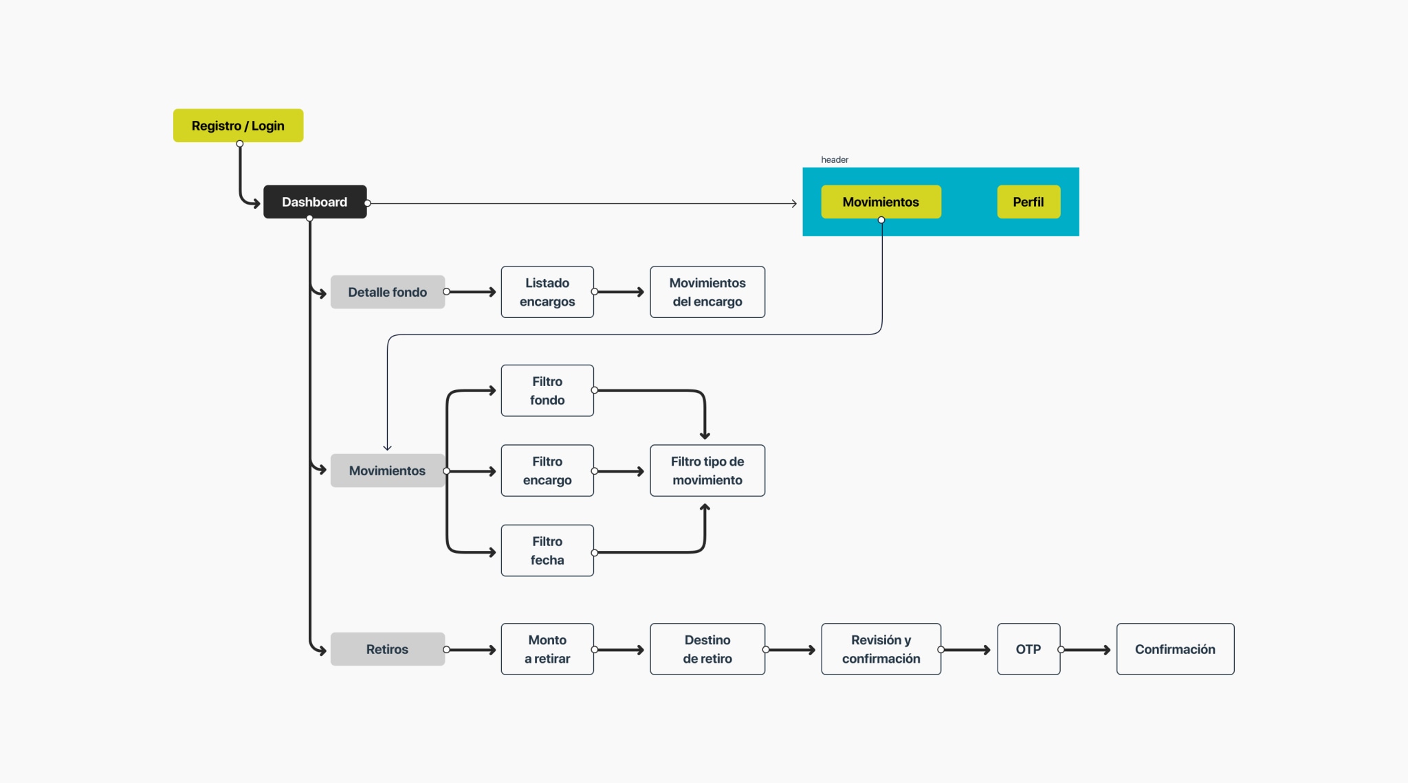
Structure - Product navigability
With a clear objective and user insights, we generate a simple information structure that would allow users to navigate and reduce the learning curve with this new product, in addition to recreating the financial experience as similar as possible to traditional portals with those who have contact in their day to day.
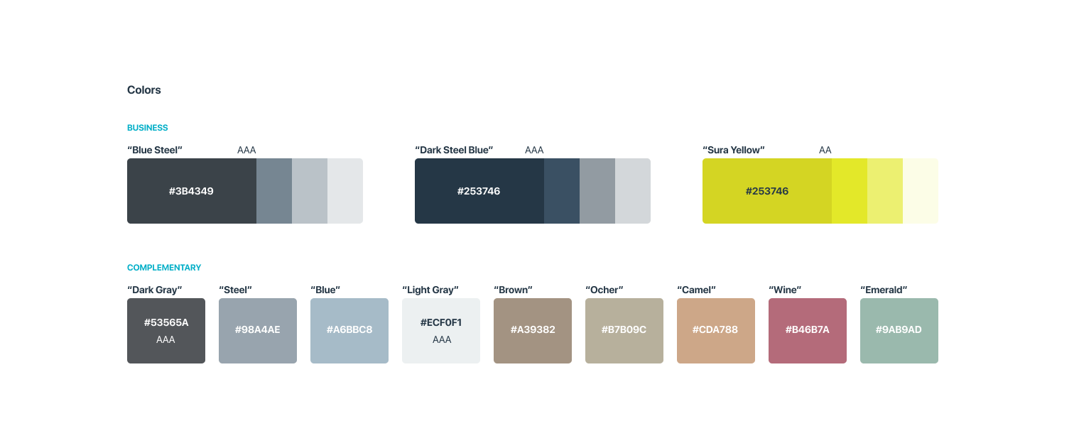
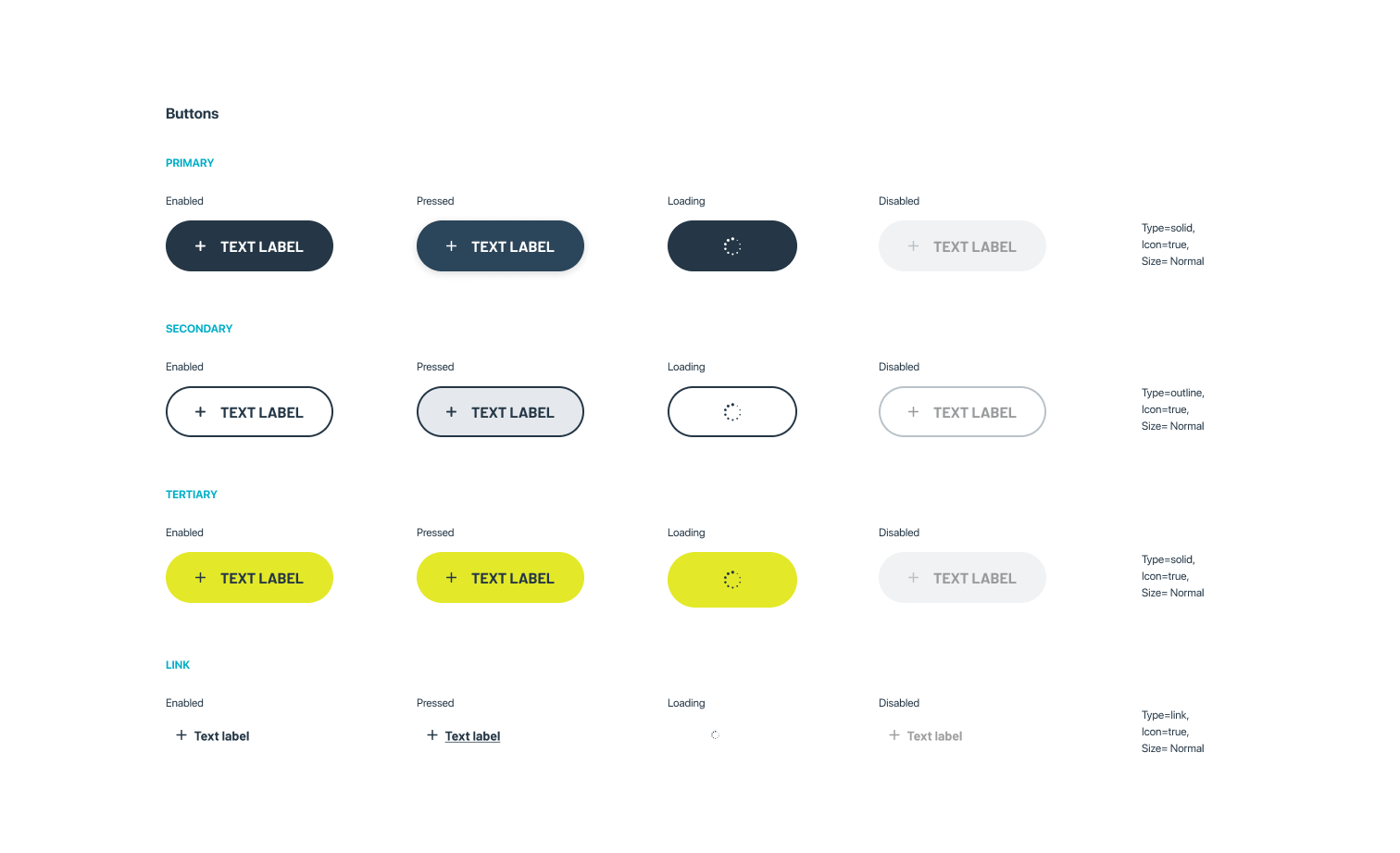
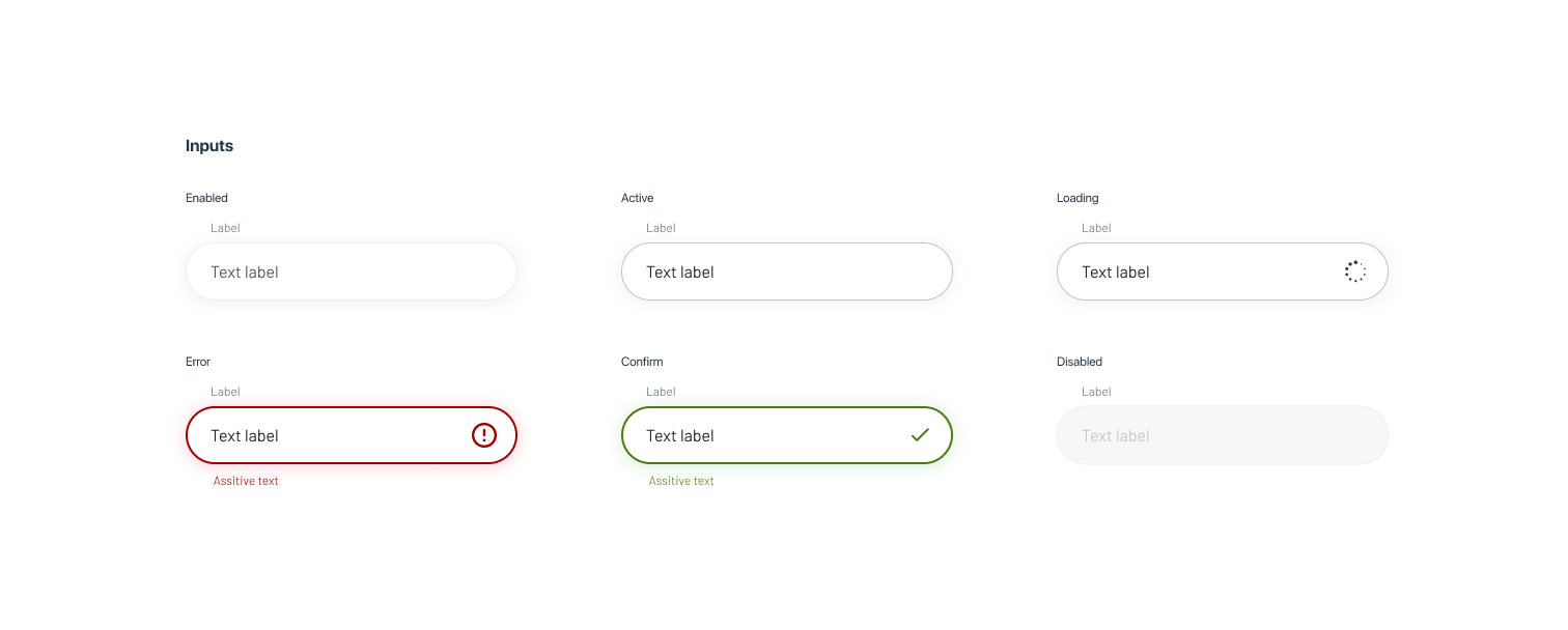
Ideation - Design system
Taking as a starting point a graphic identity of the brand and a UI kit, we generated a design system with components that would allow us to create a scalable product and, above all, accessible to our users.
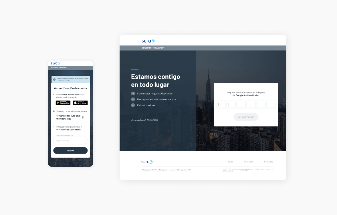
Money in a safe place (Security)
A recurring concern is the insecurity of the portals, and more so when there are large sums of money in them. To generate security and support for users, a double verification factor was added when entering the platform for the first time.
This provided support to users who entered the site with the peace of mind that their investments are in a safe place.
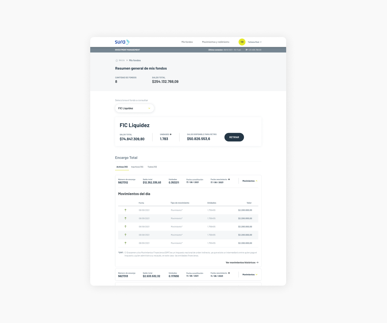
Investment self-management (Fund details)
The user can analyze each fund in depth, can see the recent movements of each order (if they exist), can also see the constitution and expiration dates for each one, see the summary of the orders that make up their investments in the fund, request a withdrawal and you can also navigate between the different funds in this same section.
We prioritize the organization of information, because being a financial product with so many numbers it can be confusing to understand, so we classify the investments by the status of each one of them, freeing up cognitive load.
Prevention of errors and frustrations (Experience)
Being a new product, it was necessary to provide help to the user for its adaptation to the platform, so we created an onboarding for the key functionalities (such as withdrawals), since it was a completely unknown process until then. We also create alerts and notifications that help minimize errors and frustrations for our users.
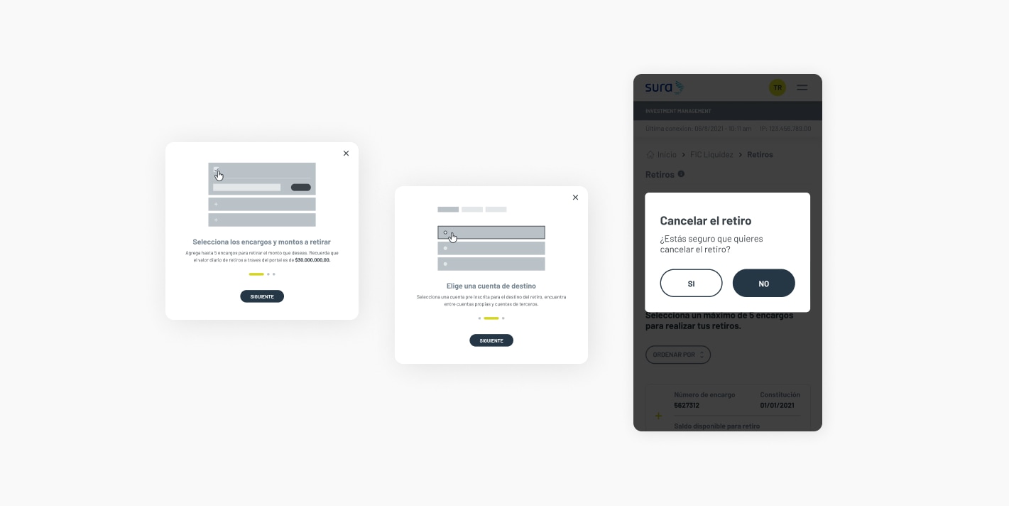
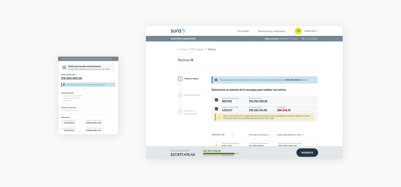
Partial or total withdrawals in 3 simple steps (Withdrawals)
Users can make withdrawals of funds through each of the orders that compose it. For them, they must select from which order they wish to withdraw and enter the amount, the system analyzes the viability and warns about possible sanctions that may be incurred, with this we help improve the experience and be very transparent with the information. When the user has chosen the orders and the amounts to be withdrawn, he ends and receives a receipt for the transaction.
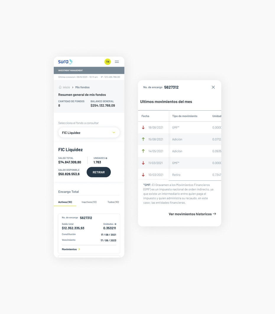
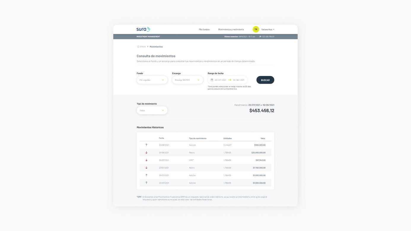
Consult, filter and discover your utilities (Movements)
We created the functionality to be able to see the historical movements by the orders that make up the funds, there they can be filtered by specific dates or by specific type of movement, in addition, the search result also shows the profits obtained in the selected time range.
Results
40% reduction in customer support dependency for SURA Fiduciary.
23% increase in users interested in transferring their investments to SURA Fiduaciaria.
+ 75M USD self-managed by users in the first 2 months of launch.