
With more than USD 450 M in assets under management, the app tyba has the opportunity to increase their conversion rate thought the dashboard, enabling users to create new products and manage their past investments.
With the new Dashboard that was launched into production on January 2nd, 2023, the conversion rate increased by 2.2X. Additionally, there was a 140% increase in users with more than one product within tyba.
-
Role: Sr. UX/UI Designer
-
Collaborators: Product Manager, Engineering, QA, Stakeholders
-
Company: tyba
-
Timeline: December 2022
Background
With over 5,000 app downloads per day in Perú, Chile and Colombia, we were experiencing a conversion rate of 8%. This was due to the fact that when users arrived at the dashboard after registering, the interface they encountered did not encourage interaction and also failed to guide the user in their initial experience with Tyba.
There was an opportunity to provide a distinctive experience to the different types of users interacting with the dashboard. How could we meet the expectations of each user type while delivering on our value proposition?

The problem
The Dashboard in Tyba was the screen where users could see all their investments in a disaggregated manner. This was causing confusion due to the volume of data (63% of users reported being confused by the displayed data) and was making navigation complex. Moreover, it was an opportunity to offer new products to users, which was not happening (94% of users only had investments in one product).
Furthermore, the Dashboard should enable users to quickly grasp the overall status of their investment products in order to make decisions. The goal was to avoid making the data reading more complicated, which was the current situation.
-
Financial performances: Users claimed not to understand the displayed data because they were not easy to correlate with the product balances.
-
JTBD: While it's clear from a business perspective that the main goal is conversion, the dashboard wasn't leveraging its position within the product and wasn't encouraging users to interact with the platform. This generates confusion when making investments.
-
Colors: tyba is known for having a well-defined color palette, with dark green as the primary color. However, this color was being used incorrectly as they were applying the main brand color for backgrounds, rather than for elements that should stand out from other content. Firstly, this complicates readability due to strong contrasts, and secondly, it diminishes the use of tyba's main color.
-
Investment options: As the main dashboard of the product, this section should also be responsible for inviting cross-selling. Previously, what was happening was that when a user made their first investment, the product showcase would become hidden, and it could only be accessed through the '+' button.
Opportunity
"Create a clear and self-explanatory experience that encourages the creation of new products and seeks user interaction through attention-grabbing CTAs."
In order to achieve the business objectives (20% in all 3 countries), it is crucial to provide an experience that guides the user through the section, offering tools for understanding and suggesting paths for further exploring the tyba universe.
Furthermore, it was the perfect opportunity to begin changing the look and feel of a product that was aesthetically falling behind in the eyes of users.

Research
- Benchmark: We analyzed more than 50 websites and applications to find patterns, information hierarchy, and best practices that we could use for creating the proposal.
-
Interviews (Meeting business with user needs): We conducted 10 interviews with customers who had previously used the product. These interviews helped us deeply understand the users' expectations regarding the expected information and functionalities.
We discovered that we needed to prioritize balances by product category rather than by investment, as it made the view more complicated.
-
Testing: We conducted 20 unmoderated user tests, which helped identify opportunities for improvement in terms of information hierarchy and element placement within the section.
-
Customer Journey Map: We wanted to understand the dashboard's behavior and the figures available prior to the new implementation. That's why we analyzed from the initial user contact stage (social media) and went through every brand interaction point until we reached the dashboard. This allowed us to comprehend the inconsistent message we were conveying and how to correct it with the new proposal. Click here to see the Customer Journey map.
The Customer Map analyzes social media, public website, download stores, app onboarding, and the previous dashboard.
-
Social media: Facebook, Twitter, Instagram, YouTube, LinkedIn, and advertising campaigns. We analyzed tone, message, wording, and content there.
-
Public website: Homepage and its content, to understand how we were explaining Tyba from there and encouraging app downloads.
-
Download stores: App Store and Play Store, to comprehend the message delivered to users who reached this point.
-
Onboarding: It was essential to understand how we introduced Tyba at the beginning of the in-app experience in order to meet expectations within the new dashboard.
-
Structure - Product navigability
The Dashboard serves as the entry point to tyba's value proposition, so it's important to consider the two main scenarios a user can encounter upon entering.
-
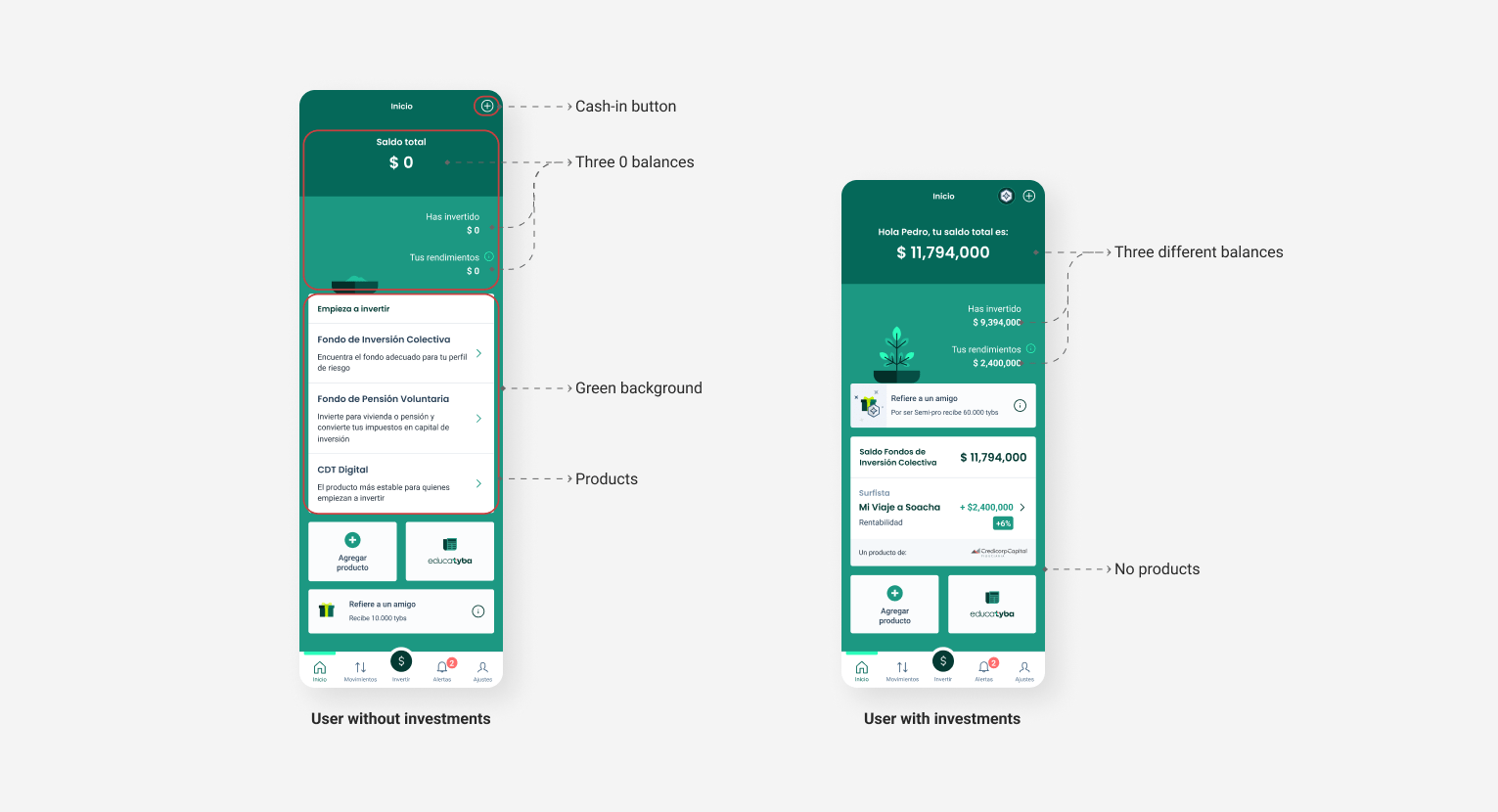
If it's the user's first time in the application, they will enter a simplified Dashboard that should showcase Tyba's value proposition and the CTA (as the central focus of the section) inviting them to invest.
-
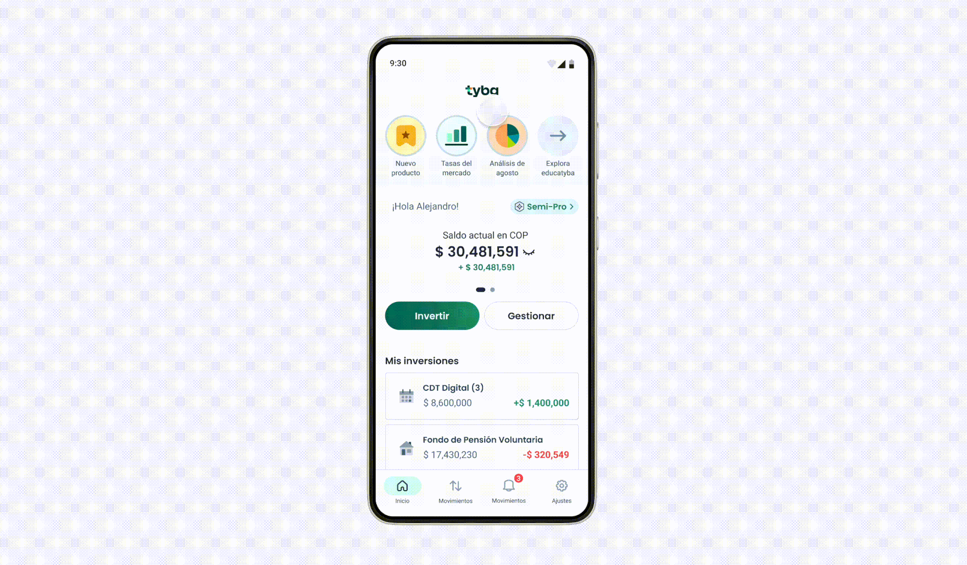
If the user has already logged in and created a product, the Dashboard they access displays the investment status of their active products and CTAs for them to manage quickly and easily.

Within the application, the Dashboard corresponds to a sales process:
-
Firstly, the product is presented, and the user is informed.
-
Next, the value proposition is displayed, and the user is invited to purchase through a CTA.
-
Lastly, once the user already has products and is investing with Tyba, they are encouraged to acquire other products.

For the new Dashboard, an intermediate category was created between the products. The products displayed on the Dashboard are exclusively the totals of the categories (Collective Investment Funds, Voluntary Pension Fund, Certificate of Deposit, Stocks, and ETFs). This is to guide the user from a macro overview to a micro-level detail.
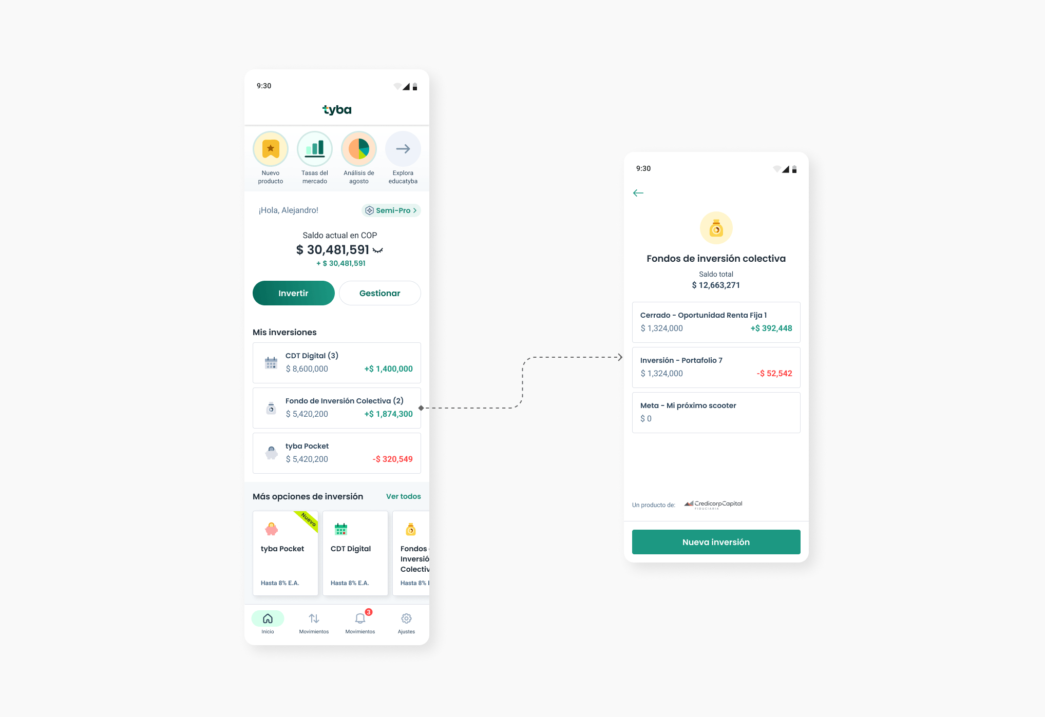
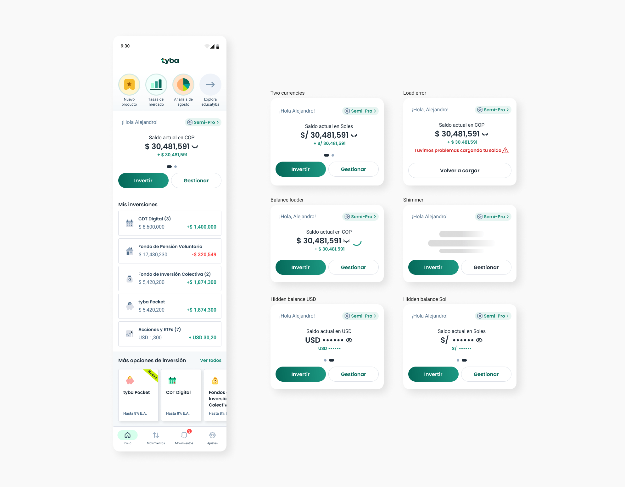
Total Balance
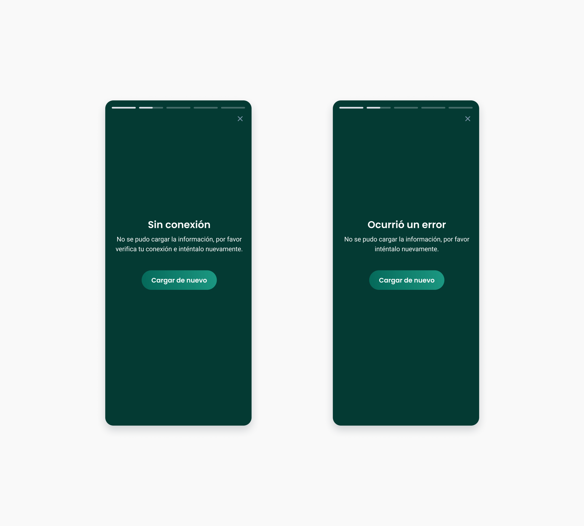
According to the various cases we found in the 3 countries, the component we created had to consider different scenarios like two currencies investments, loading, errors, hidden balances... In the overall balance, the prioritized information is crucial to inform the user in a direct and concise manner. Balance and returns, as this gives the user a general idea of how their investment portfolio is performing.
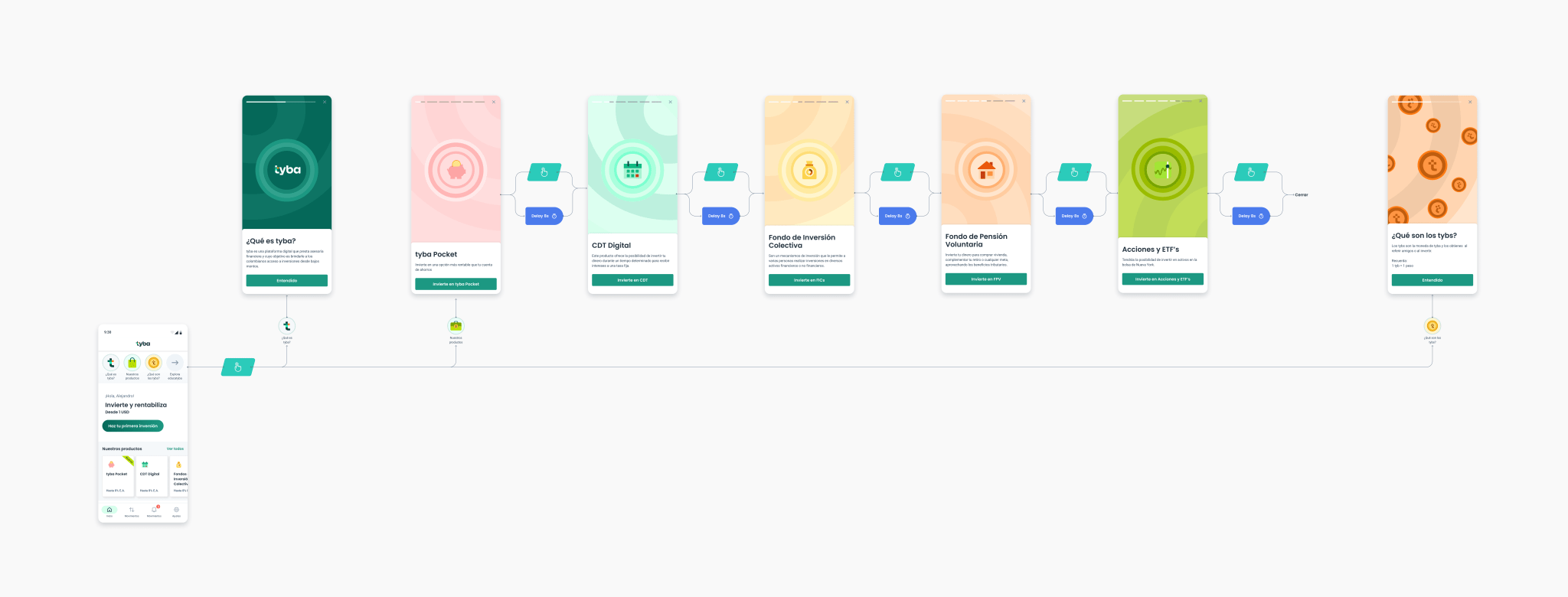
Stories
The Stories section within the Dashboard is intended for user evangelization and product promotion. The stories are dynamic, meaning there are stories for users without investments and other stories for those who already have investments, as the motivations of each type of user are different.
The stories had a positive impact on users, as through them, users started to learn more about Tyba's value proposition, definitions, benefits, product launches, exclusive rates on products.
After the initial tests with the new Dashboard in production, more than 87% of users claimed to have a better understanding of the product and navigation.

Conversion, the true north of the board
When a user has multiple investments in the portfolio products offered by Tyba, the dashboard will tend to become very vertical. This is because their investments will be positioned on top of each other, causing scrolling within the section to become very important.
When the user used to scroll, the most important CTA of the application would disappear, as well as the balance, thus losing the JTBD of the section. To prevent this, we decided to create an interaction with the top bar, where after scrolling hides the CTA and the balance, it repositions itself at the top and accompanies the user while navigating vertically. This ensures that the conversion CTA and the user's balance are always at hand.
Results
2.2X conversion rate increased.
140% increase in users with more than one product within tyba.
73% increase in users interested in new products.
42% reduction in customer service tickets for product queries.