
Team
3+1
Scope
UI/UX Design, Product Strategy, Design System, User Research, UX Writing
Problem Statement
Product designers spend a lot of time doing grunt, monotonous, non-creative work, which leads to larger product development cycles & compromised design quality.
Challenges
-
Identifying the most critical pain point within the product development cycle.
-
Evaluating effort versus impact for each stage of product development.
-
Designing a scalable system that meets the diverse needs of a growing product.
-
Analyzing competitor offerings and understanding market dynamics to build a valuable, differentiated product.
Solution
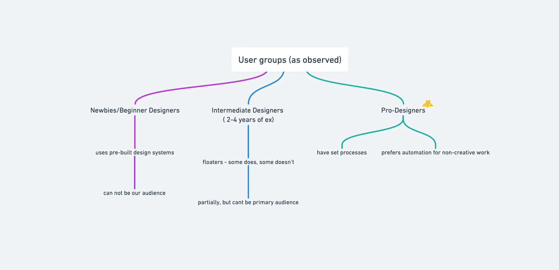
Initial Research & Hypothesis
Through early research, we noticed designers were spending a surprising amount of time outside of Figma, making decisions and preparing rather than designing. We thought, why not streamline this in a single space? So, we set out to build a tool that could save designers time and reduce decision-related back-and-forth.
Our user research confirmed a pattern: designers often loop through decisions, visualizing choices, gathering feedback, and iterating until the design aligns with both branding and stakeholder expectations. But when time gets tight, documentation often falls short—something I’d experienced at Nuclei, where missing documentation meant I had to redesign an entire app from screenshots. It was a clear lesson in how much time a solid design system could save, especially if set up early.
Version 0.1: Testing the waters
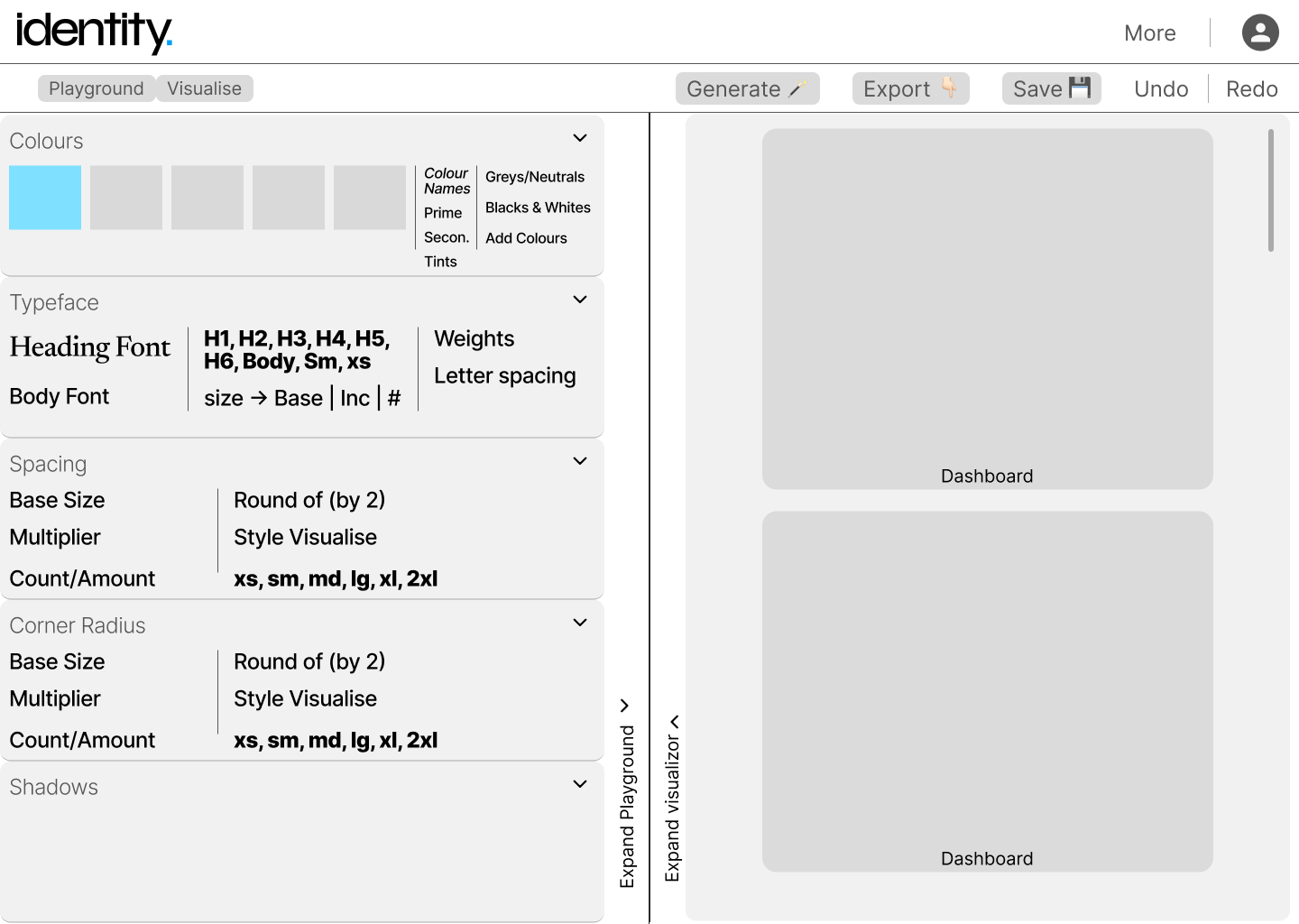
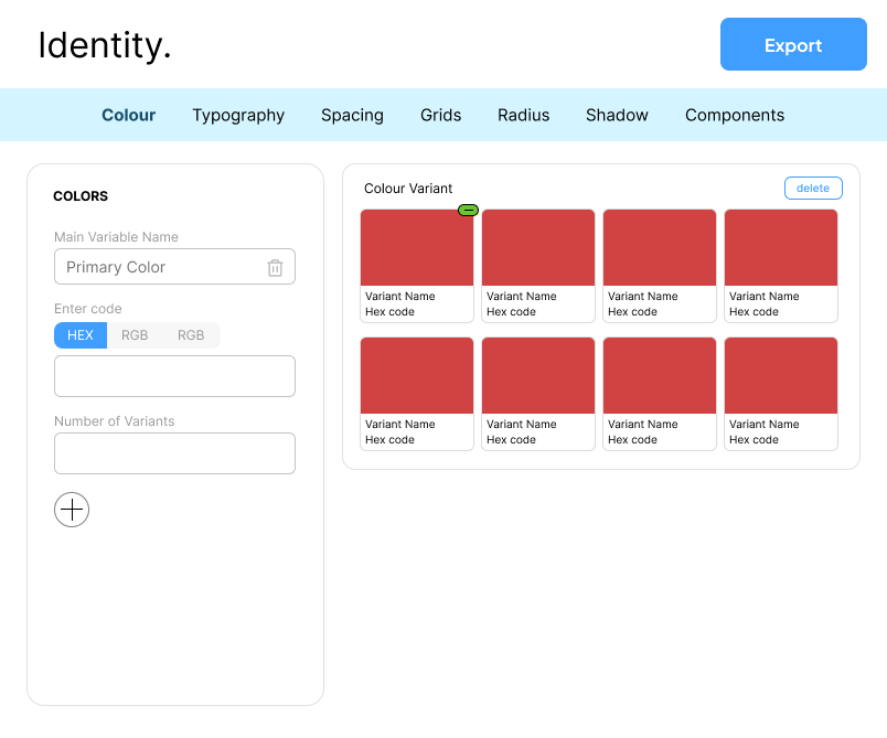
To test our idea, we built a quick MVP focused on helping designers see branding and style guides in real-time. Our goal? help designers make decisions faster and reduce rework.
Version 0.1 let designers adjust essentials like colors, typography, spacing, and shadows, and see immediate visual updates across designs.
What we learned from designers
What surprised me during user testing was how much time designers spent preparing to start a project. The real work? Not the design, but the endless decisions that had to be made first. This made us rethink how we could add real value. How could we streamline this process?
Adjusting the Solution: Version 0.2
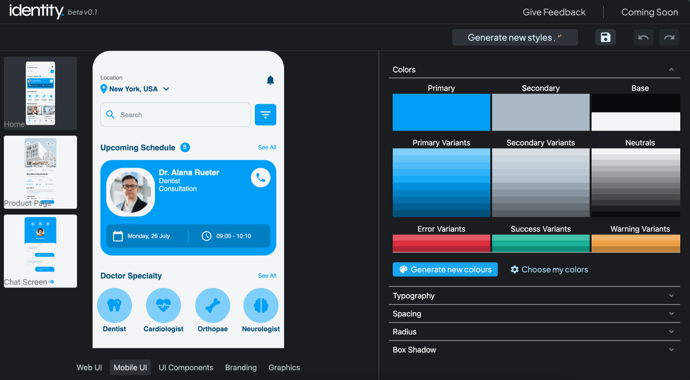
Based on our new insights, we expanded the tool’s features to offer visualization options across websites, mobile, branding, and more. A style generator was added to generate style guides based on few initial inputs of their project. The goal? Faster decisions and fewer delays.
But was this enough to make a real difference in their workflow?
User reaction
While the tool was useful for shortlisting options, it didn’t completely solve the core problem. They appreciated the visualizations, but it wasn’t enough to reduce the time they spent iterating and aligning their style guides. What did we miss? The challenge wasn’t just about visualizing—it was about making the decision-making process more effective.
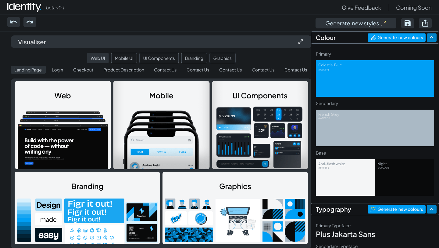
Version 0.3
Based on feedback, we refined the tool. Now, designers could not only visualize across assets but also export style guides directly to Figma. This was a critical test: would this version truly reduce effort and time, or were we still missing something?
What stood out
-
Experienced designers had a pre-established process for selecting style guides.
-
Most tools simply visualized the design elements but didn’t provide real-time decision-making support.
-
Designers preferred building out 2-3 screens for feedback rather than generating generic templates.
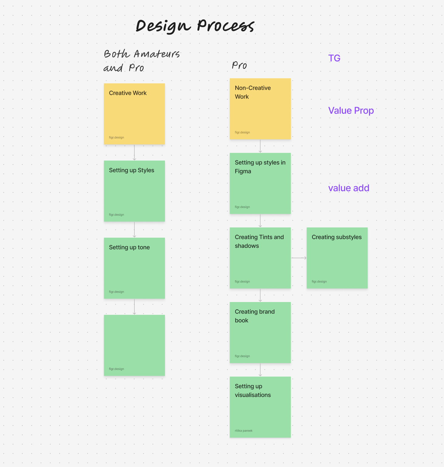
Breakthrough: the climax
The real aha! moment? Generic visualizers alone weren’t enough. Designers worked in specific contexts, and generic templates didn’t quite capture that. And while they spent plenty of time building style guides, documenting these systems often took just as much time.
Another key takeaway? Designers preferred staying within Figma rather than switching platforms, which only disrupted their flow.
The Pivot
It wasn’t just about the tool; it was about fitting seamlessly into designers’ workflows. With eyes wide open, we pivoted from a web app to a Figma plugin—creating a tool that not only visualized style guides but also automated the creation of design systems and documentation. This shift bridged the gap between exploration and implementation, reducing the manual work involved in creating and maintaining design systems.
A Shift to Figma Plugin (Version 1.0)
Our final product was a Figma plugin that allowed designers to create custom design systems directly within their Figma projects. With it, they could input style guide elements, test them on custom components, and export the full style guide—all within Figma. Designers could stay focused on the creative side while the tool handled the tedious work of building and documenting the system.