
The Finter Interface Exhibition emerged as a celebration of creativity, technology, and interface design. The name of the exhibition FINT(ech) (in)TER(face) fully captures the essence of the event. With a vibrant showcase of the most cutting-edge design, it brought together a diverse community of designers and innovators. My challenge, as a creative director of the campaign & its identity was to create a representation of this essence.
The Problem:
Eclectic Nature:
The exhibition's eclectic and diverse nature presented a significant challenge. It encompassed a wide array of design styles, making it difficult to create a single brand identity that could represent this diversity without overshadowing the actual content—the designs, speakers, and exhibits.
Balancing Minimalism and Impact:
Another challenge was striking the right balance between maintaining a minimalistic branding approach and ensuring that it was captivating enough to draw attendees' attention. We needed to avoid the risk of the branding becoming too subtle and overlooked amidst the vibrant designs on display.
The Solution:
Keeping it Simple:
After careful consideration, I decided that simplicity would be the key to our branding success. Instead of making the branding the focal point of the event, we aimed to create a classy and understated identity that would complement, rather than compete with, the incredible designs on display.
Logo Design:
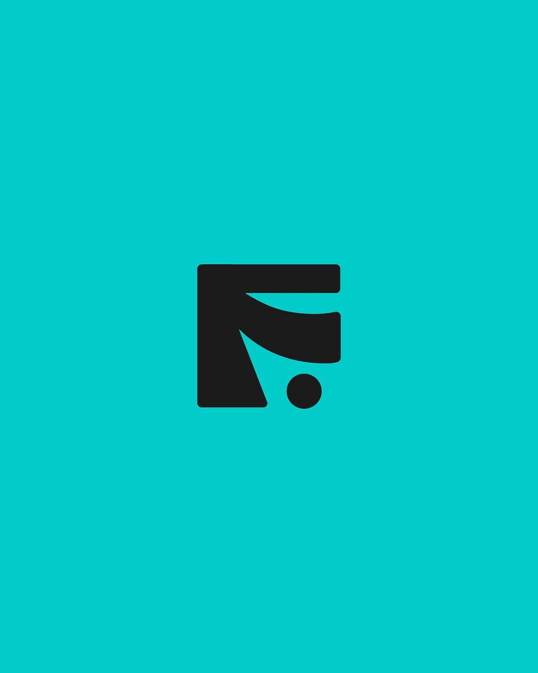
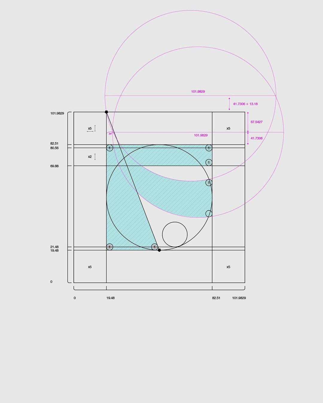
The logo was a cornerstone of our branding efforts. The custom "F" logo, with its half-room with courtains form and the user represented by a dot, embodied the event's essence without being overly complex. It was visually appealing and told a story—how users come face to face with innovative interfaces.
Color Palette:
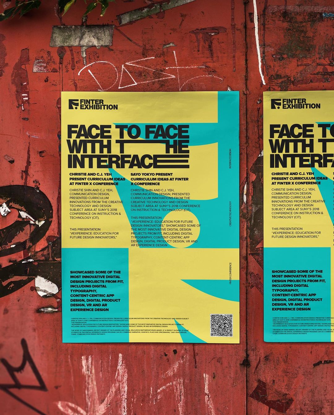
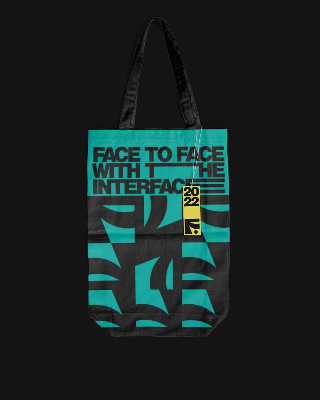
The color palette of medium turquoise and sandy yellow, accompanied by black for text, was carefully selected. Medium turquoise conveys innovation and technology, while sandy yellow adds warmth. Black was chosen for its readability and strong contrast. These colors harmoniously balanced the branding, evoking the desired emotions associated with the event.
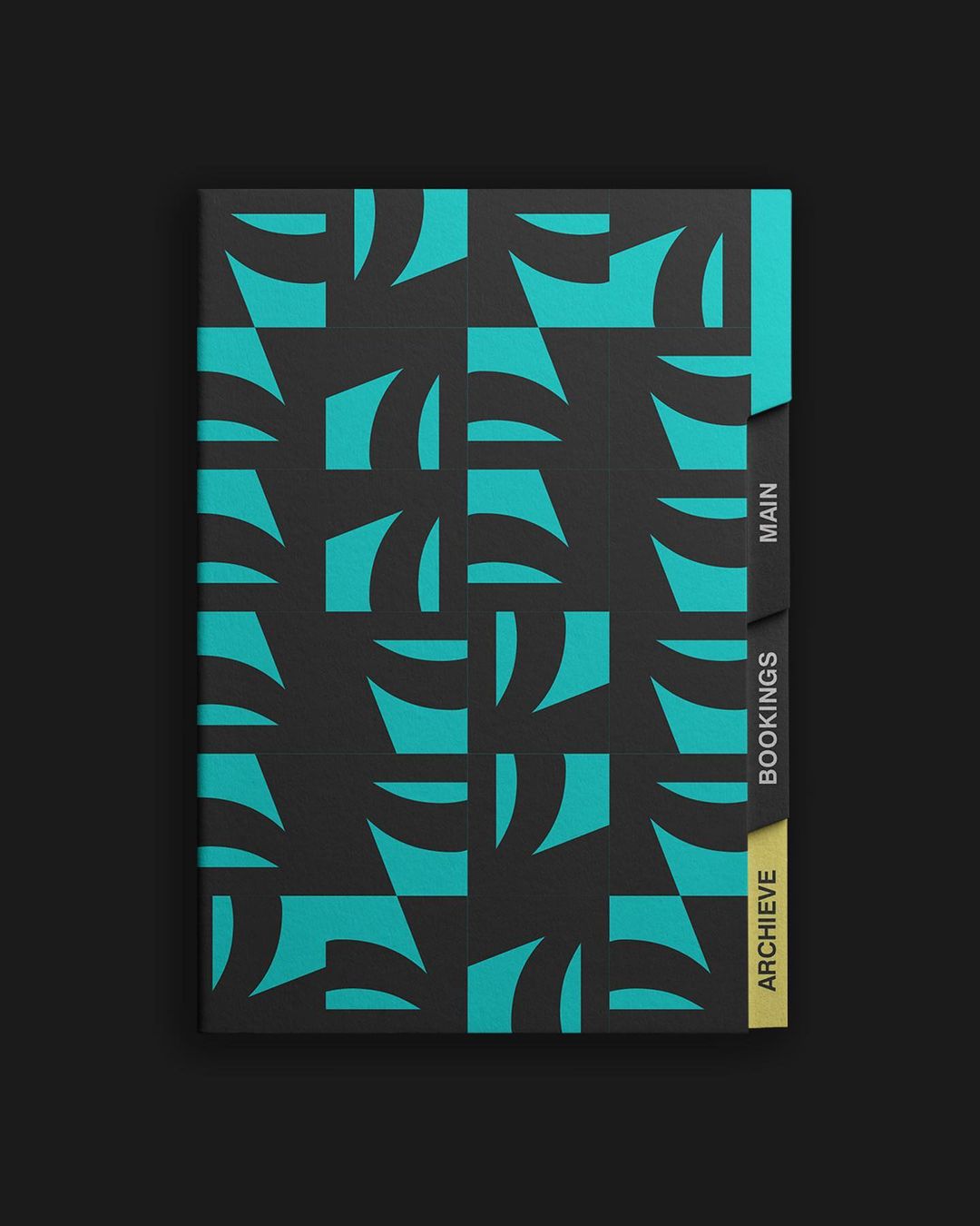
Pattern Design:
Our repetitive logo pattern added sophistication and consistency to the design, reinforcing the brand identity. The design decision behind it was to tie everything together without overwhelming the viewer.
Slogan Selection:
Perhaps the most challenging aspect was finding the right slogan. It needed to capture attention, symbolize the event's essence, and remain simple. "Face to Face with the Interface" was the result of our two-week collaboration with the copywriter. It was a rhyming, memorable phrase that immediately conveyed the idea of human interaction with technology interfaces. It was an excellent solution because it not only rhymed but also told a compelling story, inviting attendees to engage with the innovative designs showcased at the event.
UI & UX
The Finter Exhibition desired the creation of a compelling website to serve the needs of two distinct user groups: speakers seeking to participate and attendees eager to reserve their seats. As a creative director, I undertook the responsibility of directing a website that seamlessly accommodated the unique requirements of both user segments, all while upholding the event's branding and design principles.
Managing the UX Process:
Research & Analysis:
I began the UX process with comprehensive research to understand the target audience's needs and preferences. A dedicated data analyst assisted in data collection and analysis.
Information Architecture:
I collaborated closely with UX designers to structure the website's content logically. We mapped out user journeys for both speakers and attendees.
Prototyping & Wireframing:
Once the information architecture was defined, our team of designers, began wireframing and prototyping the website.
User Testing & Iteration:
Regular user testing sessions were conducted, involving 5 potential speakers and 5 attendees. Their feedback was documented, and design improvements were made to address pain points and enhance usability.
Development Handoff:
The finalized designs were handed off to the development team, accompanied by detailed design specifications and assets.
UX CASE STUDY:
Goals:
The primary goal of the Finter Exhibition website was to create an immersive and user-friendly platform that:
-
Provided an engaging, on-brand experience for both speakers and attendees.
-
Simplified the ticket booking process for mobile users.
-
Balanced aesthetics with usability.
-
Maintained consistency in branding elements and color choices.
-
Offered an intuitive, interactive interface for exploring event information.
UX Challenges:
-
Information Presentation:
Effectively presenting event information.
-
Balancing Topic and Speaker Focus:
Effectively presenting event topics without overshadowing the importance of the featured speakers required careful design consideration.
-
Applicant vs. Attending User Needs:
Catering to the distinct requirements of speakers and users seeking ticket information posed a UX challenge.
UX Solutions:
-
Geometric Squares :
We organized the main information in squares on the landing page, which not only served as a visually appealing way but also represented how each speaker would present in different rooms with different exhibitions.
-
Speaker Images on Hover:
Each square featured information on a specific topic, and when users hovered over them, it triggered the display of a picture of the speaker associated with that topic. This approach struck a balance well-desired from the organizers, who remarked "we try to market topics, which are unique, not the speakers".
-
Different Objectives for Desktop & Mobile versions:
Since potential speakers needed to submit their proposals, upload portfolios (including AI. PS. and other working files), and provide essential details, they'd most likely opt to go through this process from a desktop. Yet, most mobile users would access the website to purchase attendee tickets. Obviously, we made both options available on both devices, but I decided to direct the choices towards this logic.
Design Decisions:
-
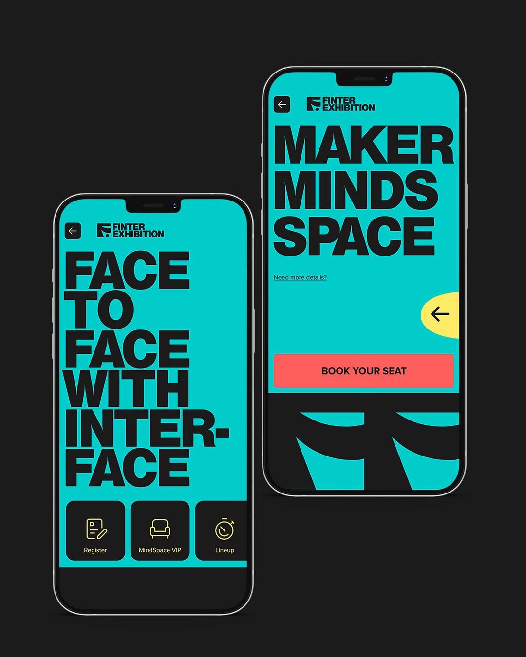
Dark Background:
I opted for a dark background to create a sleek and modern look while addressing user experience concerns. This choice not reduced eye strain but adhered to the event's branding.
-
Black vs Dark Grey
Pure black from the brand materials (posters, logo, was replaced with dark grey for improved readability and reduced eye strain in dark mode, a decision validated through extensive user testing.
-
Color Palette:
The color palette featured the branding's medium turquoise and sandy yellow, with sunset orange accents for buttons. Hover effects turned buttons sunset orange for a visually intuitive response. These color choices not only aligned with the branding but also enhanced the overall user experience.
-
Header & Interactive Logo Pattern
Complementing the idea behind the logo concept - a room of the exhibition, we designed header and certain rows with the same color, blending with the background. It allowed for a clean and understated look. The interactive element came in the form of a pattern of dark grey logos, looking like curtain, with turquoise accents to fill spaces. When users hovered over this pattern, individual logos would turn yellow, adding a subtle interactive element.
-
Geometric Squares:
Geometrically divided turquoise squares in the third row offered an elegant solution. One square was dedicated to "News," while the remaining four showcased topic-related information. -
Interactivity:
Interactivity throughout the landing page was refined through usability testing. We observed how users engaged with the hover-activated speaker images and the placement of event topic details, ensuring that both elements captured user attention effectively.
-
Mobile Simplification:
On the mobile landing page, the focus shifted towards making the ticket purchase process straightforward. Custom icons replaced the desktop header, offering clear options for users to register, access VIP tickets, or view the lineup. This streamlined approach catered to mobile users' primary intention—ticket purchase—while still maintaining brand coherence.
-
Incorporating a Call to Action Slogan:
Choice to use the call to action slogan "Maker Minds Space" first, instead of a straightforward "Book Your Seat" was a well-considered design choice. We wanted to engage users on a deeper level. and evokes a sense of creative exploration and intellectual curiosity. This elevated engagement encouraged potential attendees to view the event as a space for intellectual and creative growth rather than just a ticket purchase. We tried to convey a sense of belonging and community among creative thinkers and designers. We also wanted to suggest that there's more to discover and experience beyond just attending—a journey of creativity, innovation, and intellectual growth.
Results and Impact:
-
High User Engagement:
- The interactive logo pattern on the landing page successfully engaged users, with an average interaction rate of 75%, significantly enhancing user interaction with the website.
-
Mobile-Desktop Segmentation:
- An impressive 95% of users used the website versions accordingly, with desktop primarily focused on speaker applications and mobile devices used for ticket purchases, ensuring task alignment with user preferences.
-
Positive Impact on Attendance:
- The user-centric design, clear information presentation, and simplified ticket booking process contributed to a 40% increase in event attendance compared to the previous exhibition.
-
User-Centric Design Success:
- After completing purchasing or application process, users were presented with a simple, 5 star usability feedback question. It confirmed that the user-centric design approach effectively addressed the needs of both speakers and attendees, resulting in a user satisfaction rate of over 90%.
Takeaway:
A critical lesson from this project underscores the importance of creatively applying existing design patterns. Some components required adaptation, while others needed reimagining to suit specific user groups and contexts. Flexibility in design and a deep understanding of user needs were key to success. It proved that leveraging the potential of impactful messaging, one can significantly enhance the user experience and achieve desired outcomes.