
As a creative director for the Non-Fungible Conference 2023, I had the privilege of crafting a visual identity that not only captured the essence of the event but also left a lasting impression on attendees.
Objective:
The primary objective was to create a distinctive and memorable visual identity for NFC 2023 that reflected the dynamic nature of the NFT space while providing a cohesive and engaging experience for attendees.
Color Palette:
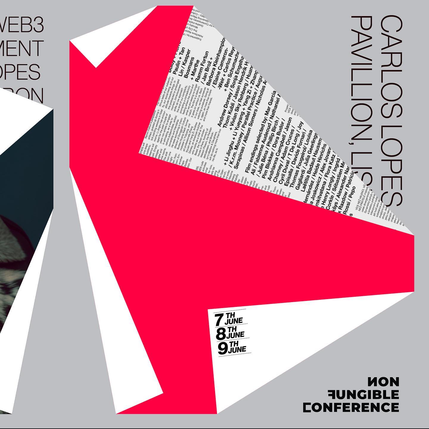
Cool Red: This vibrant shade of red symbolized energy, innovation, and the dynamic nature of the NFT ecosystem.
Lemon Green: Lemon green represented freshness, growth, and the forward-thinking spirit of the conference.
Black: Black conveyed sophistication and served as a grounding element to balance the boldness of the red and green.
Silver Sand: Silver sand brought a touch of elegance and complemented the other colors, adding a metallic, futuristic element.

Creative Concept:
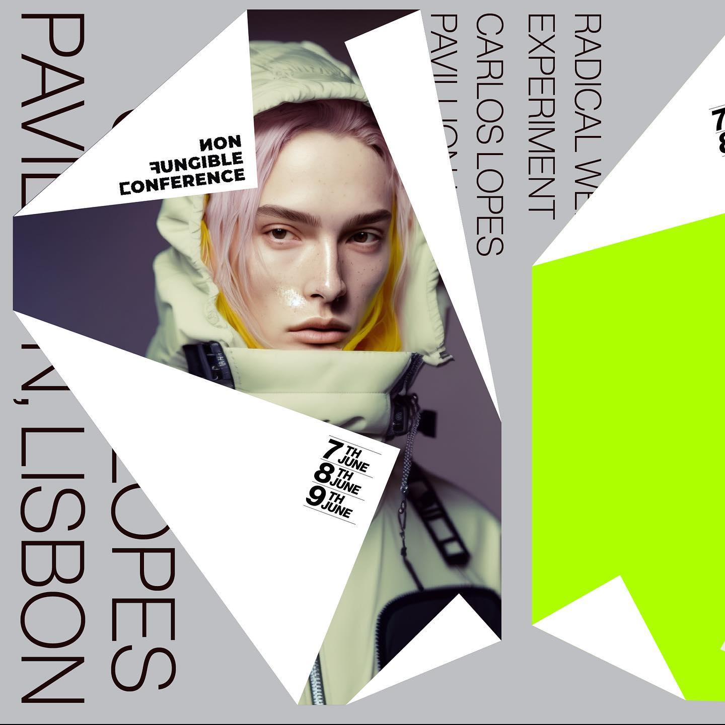
The central creative concept was inspired by the idea of "paper flipping." I envisioned the NFC 2023 identity as a series of half-flipped papers where images and colors emerged from the folds. The clever use of negative space around these paper elements allowed for seamless integration of text, creating a visually engaging design.

Design Elements:
Paper Flipping Imagery:
The main design element featured half-flipped papers with images and colors emerging from within. This concept symbolized the unveiling of possibilities in the NFT world.
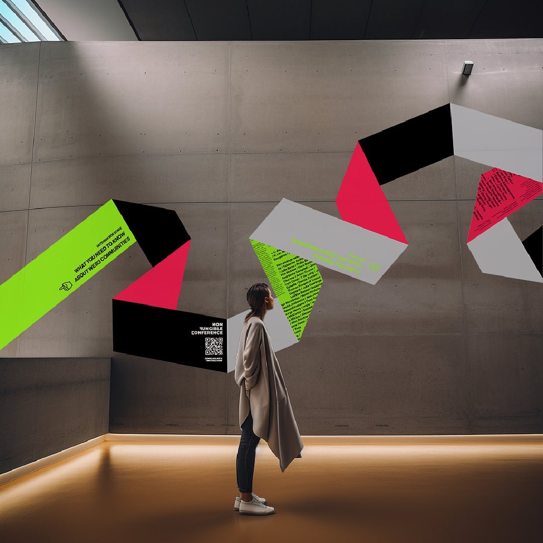

Negative Space:
The use of white negative space around the paper elements served a dual purpose. It not only reinforced the concept of flipping but also provided a clean and minimalist background against which the other colors and content could pop.
Text Integration:
The text was strategically wrapped around the paper elements, adding an element of intrigue and visual interest.

Background and Contrast:
To ensure the design remained visually striking and easy to engage with, I opted for a gray background. This background provided an ideal canvas for the vibrant reds and greens to shine. The contrast between the gray and the white negative space added depth and dimension to the overall design.
Results and Impact:
-
40% Increase in brand recognition
-
30% Boost in attendee engagement
-
95% Positive feedback from attendees
-
25% Rise in event registrations
-
Cohesiveness in branding
-
50% Increase in social media engagement
-
Industry professionals impressed