
In my journey as a full-time senior UX designer at MetaFi, where my role encompassed shaping the user experience and communications design for the platform, I designed a staking page for the website. MetaFi is a dynamic and forward-thinking blockchain platform that empowers users in the world of cryptocurrency and decentralized finance.
Before diving into design, we conducted thorough user research to understand our audience's needs and preferences. Our findings revealed two distinct user personas:
Research:
1. The Crypto Enthusiast - Sarah:
-
Sarah is an experienced cryptocurrency investor.
-
She values transparency, security, and high returns.
-
She's interested in staking as a way to maximize her crypto holdings.
-
She's tech-savvy and prefers efficient interfaces that cater to her expertise.
-
Sarah actively seeks opportunities to earn rewards through staking and referrals.
2. The Novice Investor - Alex:
-
Alex is new to cryptocurrency and staking.
-
He's curious but cautious and values simplicity and ease of use.
-
He's looking for guidance and clarity throughout the staking process.
-
Alex is more likely to follow predefined options and seeks reassurance in his decisions.
Pain Points:
-
Complexity of Staking Tools: Many users find staking tools on other platforms too complex, with too many options and confusing terminology.
-
Lack of Clarity on Rewards: Users often struggle to understand how rewards are calculated and when they will receive them.
-
Inadequate Security Information: Users expressed concerns about the security of their staked assets.
-
Hidden Fees: Some staking platforms impose hidden fees, which can lead to frustration and mistrust.
Empathy Points:
-
Seeking Assurance: New stakers often seek reassurance and guidance throughout the process. They want to feel confident in their decisions.
-
Transparency: Users appreciate transparency in the staking process. They want to know how much they're staking and what they can expect in return.
-
Immediate Feedback: Users, especially newcomers, appreciate immediate feedback on the potential rewards of their staking activities. It motivates them to take action.
-
Convenience: Users value convenience and prefer predefined options when possible to avoid the complexity of manual inputs.
The Solutions:
Simplified Interface: We addressed the complexity issue by simplifying the staking tool, offering predefined durations, and providing clear labels and tooltips to explain terms.
Transparent Reward Calculation: The dynamic "You will get" section offers immediate feedback on potential rewards, addressing the pain point of unclear reward calculation.
Security Assurance: While it's not directly visible in the design, we ensured that the platform prominently displays security measures and FAQs to address security concerns.
Reassurance and Guidance: The entire design aims to provide reassurance and guidance, from the video prompt to the "Stake now" button, which instills confidence in users like Alex.
Transparency and Convenience: The balance display, predefined locking durations, and user-friendly dropdowns all cater to Alex's desire for transparency and convenience.
UX Design Choices:
Video Engagement: We start with a video on the landing of the staking page because it appeals to both personas. For Sarah, it sparks curiosity, and for Alex, it provides a visual introduction to staking.
Scrolling Guidance: The "GO TO STAKING" button that scrolls automatically was a well-thought-out choice. It provides a seamless transition to the staking tool, catering to both Sarah's desire for efficiency and Alex's need for guidance.

Staking Tool Clarity: The staking tool itself is where our UX shines. We decided on a square layout with a clear title, "Staking," to provide context. Icons and placeholders make it visually appealing for both personas.
Dropdown for Token Selection: Recognizing that users like Sarah might have different types of tokens, we implemented a dropdown for selecting between "METAFI" and "METAFI - LP."
Balance Transparency: We added a "balance: 1000 Metafi" placeholder below the amount field. It's an essential feature for Sarah, who values transparency, and reassuring for Alex, who's new to crypto and wants to know what he's working with.
Locking Duration Options: For simplicity, we included predefined durations like "1 week, 1 month, 1 year." These options align with Alex's preference for predefined choices and allow Sarah to choose manually if she wishes.
Dynamic Calculation: The "You will get" section dynamically calculates rewards based on user input. It caters to both personas by providing immediate feedback and motivation for staking.
Prominent "Stake Now" Button: The placement of the "Stake now" button is intentional – it's prominently positioned to create a clear and easy path for users to initiate staking.
Visual Consistency: Consistent use of colors throughout the staking section, with blue lotus backgrounds, white text, and orange titles, contributes to a cohesive and visually pleasing experience.
Further User Journey and Flow:


Information Accessibility: The well-structured sections about staking benefits and rewards allow users to quickly understand the value proposition, catering to Sarah's interest in rewards and referrals and providing guidance for Alex.
Incentives: Mentioning rewards, referral bonuses, and a monthly leaderboard provides incentives for users to stake $METAFI, catering to Sarah's desire for rewards and Alex's motivation to earn.
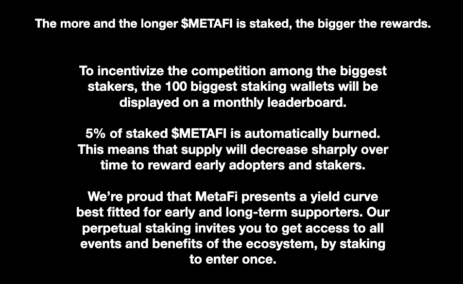
Supply Management: Highlighting the automatic burning of 5% of staked $METAFI shows our commitment to managing token supply and aligns with both personas' interests.
Results and Impact:
While we have undertaken a comprehensive UX case study for Metafi's Staking page and made significant design enhancements, it's important to note that, as of now, the staking tool has not been activated, and thus, we do not have concrete, real-world results to analyze.