Welcome back to part 4 of my series of blogs about design systems. In this blog, we will talk about colors in Design systems.
Colors in design systems:
One of the first things we do when starting a new project is choosing a color. Choice of colors to match the brand and project. It's the same when creating a design system, so if you're starting a new design system, one of the first things you should do is choose the right colors. The right colors? Yes... But what is the correct color and according to whom? If we ask this question, we can start already.🤯
There is no standard rule for choosing colors for a design system, and many designers have their own correct ways. And today I will tell you about how I did it while preparing the VTB Design system.
Places of use:
Before starting the color selection, we must first determine where and in which parts we will use the colors.
These parts for the VTB Design system (Figure 1):
1. Surface
2. Border
3. Element
4. Text
was determined as:
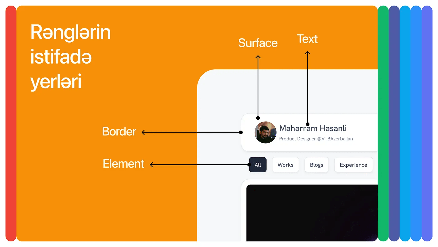
Figure 1 shows an example of the interface according to the names. Now let's go to the second stage, the choice of states. Since states are globally defaulted, let's choose states without wasting too much time in this section:
1. Default
2. Hover
3. Focus
4. Disabled
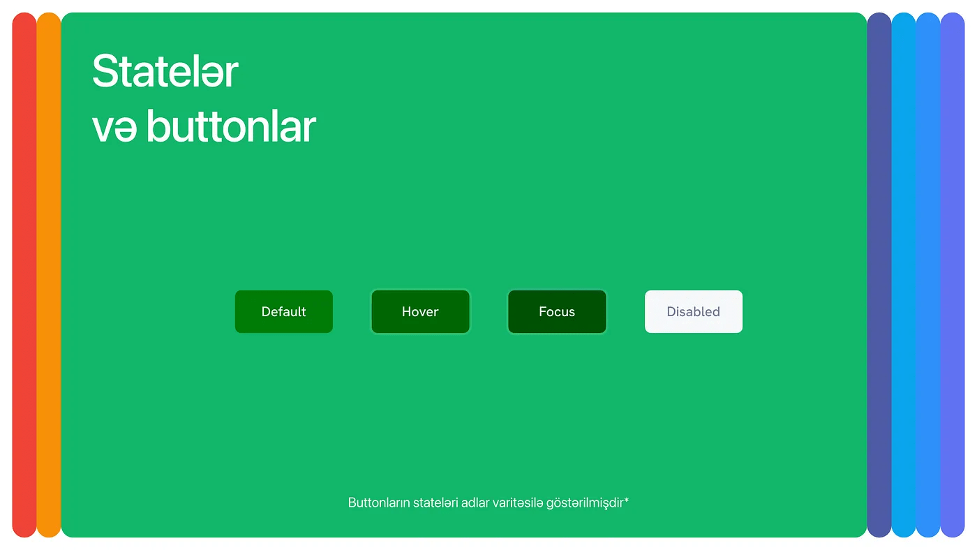
In our projects, the indicated 4 states are enough, if you need an additional state or less, you are free to choose.
Brand colors:
Since we finished the first 2 parts, we can now move on to the 3rd stage, that is, the selection of colors. (Photo 3)🏄🏻♀️
Here, the brand color is selected as the main color (or colors), and semantic, neutral colors are prepared accordingly. Semantic colors are selected over the HSL system and mainly change the hue, while the saturation and lightness change with a maximum range of +10 and -10. In this way, we get the semantic colors corresponding to the brand color.
Neutral colors are obtained by changing saturation and lightness, while the hue remains constant. In this way, a neutral color matching the brand color can be obtained.

Shades:
If we have chosen the places of use and brand colors, we can move to the next stage, the selection of shades. 🫡
There are two methods for this, Manual and Automatic method:
- Manual method: With this method, you can select the shade range and change the saturation and brightness on HSB based on it. Briefly, you can lower the saturation to 10 and increase the brightness to 99 to get lighter shades. For dark shades, it is enough to reduce the brightness to 50 without changing the saturation.
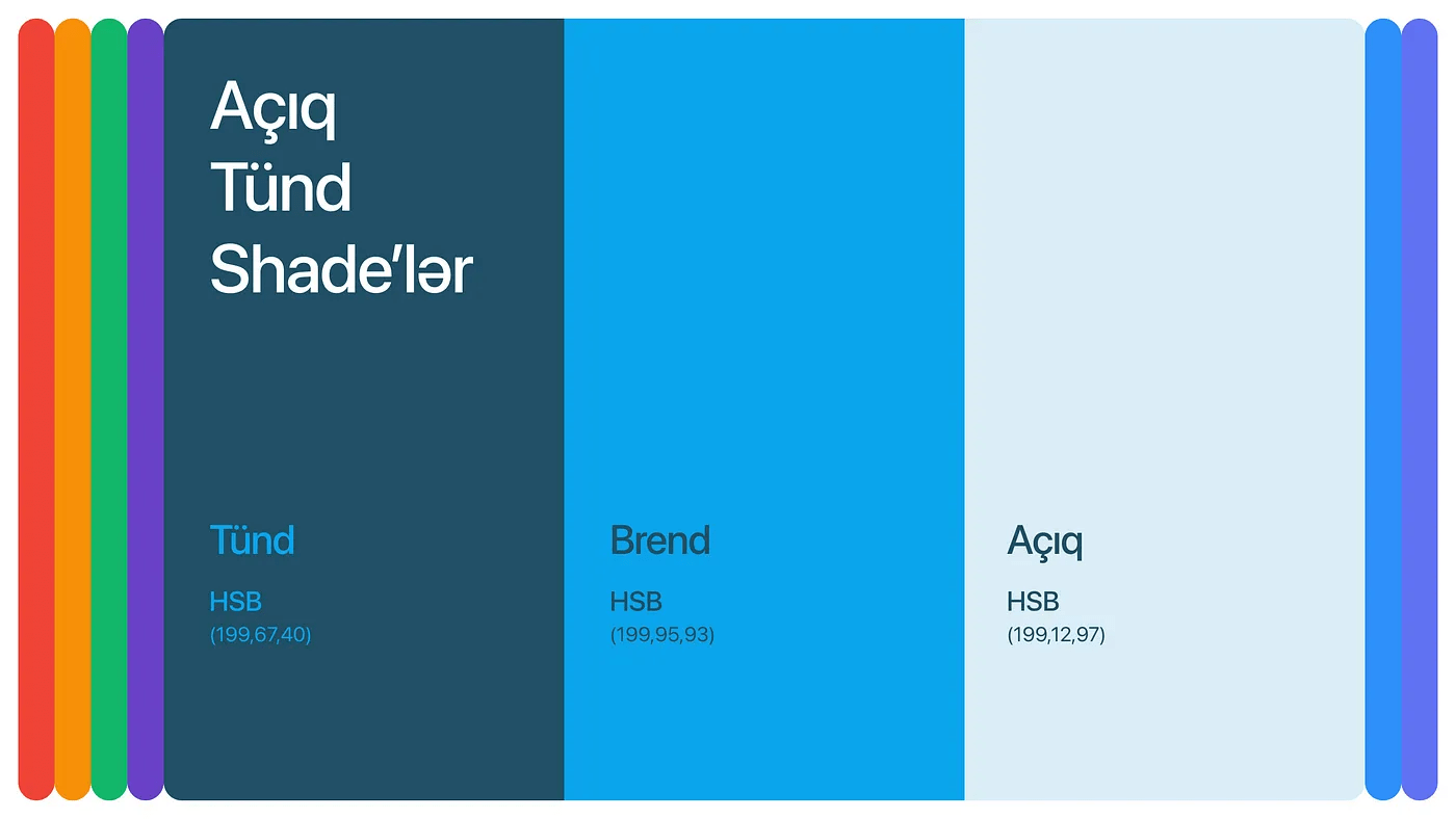
As we can see from the example above, when making dark and light shades, exact numbers are not used, they vary by color. In other words, when we say English, we do ( Eyeballing ). 👀
2. Automatic method: In this method, we can use various online tools or Figma plugins.
As a website:
Figma plugins:
In this way, it is easier and faster to get results and prepare colors. But sometimes you may need to change the colors slightly to meet WCAG standards.
Of the tools I mentioned above, the one I use the most is Colorbox.io. Here you can interfere more with colors and shades, which in turn makes the result better.
Color box:
Now let's go to how to use the Color box:
Without further ado, let me tell you simply what settings I use:
Number of Steps:
21 — minor steps 0 & 1
Hue:
From start to end same value
Saturation:
From 0 to 1 — Rate 1
Brightness:
From 0 to 1
Locked Value:
The Hue number of the selected color
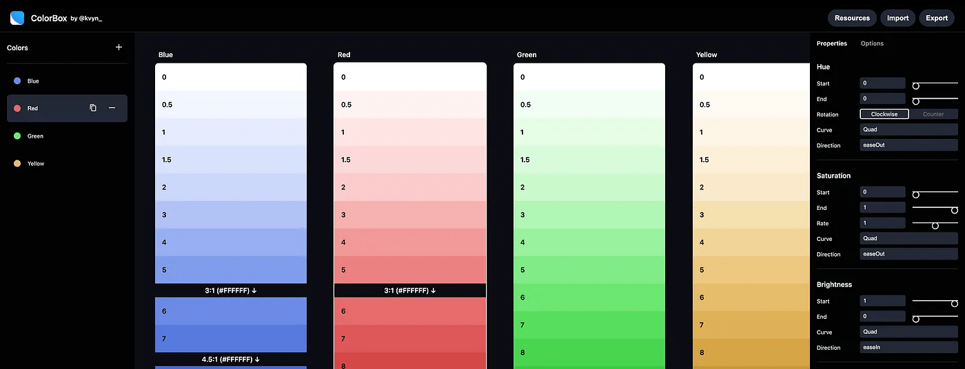
P.s. When making Shades, don't forget to change the Curve settings of different colors and choose the appropriate one. All colors are different and each color has its own Curve adjustment.
Choice of colors:
Since we have prepared our shades, we can now move on to the selection of colors. (Figure 6)
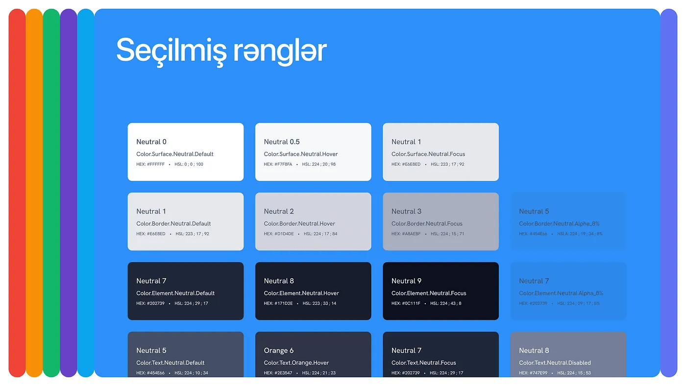
We select colors based on their usage and test each color for WCAG along with the colors it will be used for, and add that color to the system after making sure it has at least AA contrast.
For the Contrast test:
And you can use other plugins.
Remember to use Tokens when naming colors and make the naming understandable to everyone. For more information about tokens, you can check out my blog :)
Application of colors:
If we have selected the colors and done the contrast test and everything is in order, we can now apply the colors.

Figure 7 shows an example of applying colors over a Button Group. As can be seen here, each element has tokenized colors corresponding to its state. After applying the colors according to the tokens, we don't need to think about the contrasts anymore, because all our colors are AA standard.
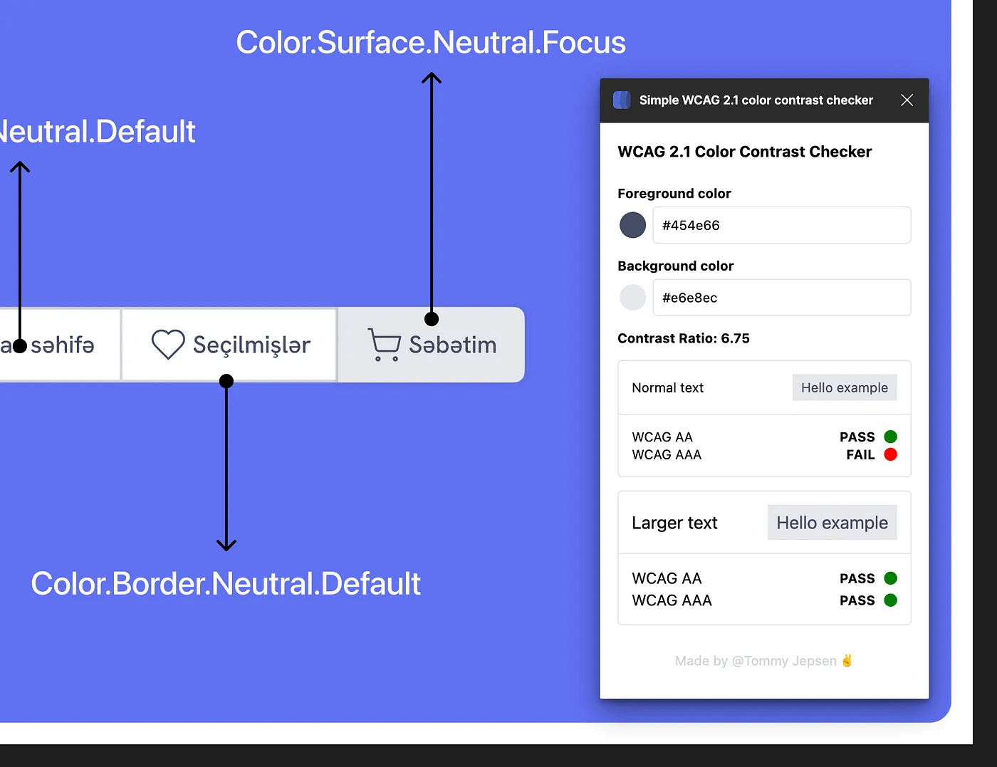
Figure 8 shows a simple test I did for contrast. After applying the colors, I just tested it without changing and it is WCAG AA compliant.
Last words…
In this blog, we mainly talked about the choice of colors and which tools to use. By doing all these things in order, you can also create accessible colors for your design system. Psst, you can apply what you learn here in your own way and discover new ways.🤫
Have a nice day and see you in the next blogs.💜
All visuals are made by me and must be credited when used.
And if you've come this far, here's a gift from me to you in this music.❤️🔥
