Learning from developer users, and establishing stable UI foundation for new design system and new products for Lighthouse

Problems
Lighthouse is the go-to tool for web developers to measure the quality of the web pages and get recommendations on what to improve on.
In 2018, there were many features to add, and new product lines to add, i.e. continuous integrations, and community plug-ins.
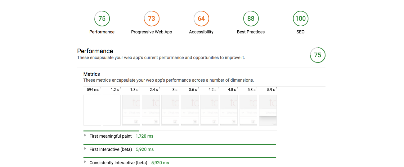
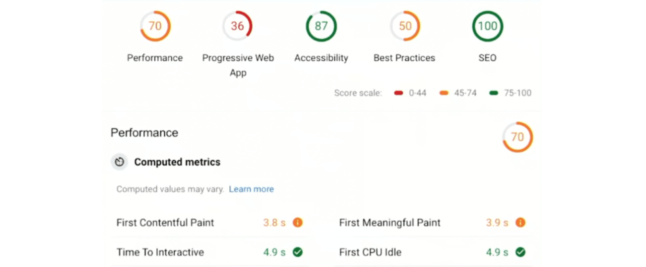
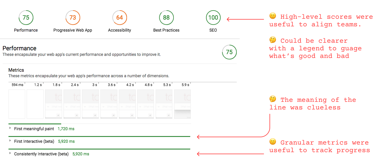
Also there was an abstract feedback that the Lighthouse report (below) was not easy to comprehend. There were various ideas to try and explore.
The usability study revealed and unpacked the comprehension issues on the UI patterns in detail.
Solutions
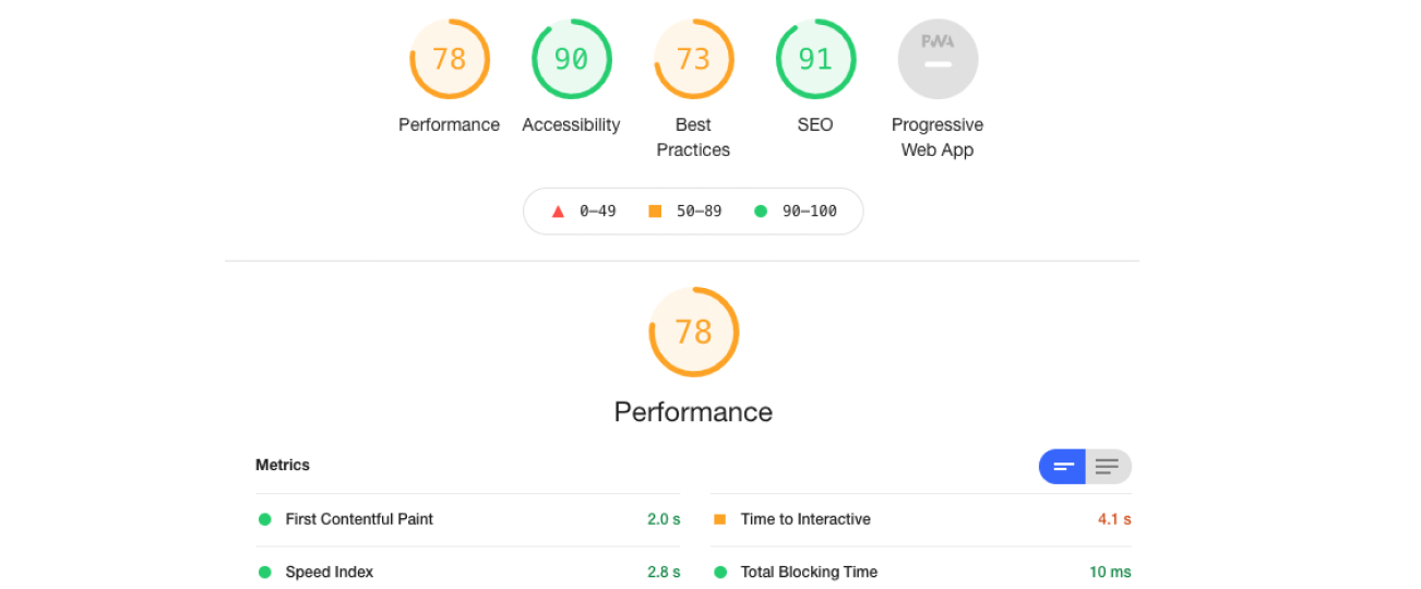
The team delivered both usability improvements and new measurement mechanism under the hood, which would enable the design system revamp and the product expansion.
Throughout the course, the team went through generative and evaluative design activities.
-
Design workshop to build a shared brain on the issues and ideas
-
Sketches and mocks
-
Usability study on the existing UI and on the new ideas
-
Design iterations, reviews, and refinements
-
UI pattern inventory
-
Sessions of design system development and reviews
-
Logo development and reviews
-
Prototypes
My contributions
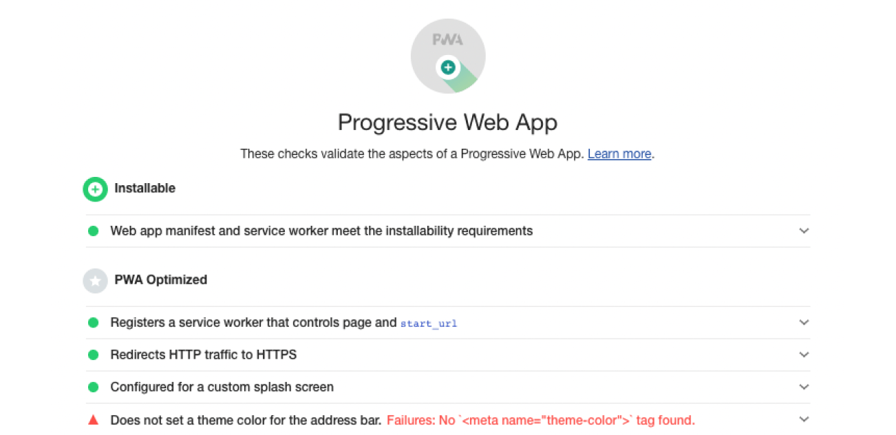
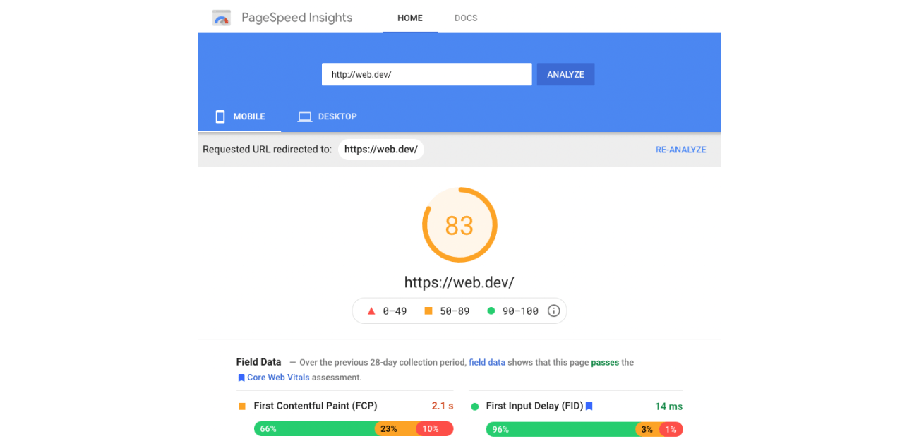
As the lead designer, I introduced and drove the design process, and ran design workshops with the cross functional groups. For the usability improvements, I did hands-on design for iterations and study preparation, and shipped the version 3 on the Chrome DevTools as well as on the Google Page Speed Insights in 2018. I then redesigned the PWA audit report UI and shipped the new badge system.
I proposed and get the buy-ins for engineering investment and funding to the new design system creation. I hired the design system expert, and guided the design development and the launch of the version 6. And, I guided the design and launch of the Lighthouse CI product.
I onboarded a new designer to own the Lighthouse product design, and continued guiding the design and launch of the features up until April 2021.
