How to Enhance Your Search Fields with Images
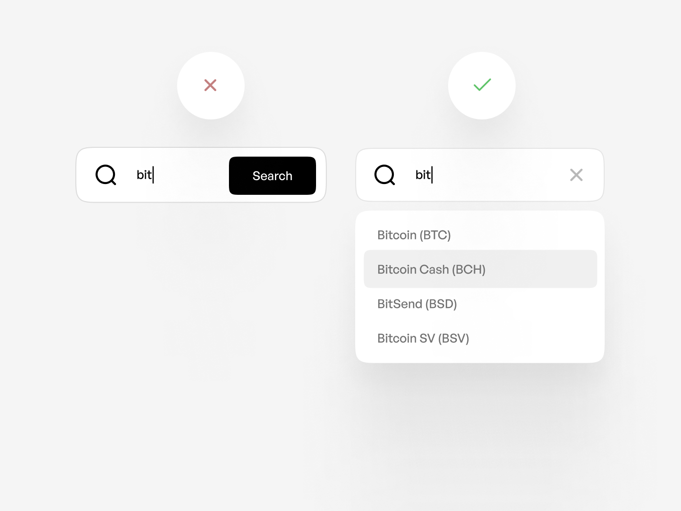
As a designer, you're probably familiar with the basic search field that has been around since the early days of the web. You know, the one where users type in what they're looking for and then get a list of results. It's simple, straightforward, and gets the job done.
But let's be real, we can do better than that. Enter the autocomplete feature - the next generation of search fields. This handy little tool displays potential results in a menu based on what the user has typed so far. It's a game-changer, making search faster and easier for users. No more struggling to remember exact terms!

However, even with autocomplete, users can still face some challenges. Picture this: the suggested search terms are so similar that users can't tell them apart. It's like trying to choose between identical twins - good luck with that!
For example, let's say a user is searching for a specific cryptocurrency token. The menu shows multiple options with similar names, but the user has no idea what sets them apart. It's a shot in the dark, and if they choose the wrong one, well, that's time and effort down the drain.

The same issue can arise when users need to select a person from a database. They might remember the first name but draw a blank on the last name. Now they're stuck, forced to rack their brain for that elusive surname.
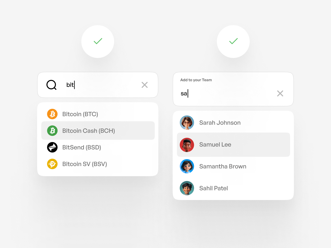
But fear not, my fellow designers! There's a solution: imagery. By including images with your autocomplete search fields, you give users a visual reference to differentiate between similar terms.
Let's revisit our cryptocurrency example. If each option in the menu had a thumbnail image of the token's logo, users could easily recognize the one they're after, even if the names are confusingly alike.
The same goes for selecting people. If the user can't remember Samuel's name, an avatar next to each option can help them pick out the right Joseph based on appearance.

When search terms are practically indistinguishable, imagery becomes the key differentiator. By adding icons, thumbnails, or avatars to your autocomplete menu items, you'll make the search experience far more user-friendly. Plain text just doesn't cut it anymore.
So, my advice to you? Embrace the power of visuals in your search fields. Your users will thank you for it!
