
I designed a component-based website for Rosetta AI and modelled the content in Prismic to allow for a great deal of customisation thanks to Prismic's slices technology, resulting in countless hours saved on design and engineering resources, by allowing the marketing team to quickly make changes, add new pages and content whilst still keeping the site visually and functionally consistent.
Requirement:
Design and plan a website that matches the Rosetta's fashion focused brand, and a website that can be fully customised by the marketing team without the need for a design or engineering implementation.
Final product:
Designed a component-based website for Rosetta and modelled the content in Prismic to allow for a great deal of customisation thanks to Prismic's slices technology.
The result:
Countless hours saved on design and engineering resources, with the marketing team being able to quickly make changes, add landing pages and more whilst still keeping the site visually and functionally consistent.
Iteration:
A different approach to web design: component-based design
The brief for the site was a little different than usual, while usually I would start with mapping out the information architecture, then move onto content strategy and wireframes, this time I had to create a website that had to fulfil requirements that were not yet known.
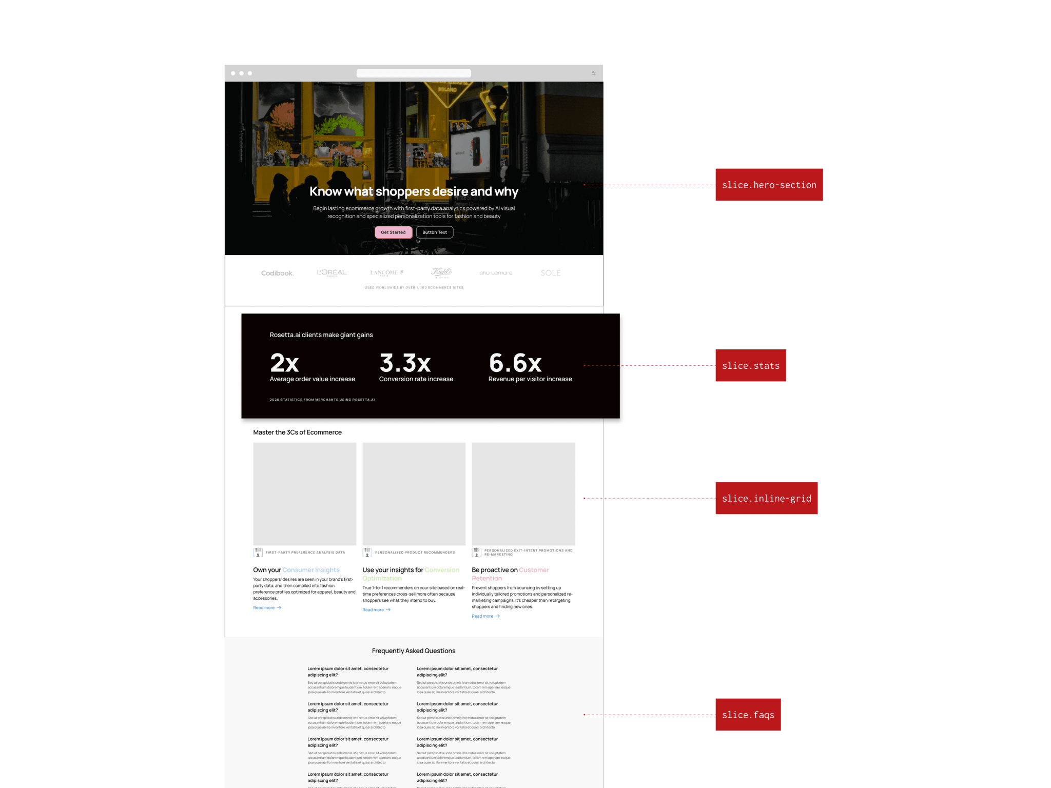
In order to do this, I decided to start with components first, and design a large number of components taken from the familiar patterns and use cases from the web and then put the pieces together.
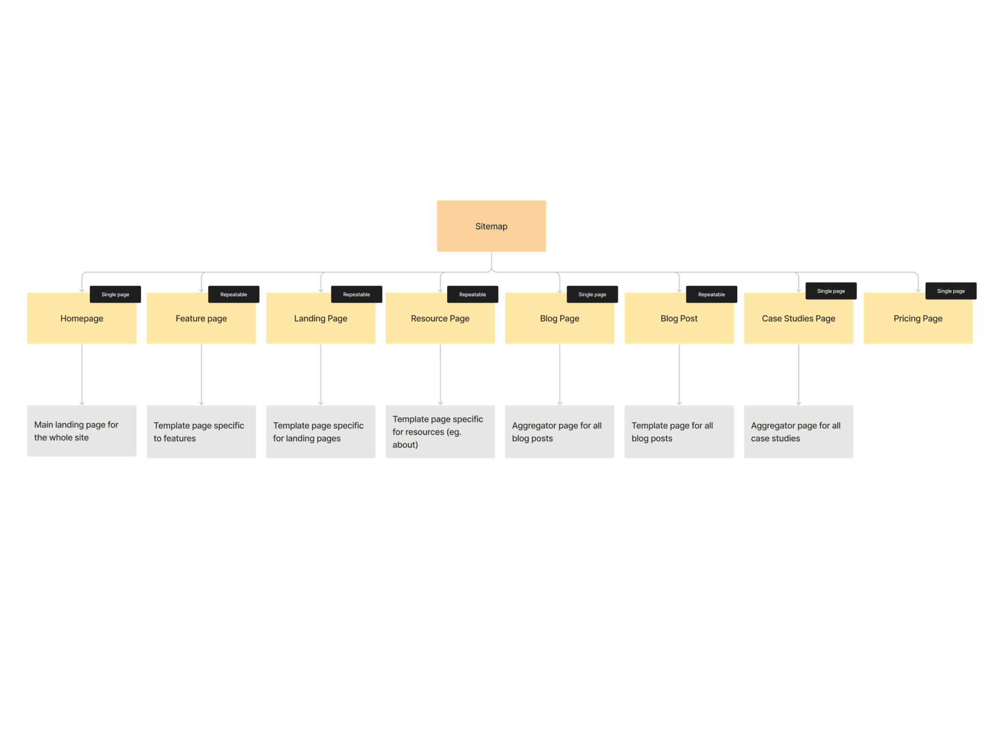
I started by creating a base number of pages, which would then go to become "custom pages" in the Prismic content model.
The base pages were the "homepage" and the "pricing page" which are single type pages, which means there can only be one of each. Then a number of repeatable pages that can be re-used and re-created at wish, these were the "feature page", "resource page, "landing page" and a few more.
Once these have been decided and discussed, I started mapping out the components that will go into these pages.
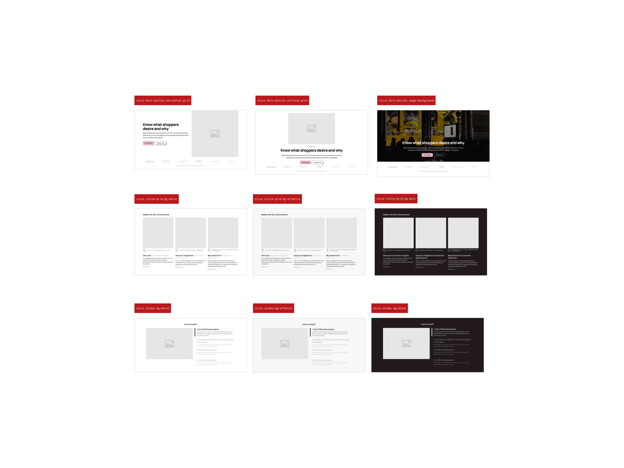
I have created over 20 components, with lots of customisable options, from different layouts, to different background colours.
Now it was time to design the components.
The main inspiration for the site visual patterns were Apple's Human Interface Guidelines, a simple and sure-fire way to create and interface that is consistent and pleasing to eye.
Once the components (which I'm gonna start calling "slices" going forward to match Prismic's own terminology) were mapped out and the base elements designed, I have created different variants for background colour, layout as well s for the different breakpoints.
I have used a total of 4 breakpoints (mobile, tablet, desktop, large desktop) so if a designer wanted to put together a page before doing it within Prismic they could do it easily and quickly in Figma first.
Once the slices were completed it was time to go through approval and revision stages.
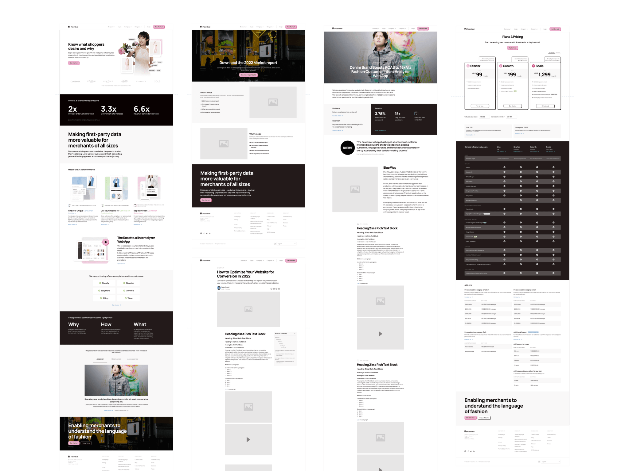
I've also created a couple of pages as an example to show stakeholders on how a finished page is supposed to look like.
The approval marked the end of the design phase. Next step was the content modelling phase, which is another Prismic term for data modelling within the platform.
Content modelling within Prismic
The Prismic interface and mental models are pretty straightforward and probably one of the easiest Content Management Systems to use.
I have setup the base pages following the site structure, and then proceeded onto creating the "slices".
I have added certain limitations depending on which slices should or should not be included in a specific page type, as well as added limitations around the design itself, to keep the design consistent in all possible scenarios.
Once that was completed, I have filled all the content from the previous website version and proceeded to document the work on Loom.
Once this was all complete, the designs and the content model was handed over to the developer.
The impact
The website looks slick, but more importantly thanks to the simplified workflow and to the ability given to the marketing team to make changes on the go, create new pages on a whiff, the speed of execution has drastically increased from 1 week of work to create one page, to a couple of hours at worst.