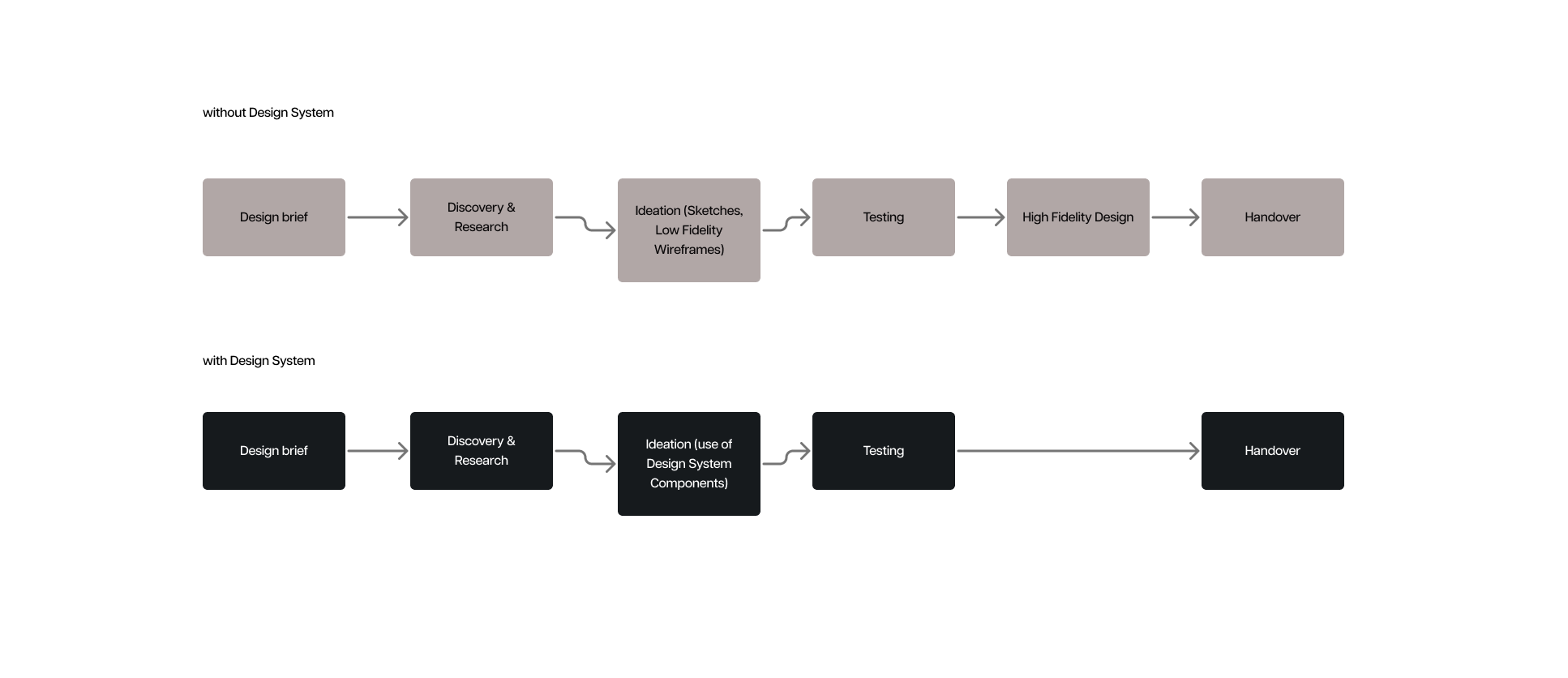
A good component library and design system are fundamental to improve speed of execution allow teams to iterate through ideas and hypotheses much faster compared to the classic workflow where UX and UI are separate.
The first requirement upon joining Rosetta.ai was to create a component library / design system to allow for easier prototyping in design.
A good component library and design system are fundamental to improve speed of execution and allow teams to iterate through ideas and hypotheses much faster compared to the classic workflow where UX and UI are separate.
UX designers can now build up wireframes with existing components while UI designers only work on maintaining the system and managing handover with developers.
The first step is to take an existing base library whose look and feel is closer to our brand.
The development team has been using ChakraUI in development so we took that as a base and started building on top.
You may ask, why not just use ChakraUI then? Well, those libraries are extensive and decently thorough but they are also fixed and harder to personalise down the line. While the styling of the components can be changed it requires work on top of these components which will create bloated code and will likely decrease productivity, therefore going against one of the main principles of building a design system: speed of execution.
Open source component libraries are a good resource to use for prototypes or MVPs but once you start building your app, having your own custom components, tailored to your brand, tailored to your use cases and functionalities is fundamental.
Using Atomic Design Principles
First thing to do when creating a design system is to create principles for categorising all the components.
Even if we only have 30 components, if they are nor organised properly it is very easy to get lost or create duplicates.
The best way to organise a component library based on my experience is to use Atomic Design principles by Brad Frost:
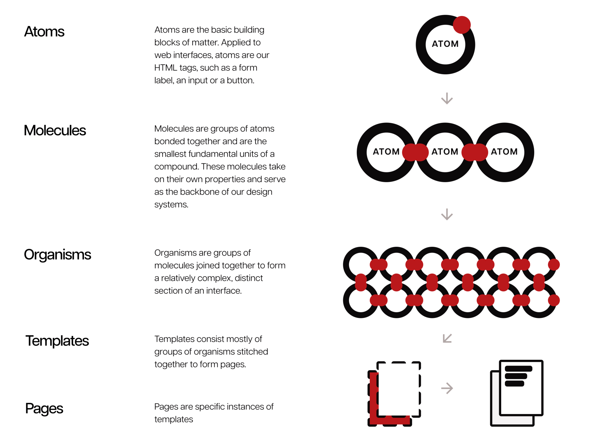
The main principle is to divide the components hierarchically, starting from Atoms, to Molecules, to Organisms, to Templates and end up with full Pages.
I have taken a few ChakraUI components and the base html fields needed for a good component library and got to work.
The structure
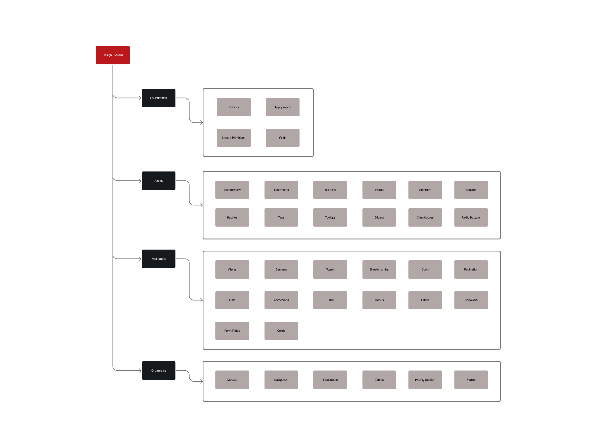
Foundations
The foundations include all of the base elements that each component and atom is going to be made of, these include:
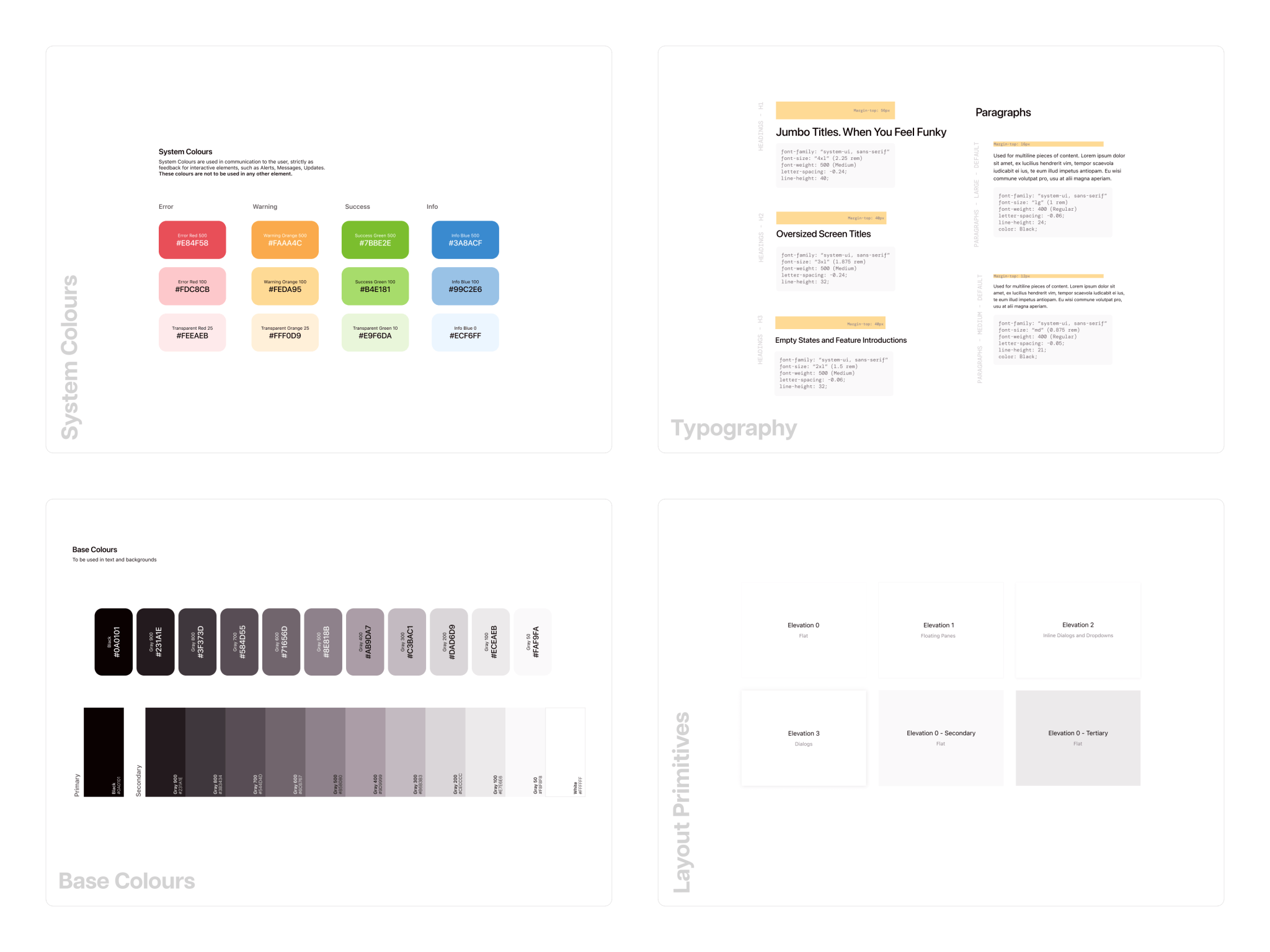
Colours
Includes all the colours that can be used within the system and is sub-divided into four categories:
-
Base colours, which are the black and white shades and tints adjusted to the main brand colour.
-
Brand colours, which are the main brand colour accents, with shades, tints, muted versions and gradient variations.
-
System colours, which are the base green (success), orange (warning), blue (information) and red (errors).
-
Graph colours, which are variations of all possible colours that can be used within graphs, adjusted to fit well with the main brand colours.
Typography
Includes all possible text use cases from headings, to links, to single line text, to paragraphs.
Layout Primitives
Which are the base foundation of all containers, boxes, cards and layouts.
These are subdivided into different elevations and different background colours.
Grids
Includes all the grid layouts for every single screen (large desktop, desktop, tablet, mobile and more)
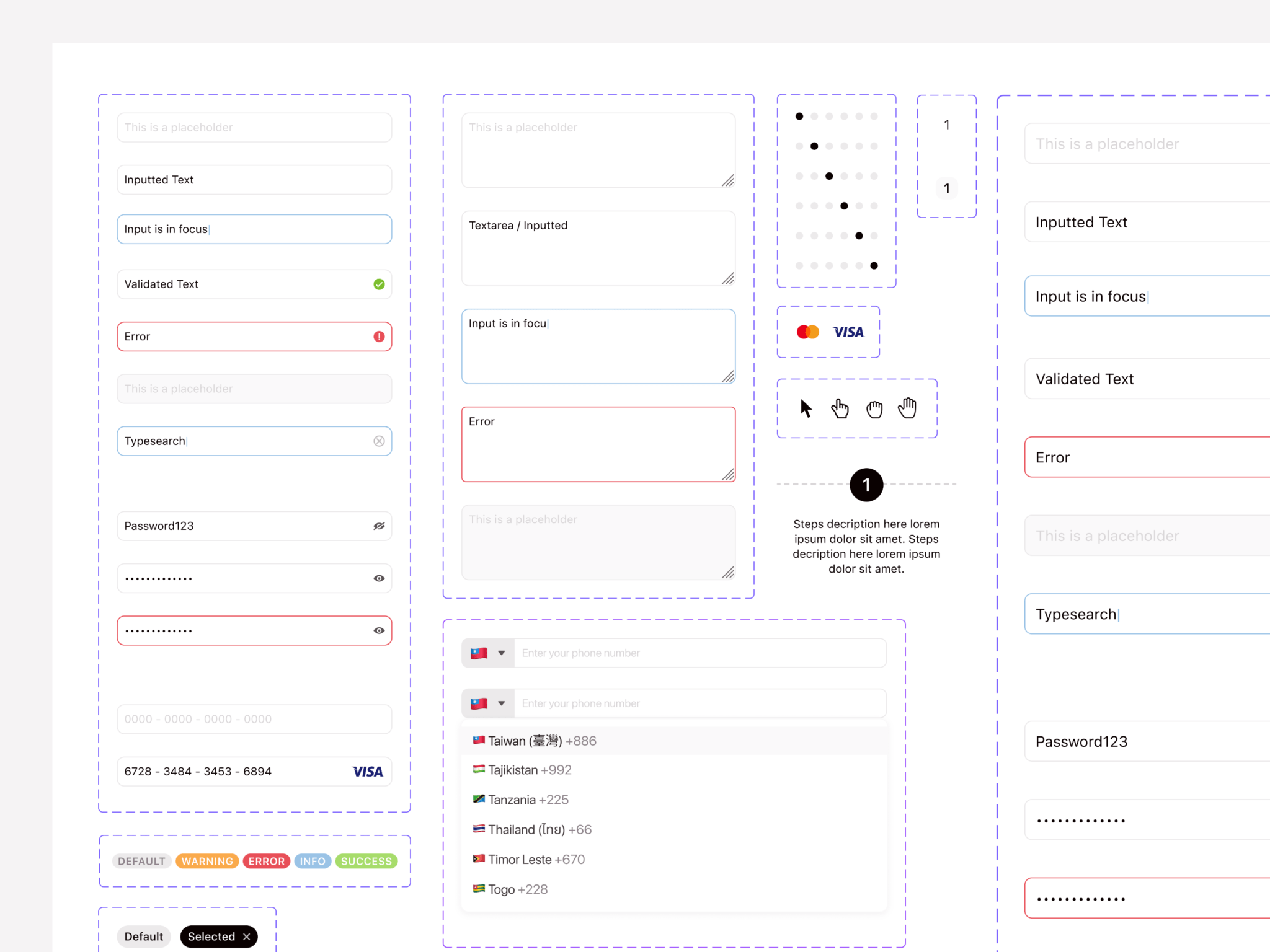
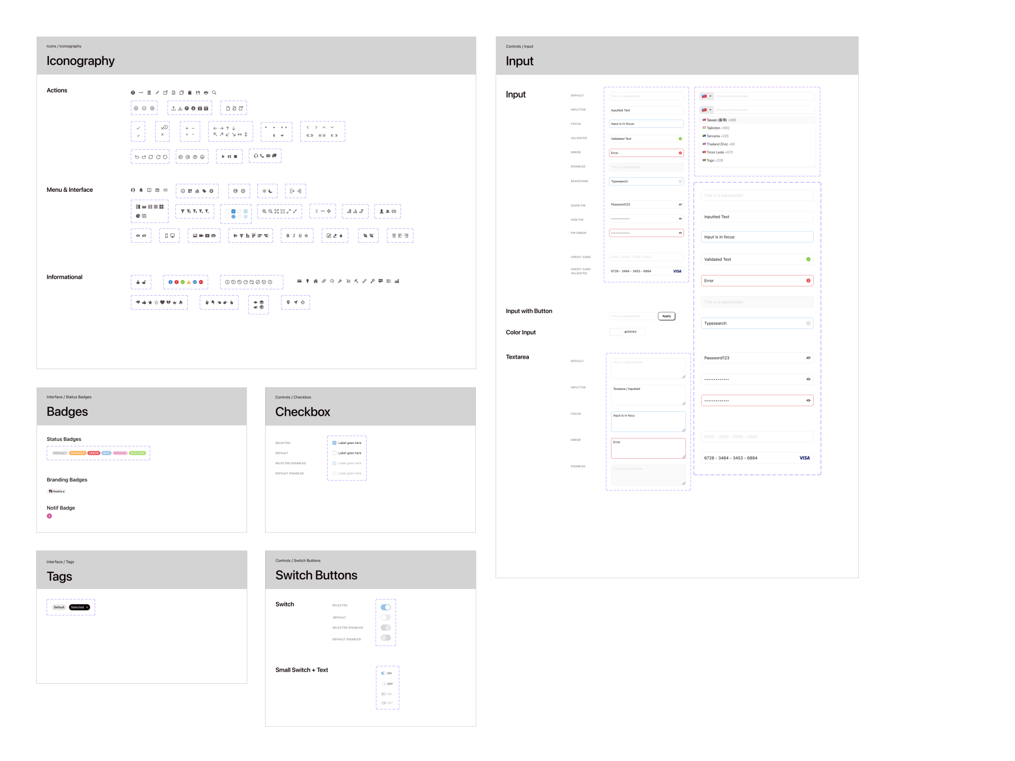
Atoms
These are the building blocks of all interface components and include base HTML elements such as labels, checkboxes, radio buttons, inputs and more.
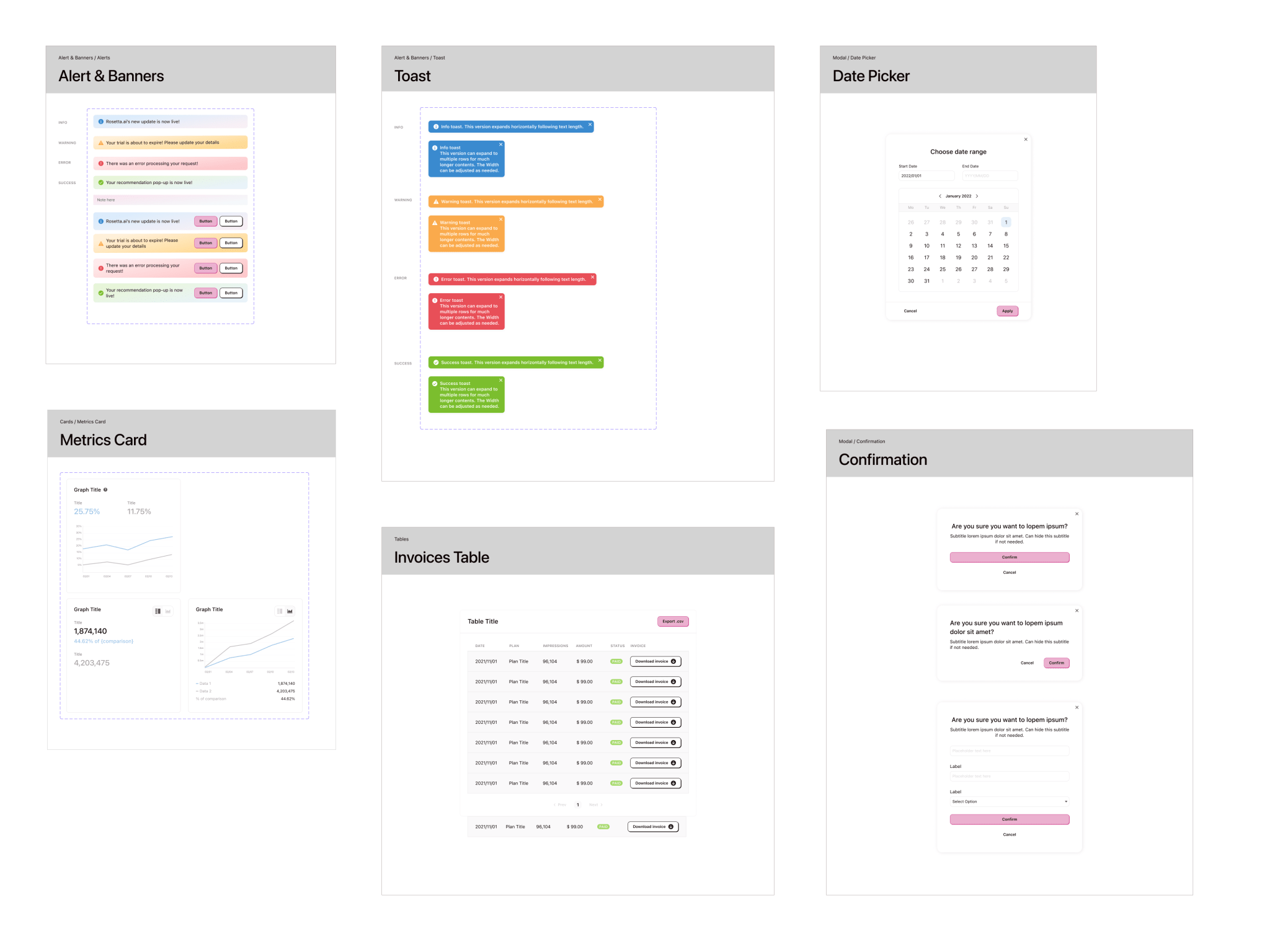
Molecules
These are components made of two or more atoms, that usually have a specific function. Like a search input with a label, search icon and different states.
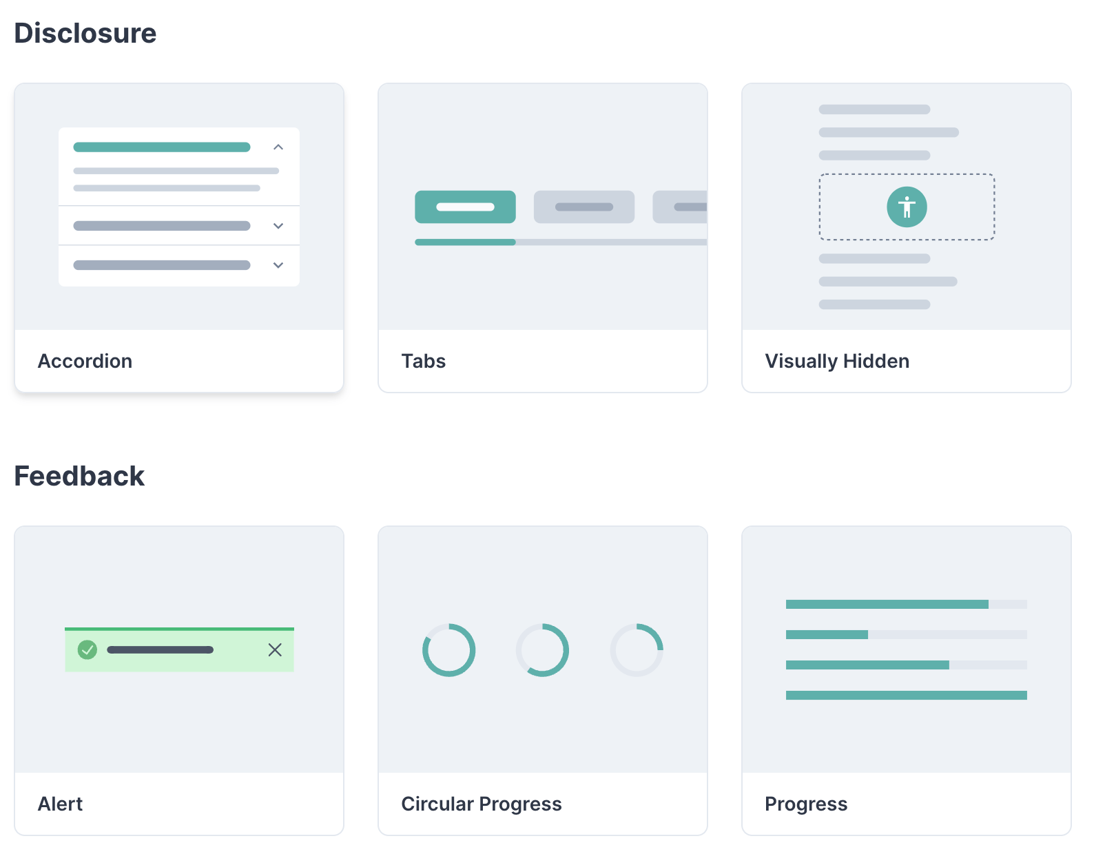
Organisms
More complex components that incorporate two or more molecules and can serve more than one specific function. An example of an organism is a header section.
Templates and Pages
These are the final components built with multiple organisms, templates are similar to bare bone pages layouts without imagery and content. Whilst pages are the complete interface design.
The result
A component library of 40+ fundamental components which led to increased speed of ideation for the design team and increased speed of execution for the development team.
All while maintaining and promoting brand consistency across the platform.