Back in pre-Covid times, our increasing struggle (constant design debt) to maintain consistency across Pupil's internal products was like a growing monster, especially since we were the ones most impacted. Facing this escalating issue was a daily challenge. However, we were often caught up in 'saving the day' with other tasks. Therefore, we resolved to make changes as we advance. This was a substantial commitment.
There was no other way to undertake this enormous task when we were busy with other stuff. And having a robust design system for a technology company with several products was imperative. Dreaming of a fully-functioning design system was only one side of the coin.
On top of this, we also had to convince the stakeholders and get a green light from them. Thus, explaining our intent was even more important than building it. This is because what you'll show at the end may need to be understood clearly and create false expectations despite your efforts. We meticulously identified our needs and outlined them as follows;
We want to build a design system for
-
Faster delivery
-
Less time on QA
-
Better designer/developer communication
Which eventually makes a
- Positive impact on the conversion rates
Fortunately, our thinking and timely approach were understood by the decision-making people.
The What and Why?
We began by explaining the "why" after the "what," lending greater resonance to our explanation. Upon uttering the term "design system," everyone in the organisation had some, little, or no understanding until we elucidated it fully. Nonetheless, it was crucial for us to curate our initial statements carefully;
A design system which was designed for Pupil’s internal products to establish consistency across all the products with its sustainable, efficient, articulated and purposeful component structure. In other words, it’s a set of rules that stand for long-term durability alongside the aesthetic values that elegantly and efficiently reflect the intended purpose.
The underlying issue (the what) was that all products used to have detached components from everywhere. This was a colossal obstacle in our daily job. Maintaining consistency was impossible. We want them to give the optimal experience with easily-accessible information they need without wasting the user's time. A well-determined design system will prevent high maintenance costs, lack of information reliability and inadequacy of role management (the why).
By establishing a successful design system, we'd be speeding up the delivery cycle and spending less time on quality assurance. All products would align with each other and have a meaningful and intuitive experience by benefiting from a single source of truth. We expect significant changes in how we design and develop, eventually impacting conversion rates.
We also wanted our design system to have its own story, which can positively impact users.
A sustainable, intuitiveness, efficient and purposeful foundation for the users is the main key term to achieve this goal.
The Research
Built World vs Spatial Data
Pupil's mission is to transform buildings into verified spatial data. We studied the parallels between the fields of product design and architecture with the aim of applying these similarities to our design system. This started with identifying key topics and then refining them to better align with the project scope. Here is a breakdown of those topics:
• Sustainability and Efficiency
• Articulation
• Personalisation
• Existentialism
Information gathering
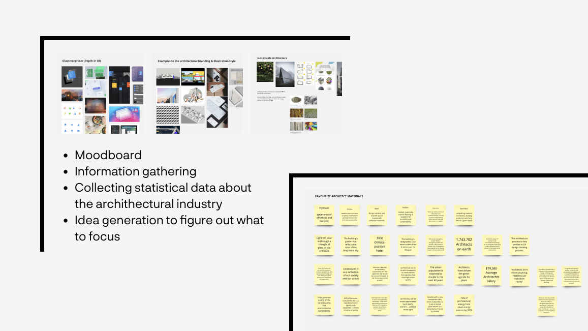
We initiated the process with a mood board that housed visual research examples. The assembly of statistical data from the architectural world informed our research process. The data collected guided us in defining the visual style and focus of the design system. The collected data helped us generate descriptions of how the design system should look and what it should focus on.
💬 Hakan: A design system that is structurally sound (concrete), reliable (familiarity) and transparent (glass)
💬 Jacopo: A futuristic and sustainable design system where its modular design is build with a material that has no impact on the nature, juxtaposing the style with transparent glass to build depth of the interface.
💬 Emrah: A system that speaks a common language across all the products with its scalable, sustainable, modular, and solid component structure. It’s built for long-term durability alongside aesthetic values that elegantly and efficiently reflect the intended purpose at all times.

We found out that architectural evolution is quite similar to Atomic design principles. They start from a singular (archaic/atoms) form to an integrated (integral/pages) organisation.
Sustainability and Efficiency
We identified some fundamental architectural principles that directly apply to product design.
-
Resource Efficiency: Just as architects aim to use materials and energy efficiently during construction and throughout a building's lifecycle, digital designers focus on creating efficient experience solutions that use less computational resources, contributing to lower energy use and longer device lifespans.
-
Modular Design: In architecture, modular design enables components to be reused or replaced without needing to reconstruct entire buildings. Similarly, in digital design, creating reusable components and patterns not only reduces the time and resources required for future projects but also ensures a consistent user experience.
-
Longevity: Both fields strive for designs that stand the test of time. Architects aim to create buildings that remain functional and attractive for decades, while digital designers aim to create products that continue to meet user needs even as technologies evolve.
-
Adaptability: In architecture, adaptable design allows buildings to be repurposed over time, extending their useful life. In digital design, flexible and scalable systems can adapt to changing user needs and technologies, increasing the product's lifespan.
-
Reduced Waste: Both fields aim to minimise waste — architects through strategies like recycling construction waste and digital designers by minimising redundant work and streamlining their processes.
In essence, sustainability and reusability are guiding principles in architecture and digital product design, driving efficient, long-lasting, and adaptable products that minimise waste and resource use.

Here’s a basic example of how we implemented these rules in our system. The image above illustrates reusability, modularity, and adaptability.
Personalisation
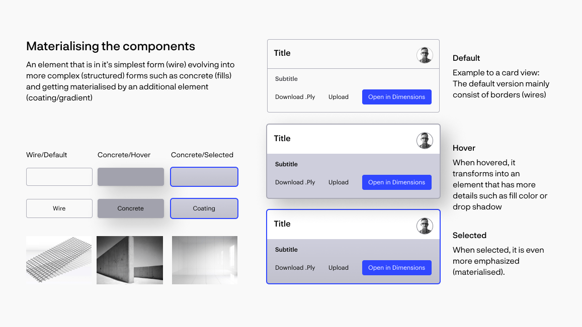
Materialisation in both digital product design and architecture revolves around the concept of turning an idea into a tangible, user-interacting entity. We concretised our vision around five main topics.
-
Choice of Materials: In architecture, the choice of materials significantly influences the aesthetic and functional qualities of the building. In digital design, the "materials (or patterns and styles)" can be considered the various elements and components that form the user interface, and their choice influences the user experience.
-
Consideration of Durability: Architects choose materials based on their longevity and performance over time. Similarly, digital product designers must ensure their products remain functional and relevant as technologies and user needs evolve.
-
Interaction of Materials: Architects consider how different materials interact with each other and with the environment. In digital design, this translates into thinking how various interface elements interact, ensuring cohesion and harmony in design.
-
Sustainability: In both fields, there is a growing emphasis on choosing sustainable materials. In digital design, this can translate into practices like reusable components or designing for longevity and reduced obsolescence.
-
Sensory Experience: The material choices in architecture significantly impact the sensory experiences of the occupants. Similarly, the "feel" of a digital product — its responsiveness, fluidity, and visual appeal — creates a sensory experience for the user.
Overall, materialisation in both architecture and digital product design involves making choices that impact not just the look of the end product but also its function, durability, and the experiences of its users.
Articulation
Just as architectural spaces create depth and perspective through the layout of buildings and rooms, digital products also utilise depth to enhance user experience. They use elements such as shadows, layering, and movement to give users a sense of hierarchy and interaction.
According to Maha Kutay from Zaha Hadid design:
“Articulated design language emphasises seamlessness and the smooth transition between elements. Each piece, while initially morphologically conceived is shaped further by typology, functional and ergonomic considerations.”

Existentialism
Existentialism, normally is a form of philosophical inquiry that explores the problem of human existence but in our case, we're trying to understand what would be the equivalent of the term existentialism in design.
In architecture, existentialism is explained as follows:
Existential Architecture is an approach towards being rather than an affected style for the show. With no visual style to champion, it is beyond fashion.
When applied to product design, existentialism could imply a focus on user autonomy and personalisation. It should not dominate the user experience but rather design for a controlled action in which the medium itself is explored, and one's self through the medium, where the overarching purpose is the exploration itself.
The Making
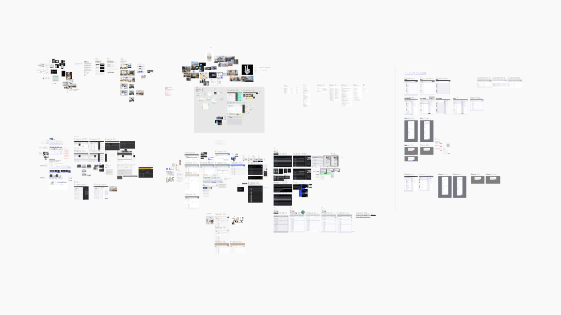
We followed an egalitarian approach which refers to designing products that are accessible, usable, and inclusive for all individuals, regardless of their abilities, age, gender, cultural background, socioeconomic status, or any other factors. This approach aims to create products that don’t discriminate or favour a specific group of users, but rather, cater to the needs and preferences of a broad and diverse audience.
Style Explorations
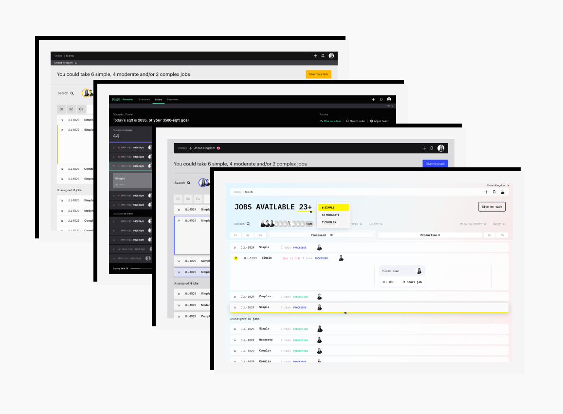
We sought to craft a theme that transcended mere aesthetics. Our goal was to enhance usability, accessibility, and the overall user experience with a distinct look and feel that could flexibly adapt to various contexts and user preferences. We experimented with different theme options to identify the optimal user interface, quickly discarding some as excessively extravagant. Still, this process yielded intriguing insights into what was possible. It became apparent that a design system intended for complex task flows should not be overwhelming.
An additional point worth mentioning is our independence from worrying about colour, typography, and iconography. The brand designers had already defined these elements, sparing us from focusing on anything beyond a few additional considerations.
Maintaining High Contrast
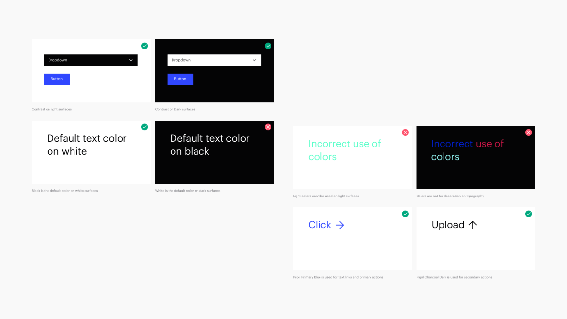
In some cases, it was helpful to apply light components to dark backgrounds or dark components to light backgrounds as shown below. This technique is useful to focus attention or create visual tension.
Colours
While we already had a defined branding color palette, we incorporated additional color variants specifically tailored for our internal products.

Typography
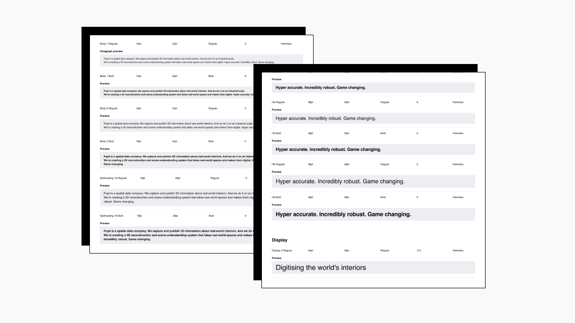
We managed typography using type tokens across two font sets: Helvetica as our primary, and Maax Mono as our secondary. Type tokens refer to preset configurations of typographic elements like font size, weight, and line spacing.
Spacing
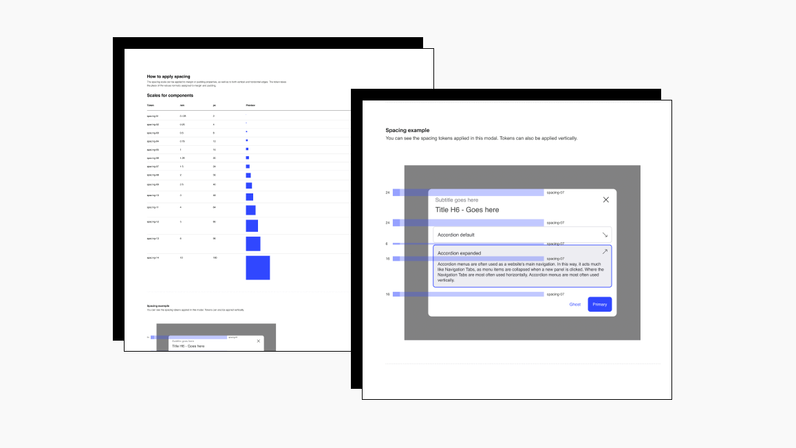
Spacing in a design system is indeed a critical but often overlooked aspect. It plays a vital role in creating a visual hierarchy, improving readability, and facilitating user comprehension. It's not merely about aesthetics; it serves the functionality and usability of a design by guiding users' attention and enhancing the user experience.
For Trace, we took this seriously by creating spacing tokens, a set of predefined values in ram and pixel units to ensure visual coherence and create more predictable and understandable user interfaces.
Nomenclature
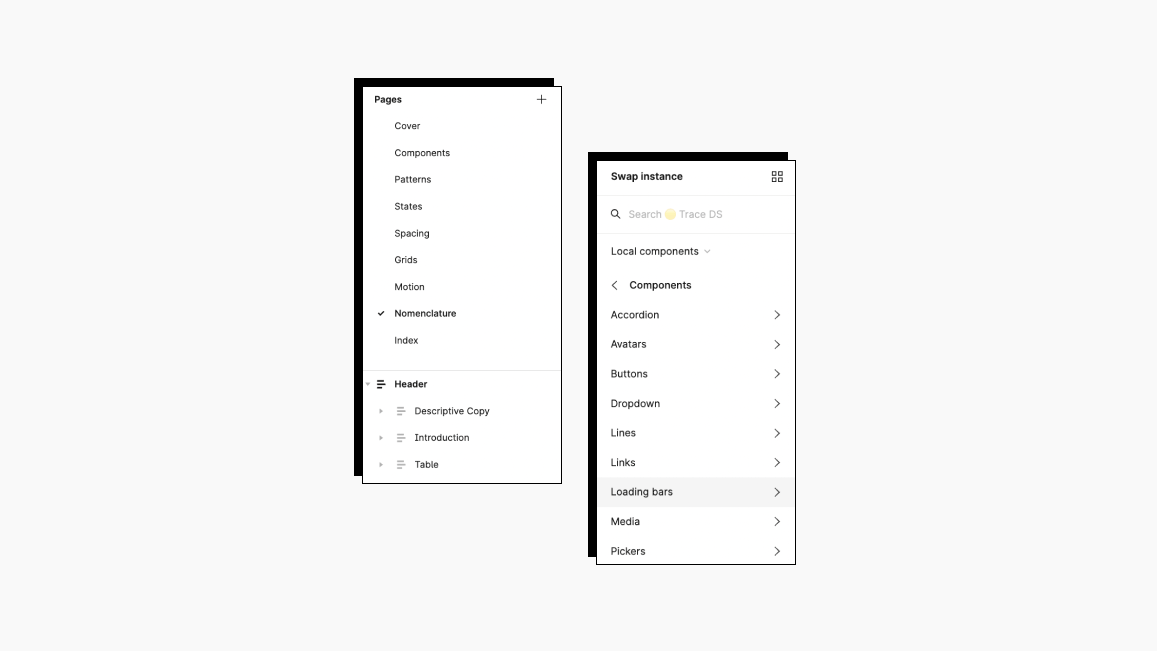
Nomenclature, or the system of naming, is a critical aspect of a large design system, especially for communication with developers. It is also important for efficiency and scalability. A well-structured naming system simplifies maintenance. Understanding what each component is and how it fits into the overall design becomes much easier, and keeping track of the system over time becomes more manageable.
Components
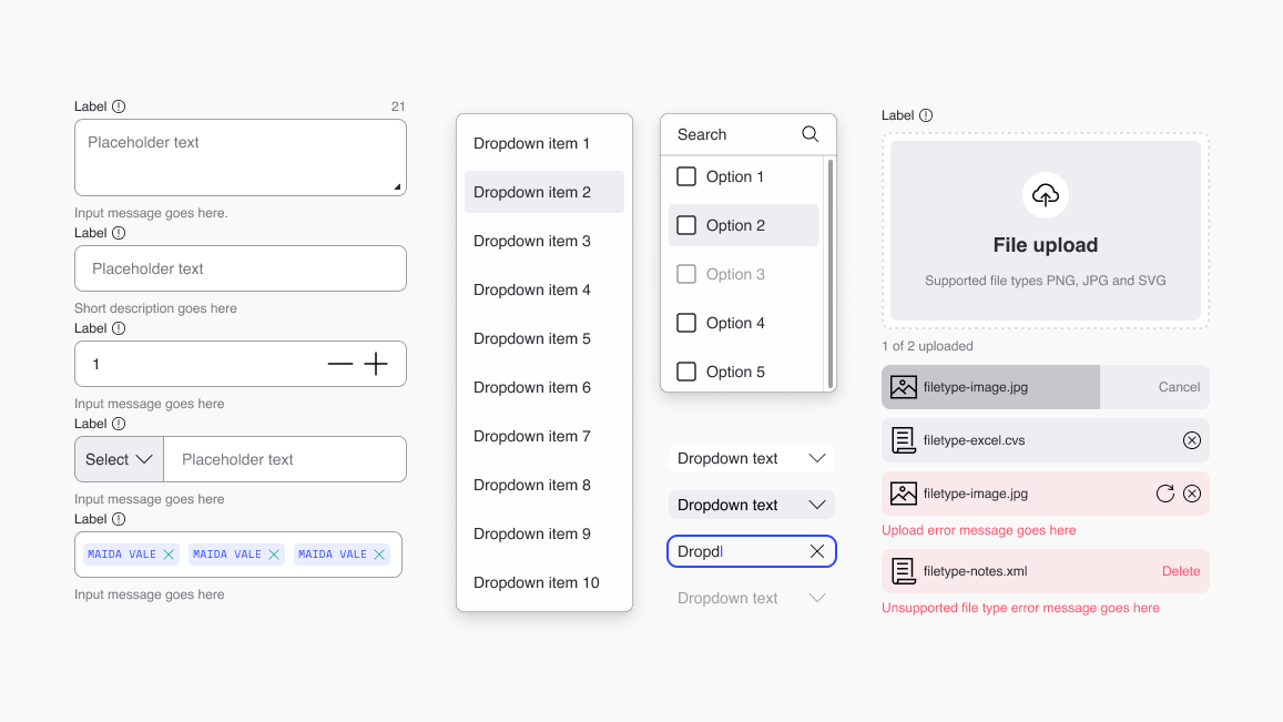
Design system components are crucial aspects in any digital product design, acting as building blocks that construct the user interface. They help ensure consistency, which in the case of Pupil, was a growing issue. Maintaining a harmonious look and feel across all products with a single source of truth was an essential mission we embarked on.
Patterns
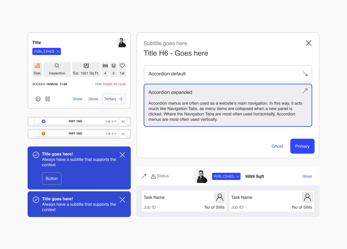
In building Trace, Pupil’s design system, we harnessed the power of patterns — reusable solutions to design issues promoting consistency and usability. These patterns, spanning navigation to user feedback, standardized problem-solving, saving time, and ensuring design uniformity across our complex product range.
They facilitated predictable interactions, boosting user satisfaction and efficiency, while accelerating design and development processes. A shared language among teams, patterns eased collaboration, reducing misunderstandings, and heightening productivity. Consequently, they’ve been integral to achieving design excellence, fostering consistency and collaboration in Pupil’s design process.
Implementation and Challenges
When we set out to implement Trace across the various internal products, we anticipated several potential hurdles. We made people aware that a substantial design system offers multiple benefits, but its integration is not without complexities.
Resource constraints: One of the biggest hurdles was our front-end development resources. With only one developer responsible for transitioning everything to Storybook, the prospect of a bottleneck became an apparent reality.
Simultaneous projects: Ongoing projects were being conducted across all six platforms. Coordinating the integration of the new design system while ensuring these projects progressed unhindered posed a formidable task.
Partial implementation: Opting for a partial implementation approach seemed the most feasible option given the project's vast scope. We started with the least complex platform and did an estimation for the others.
Fear of rejection halfway: The more complex component, pattern and etc. the longer the development time which poses a risk of being that part rejected or parked (forever), and we knew this could hamper the progress of our implementation.
Training and knowledge transfer: We made sure that all team members understood and correctly used the new system required training and documentation. Unfortunately, I did not have a chance to see the documentation finalised.
Maintenance: Post-implementation, every design system would require regular updates and maintenance. Planning for this ongoing task was another challenge.
A design system is a living organism: With the new design system serving as a single truth source across platforms, we made sure it's up-to-date at all times.
The Impact
The initiation of the Trace design system had a profound impact on Pupil as a business. It brought about a tangible transformation in how we design, build, and iterate our internal products.
The introduction of the Trace design system profoundly influenced Pupil's operations and workflows. It standardised our design and development processes, paving the way for a unified vision and shared language, eliminating the need for disparate, ad-hoc solutions. This streamlined approach facilitated a quicker time-to-market, as the availability of predefined components and patterns expedited both design and development processes. The system not only ensured a uniform user experience across all internal products, bolstering usability and user satisfaction, but it also amplified Pupil's brand perception, fostering a sense of trust among users. Moreover, the efficiency gained from avoiding designing and coding from scratch allowed teams to allocate their resources more effectively, focusing on strategic improvements and innovative solutions.
Closing Thoughts
In conclusion, the creation and implementation of Trace serve as a testament to the power of collaboration and the benefits of a user-centric approach. Throughout the project, we've learned the importance of inter-team dialogue, using the collective knowledge and skills of all involved to navigate challenges and refine our solutions. The end result is a design system that not only increases efficiency and cohesion but also fosters a culture of collaboration. Ultimately, Trace is more than just a toolset; it's a living, breathing entity that grows and evolves with us, reflecting our understanding of our users' needs and our commitment to providing exceptional user experiences.
Behind Trace: A Salute to Hakan and Jacopo
I’m profoundly grateful for the invaluable contributions made by Hakan and Jacopo in the creation of the Trace design system. Their dedication and expertise have been instrumental, shaping Trace into a transformative tool that significantly impacts Pupil’s operations and workflows. Thank you, Hakan and Jacopo, for your exceptional work. The effectiveness and unity Trace brings to our team is a testament to your skills and commitment to user-centric design.
