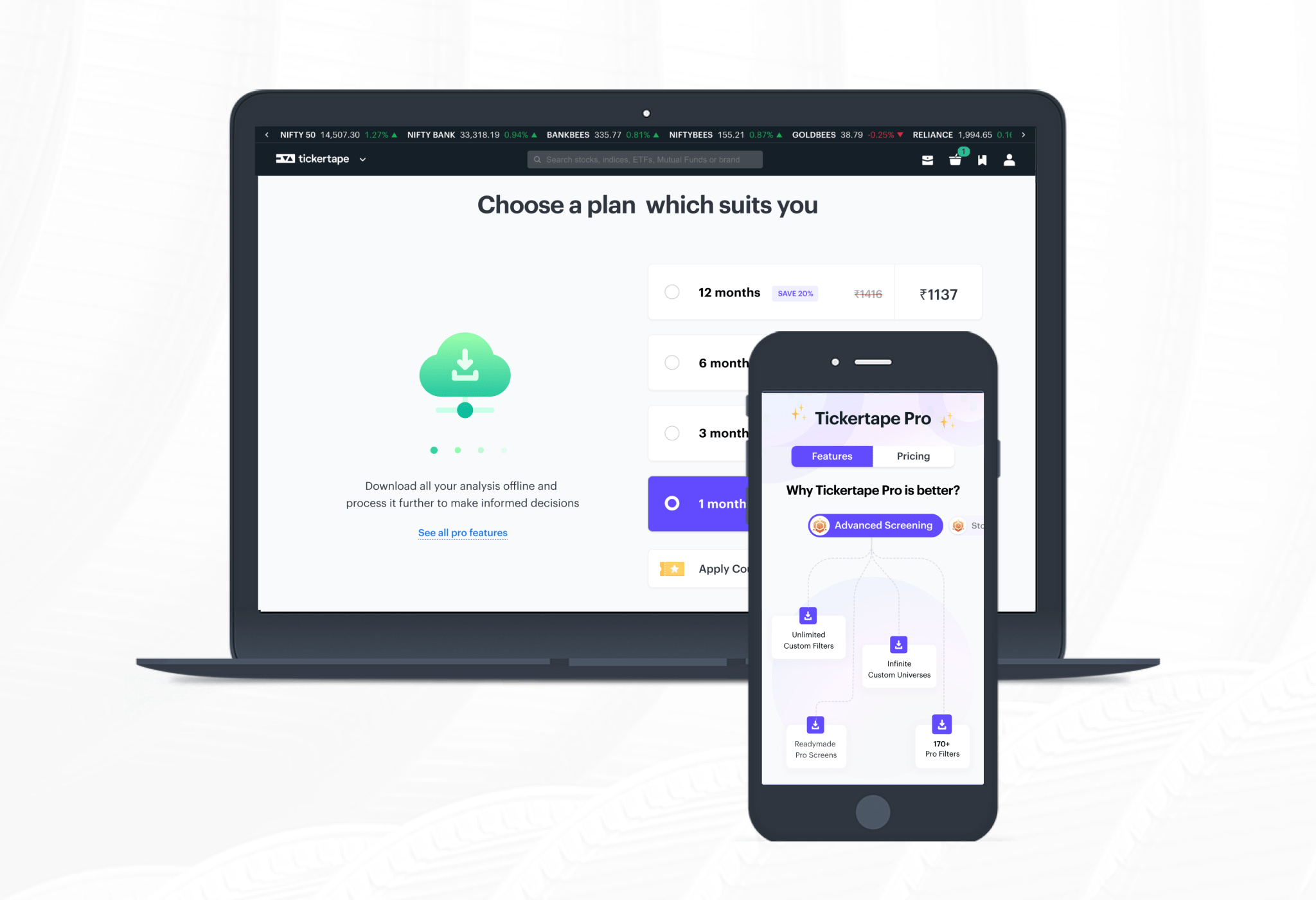
Objective ⛳️
Being a subscription-based business model, Tickertape's success was very much dependent on the number of active subscribers. Our primary objective was to get more of our users to sign up for a paid subscription version.
How did the current system look like? 💭
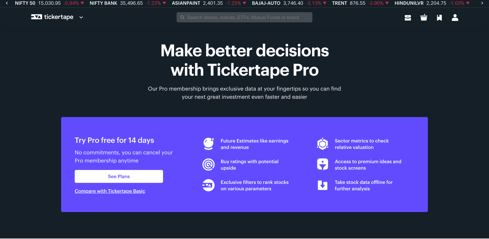
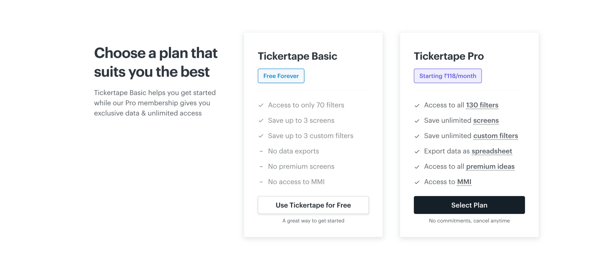
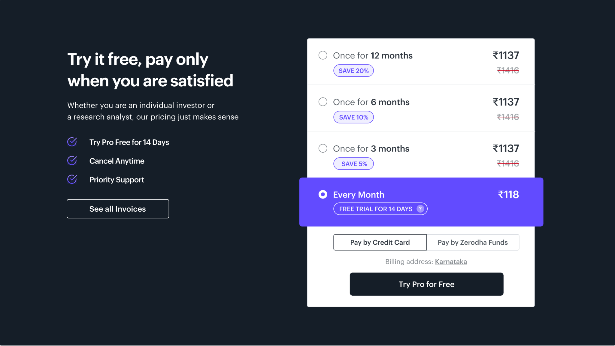
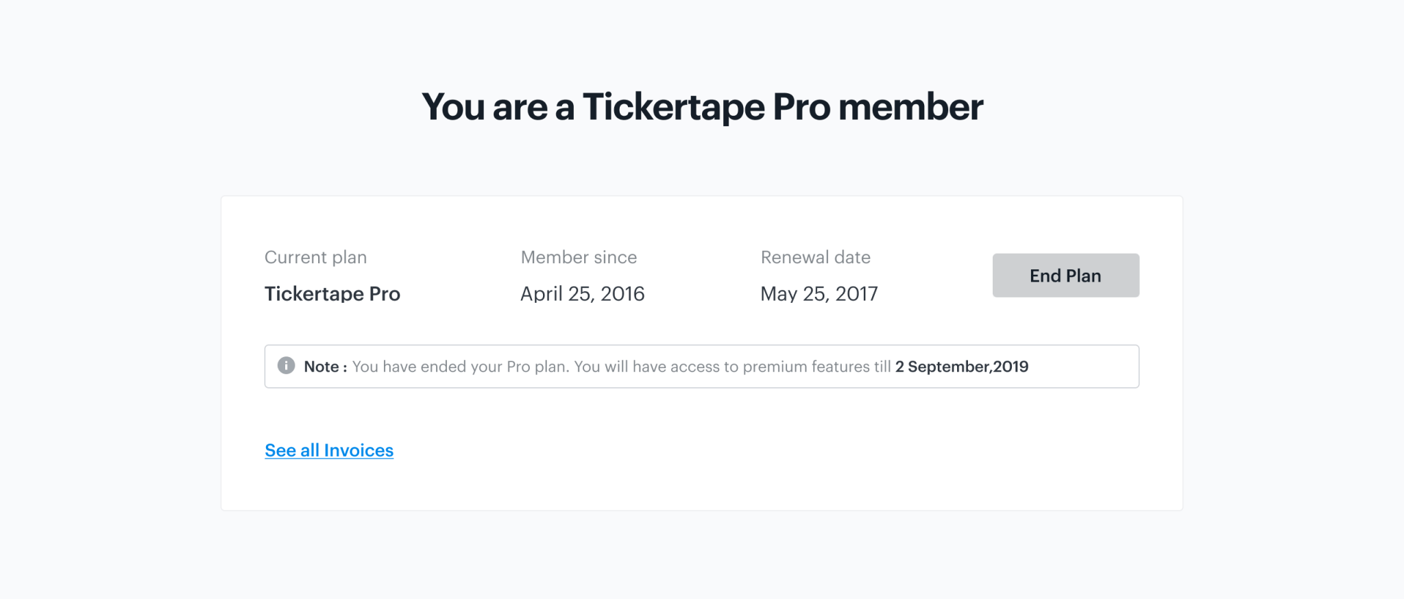
Why was an overhaul required?🧐
We already had a dedicated page but that wasn't helping a lot in terms of retaining power users to our platform. we started digging more into this problem by looking more into it.
We began the process by observing user’s behavior on our pricing page. We looked into the quantitative data using Google Analytics and Mixpanel, heatmaps, and user recordings from Hotjar. We found an a-lot of users coming to our Pricing page but the conversion rate was significantly low from there. And we were significantly losing the retention number also from the segment of users opting who were opting for a trial plan. After speaking to some of our activities and power users, we came across multiple issues.
🙋♀️ User Issues
1️⃣ Unawareness of auto-debit of amount for one month plan (After trial/ End of every month)
2️⃣ Difficulty in plan cancellation
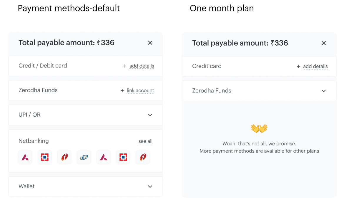
3️⃣ More payment options
4️⃣ Segregation of relevant information
💼 Business Issues
1️⃣ Increase Engagement
2️⃣ Increase Conversion
3️⃣ Increase Retention rate
Solution 💡
As a solution, we proposed a re-design where we tried to address the issues being faced by our users to make it easy for our users to understand the Tickertape Pro’s pricing and its benefits. The goal is to convert as many users as possible to Pro users by keeping the experience efficient and seamless.
But with this, we also decided to offer something new to our users which will give delight to them when using the platform. As a part of this decision- we came up with offering an "Offers & Referrals" process, where users can leverage our integrations with multiple brokers and a lot of influencers & YouTubers as and whom they like.
User Journeys 🚴🏻♀️
For this, we researched- Actions users take, Questions they ask, Happy moments they experience, Pain points, and finally Opportunities we can gain upon completion. Each step is conducted by researching different channels like social media, customer service feedback, user calls, surveys (google forms) done internally. With all these, we also defined :
-
Focused User type
-
Entry/Exit points
-
Possible/Intermediate actions
User Flow 🗺
Based on user journeys, we were able to come up with user flow which helped us defining the flow of our feature.

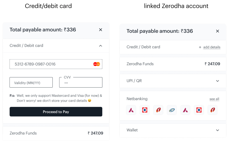
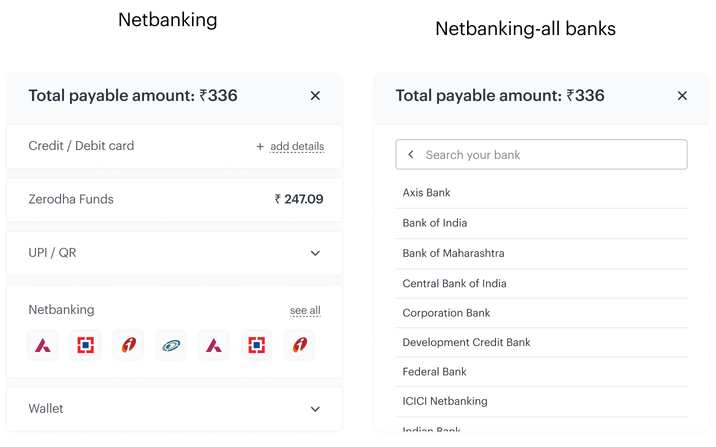
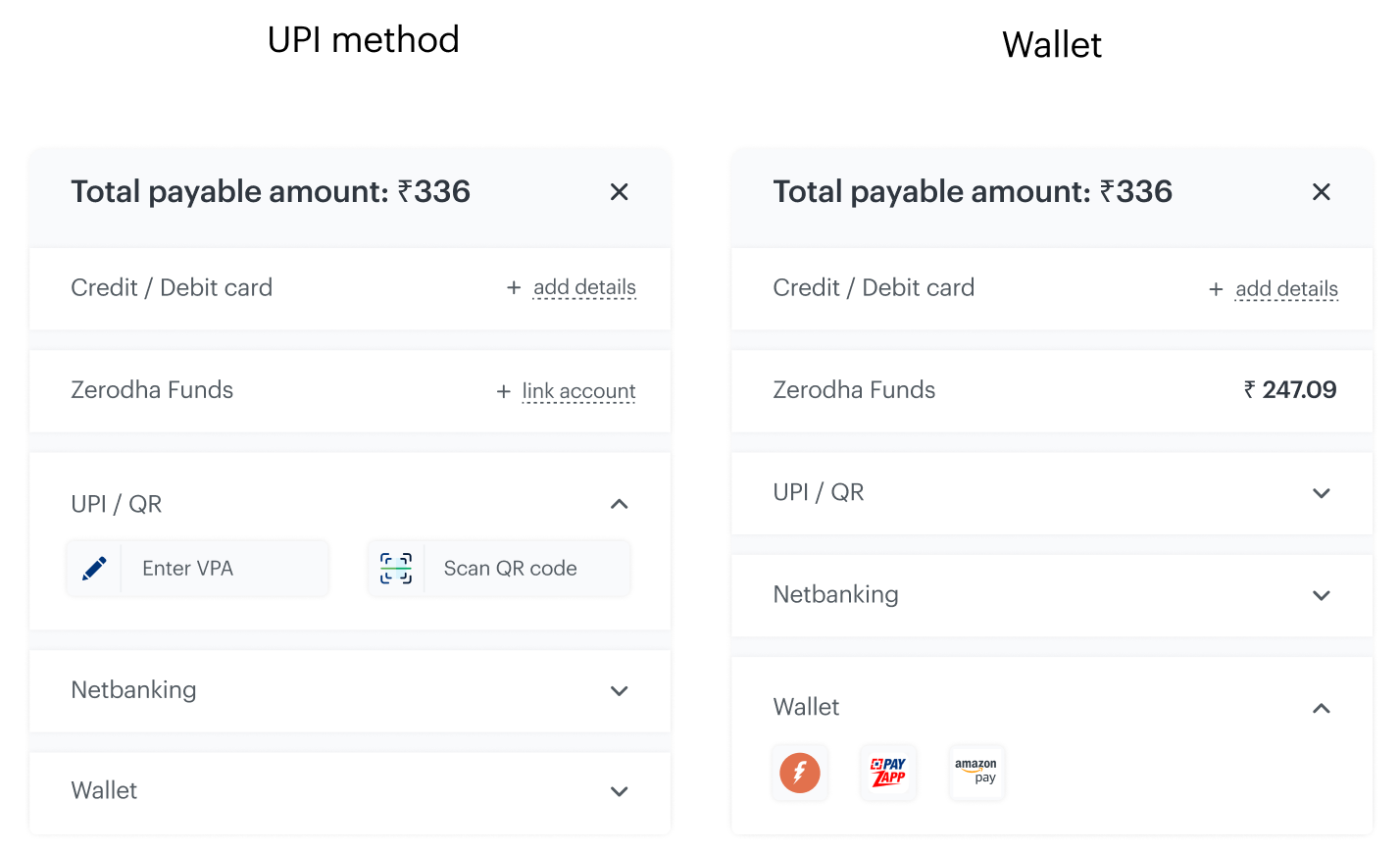
We also defined the new payment flow which included a lot of customizations, since we were using a third-party platform integration for enabling gateway for payments.
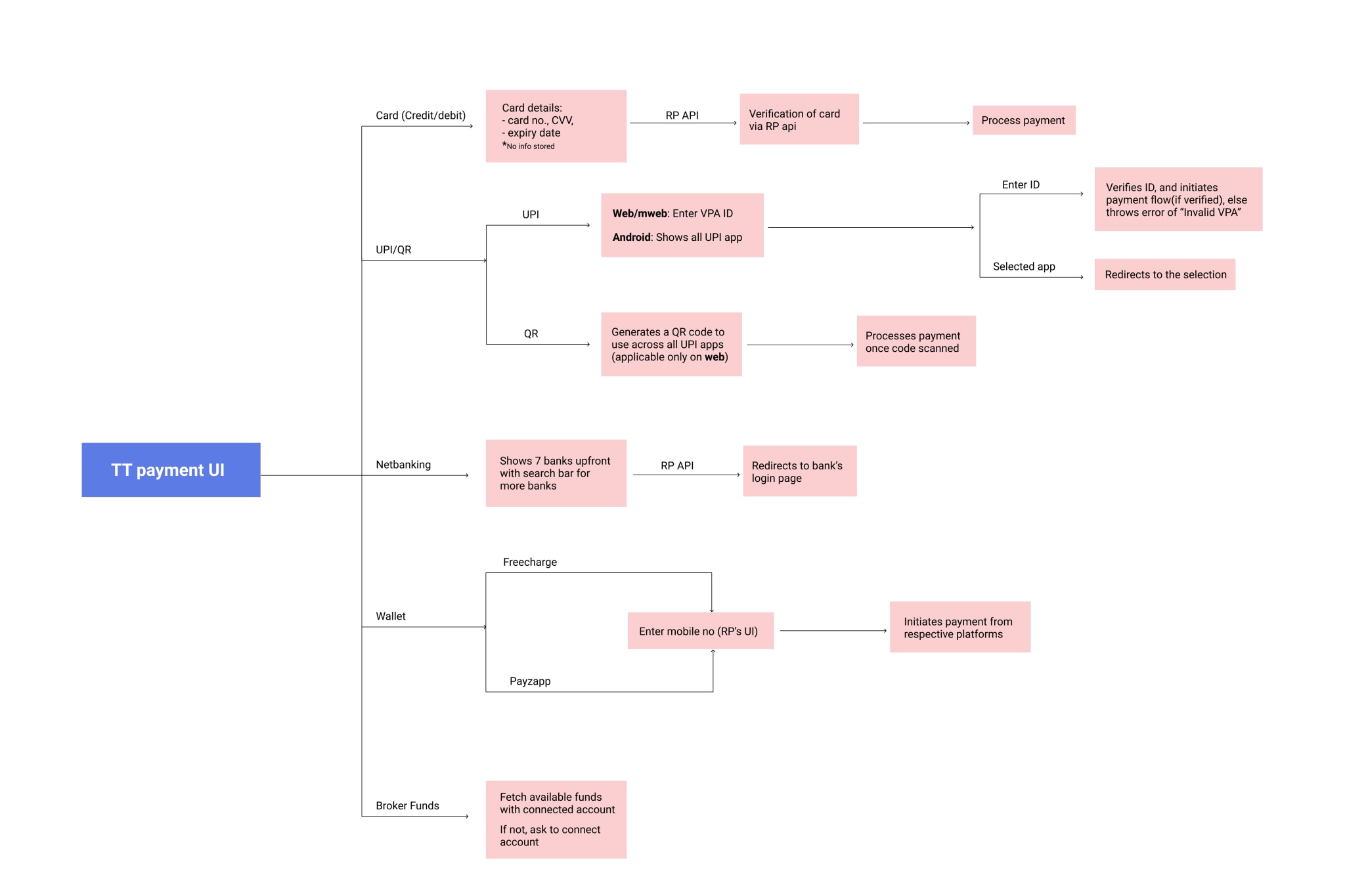
Key points identified around the experience revamp
1️⃣ Drive the entire flow with heavy usage of visual elements(less usage of text)
2️⃣ Show limited yet necessary information only
3️⃣ User should be aware of each action he takes
4️⃣ Everything should be easily accessible to users, even if it's not beneficial for business.
5️⃣ Maintain a forward flow across the funnel
Revamped System 💅
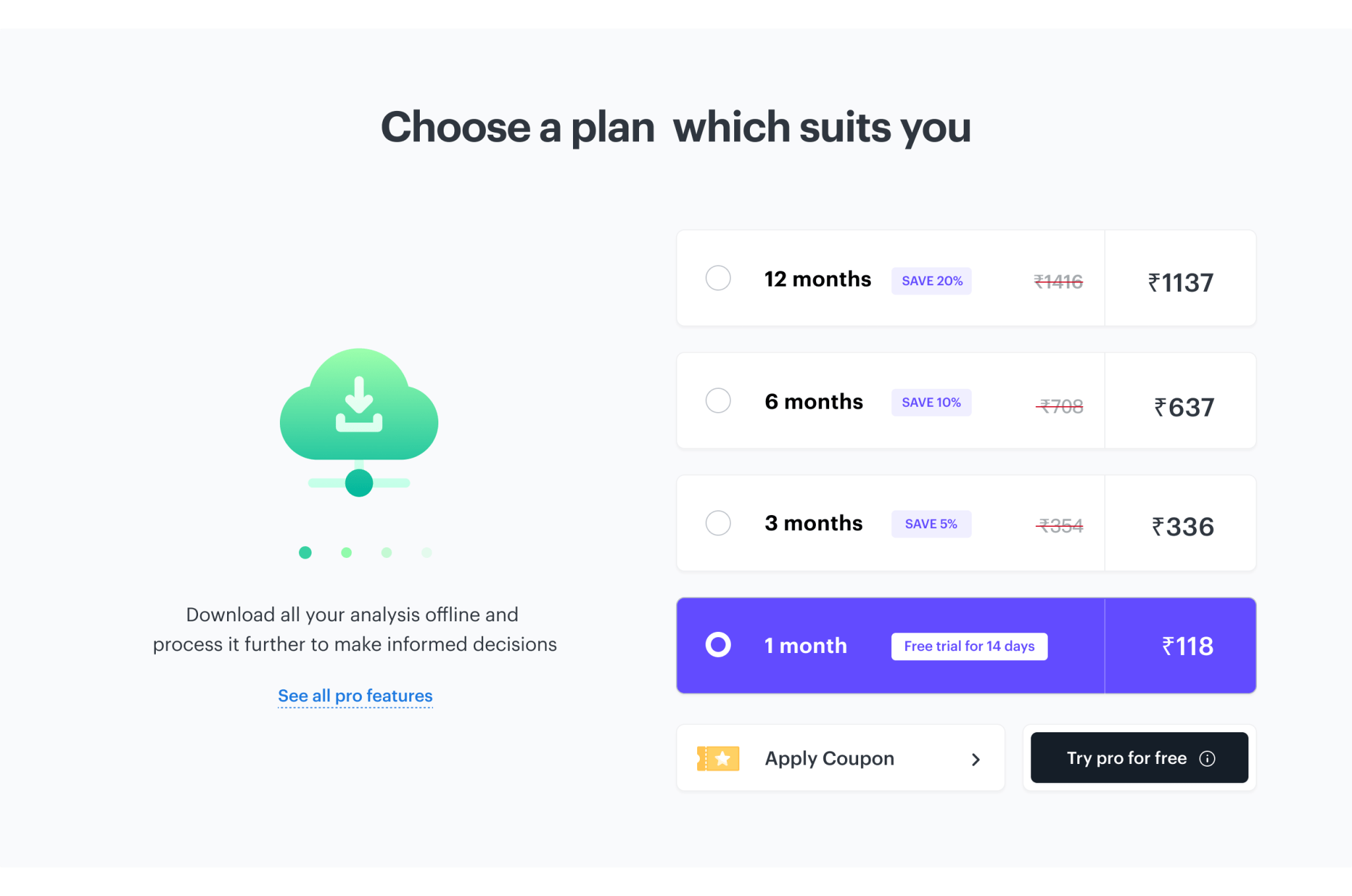
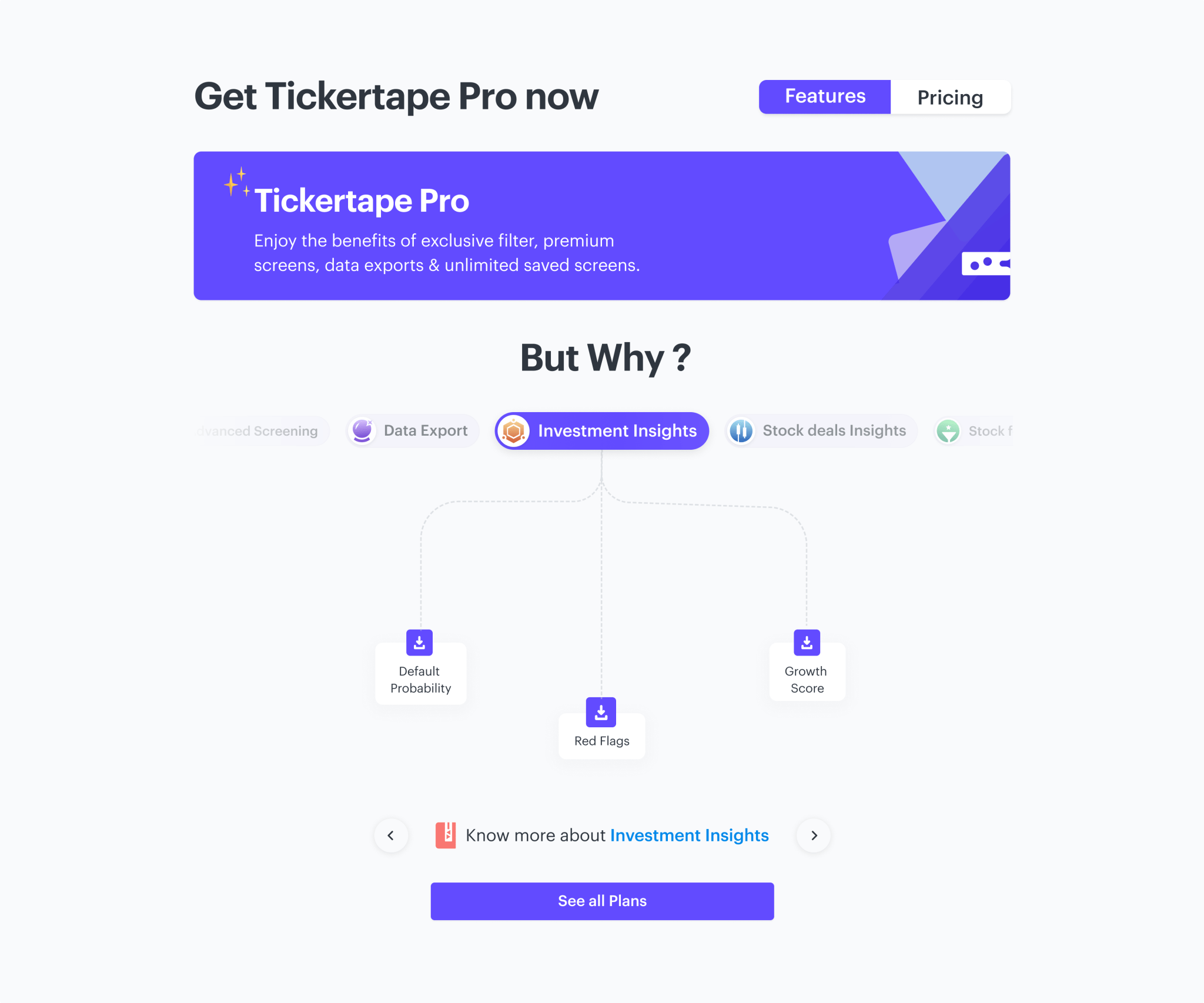
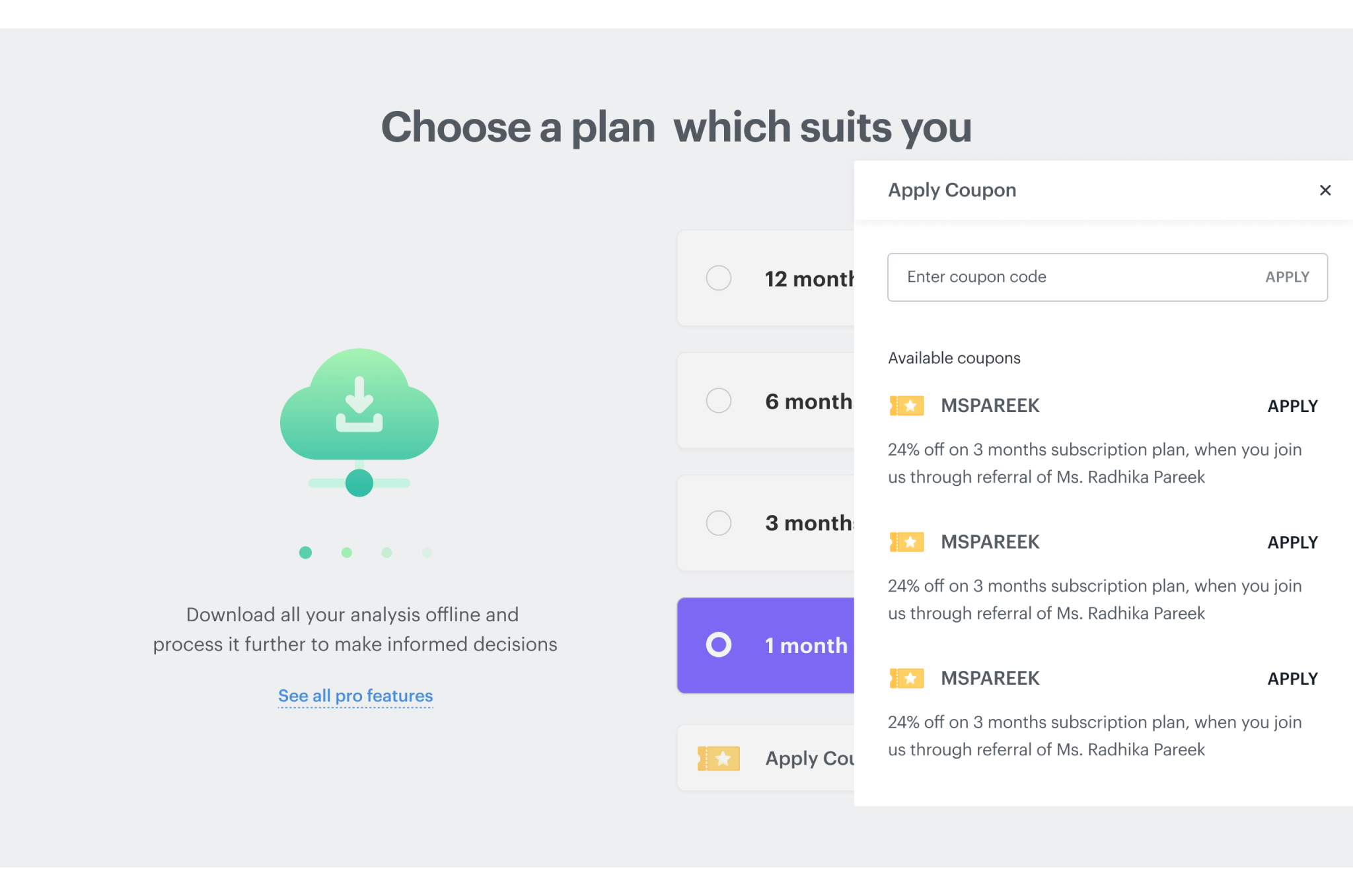
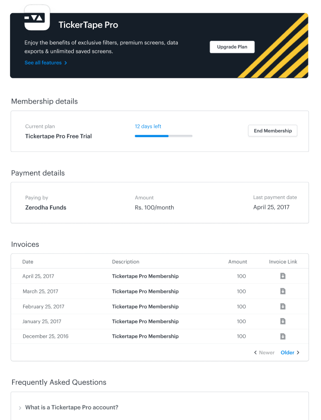
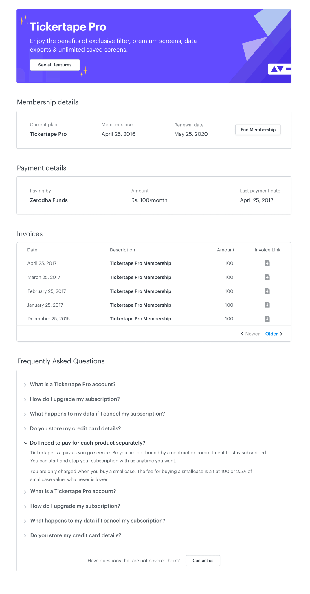
Payment Flow
Early Iterations 🥸
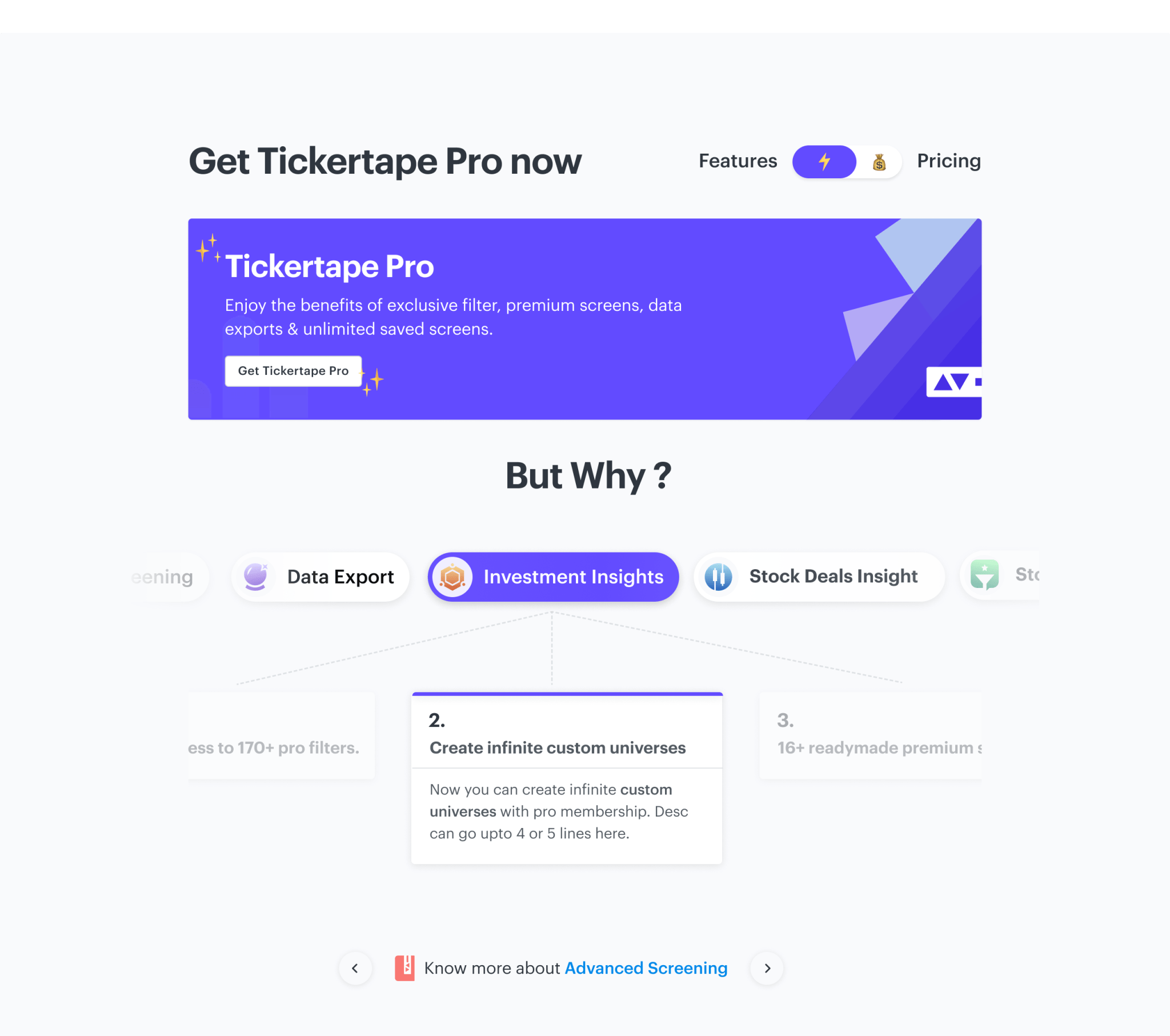
Features page as simple as it sounds, it was that complicated to actually present. Since we had to make user interactions very little and still present them our key features and also scale it up for future additions to the PRO offerings, we had to try multiple layouts to make sure that we are presenting information in a required still a modern way.
Some close to final iterations right from the garage box:
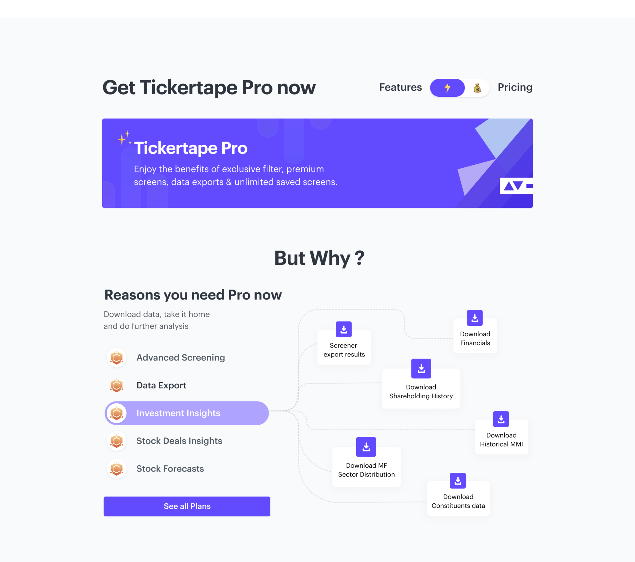
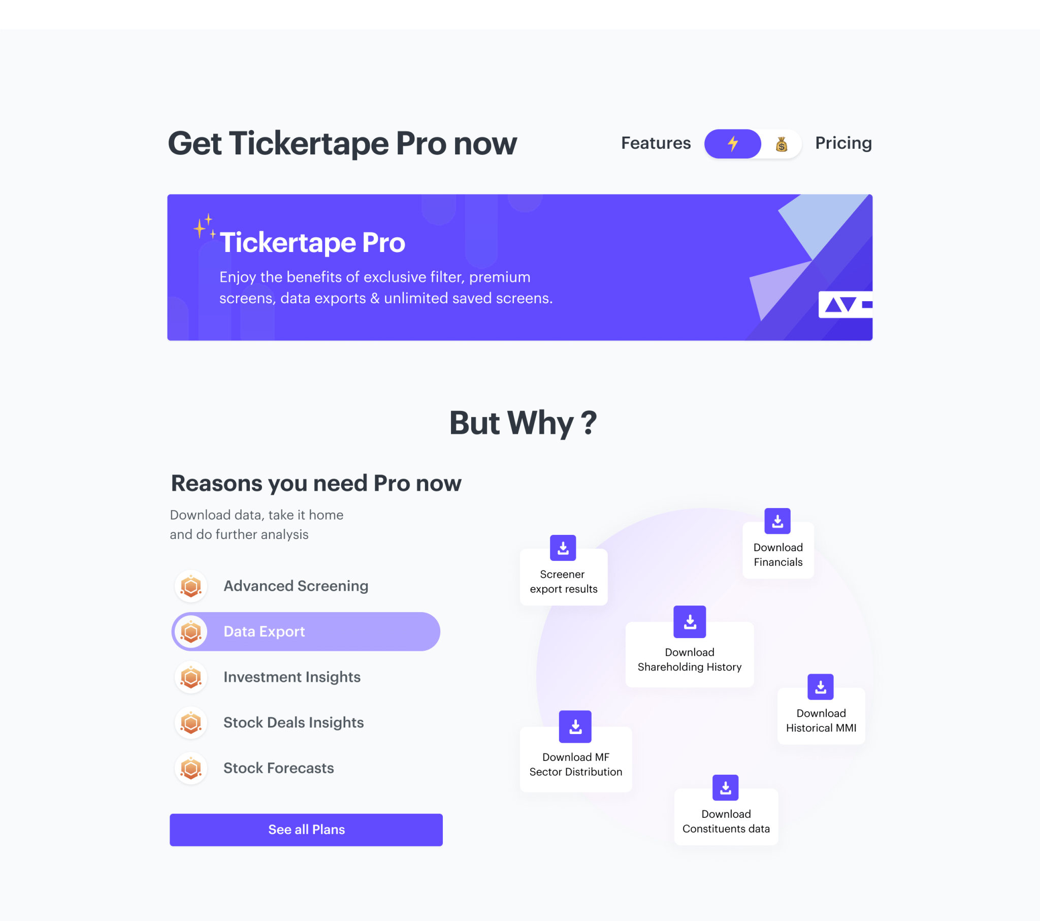
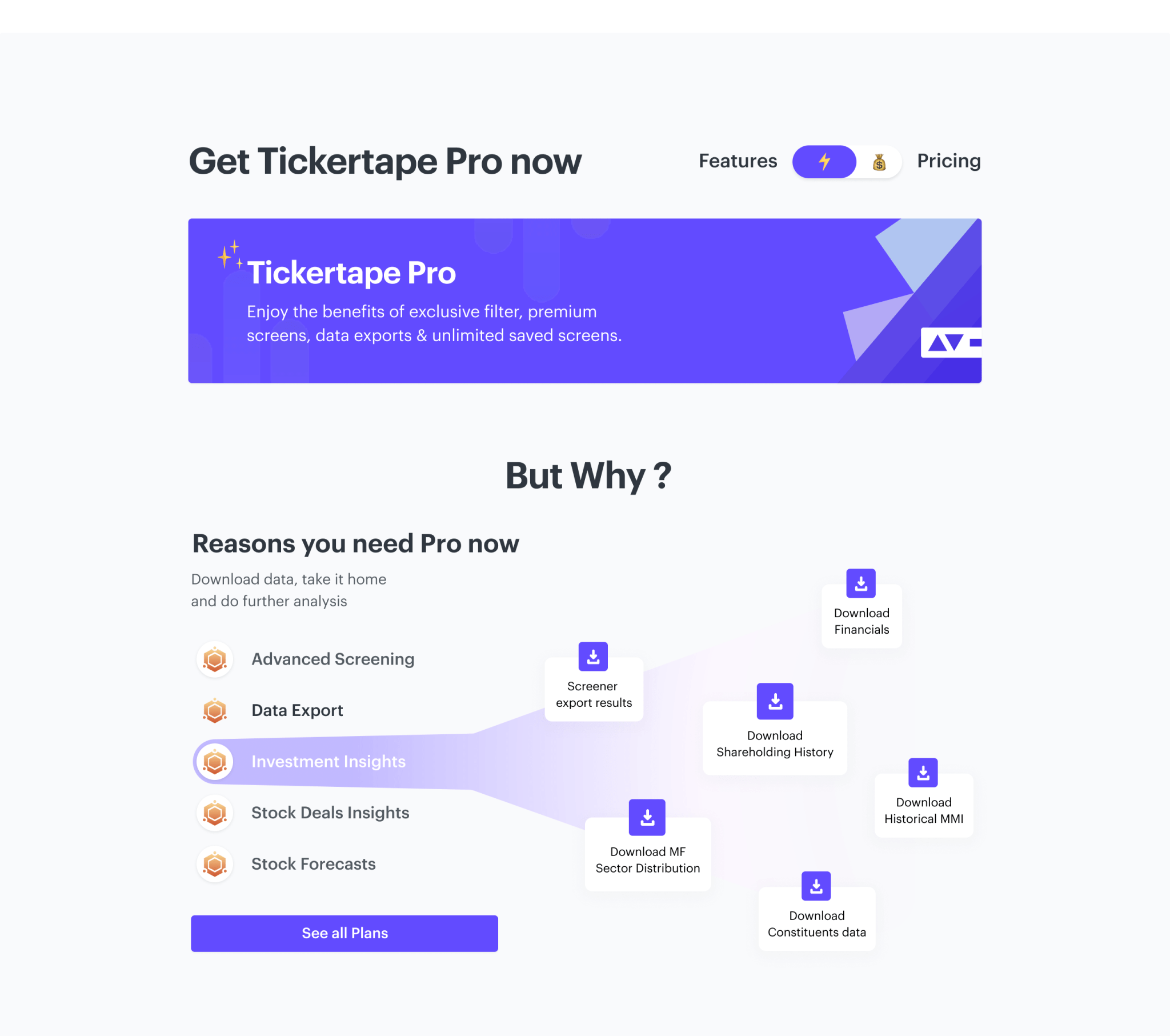
An Interaction document was created post design sign-off to present to the whole team including- Product, Engineering, CX, QA, Growth & Marketing to make sure we all are on the same page and no feedback gets missed out. Have a look
Challenges faced while development 😓
-
We designed a complete custom payment modal. But since we were using a 3rd party platform for our payments, there were a lot of discrepancies that happened in integrations and development collectively for all platforms.
-
Handling dynamic height of side-panel for coupons for different resolutions and devices was a bit tricky.
-
Maintaining communication for exceptional cases and intermediate states using proper copy-writing and empty/loading states.
Post-development, we made sure to define:
🗣 Communication: All the sources which enable direct contact with users like emails newsletters, push notifications, Campaigns, social media announcements.
📊 Analytics: Since we were to monitor user behavior very closely for this, there was a list of analytics to be tracked being provided by all teams to developers.
📈 Metrics: We were set to adapt the HEART framework as our metric system for analyzing our user experience
Interesting data Post-Launch
We monitored data for a duration of 76 days and included 3.6M users. The new variant in design helped to increase the conversion rate by over 13.07%.
This was raw data collected via clever tap measuring the uplift between the two versions.
-
Users found the new features page meaningful. The new pricing page helped us in increasing conversion by +16% for Pro subscription, just within last month. where the user base was ~51,296.
-
Pricing/Feature page visits converting to PRO users increased from 4.4% to 7.03%
-
Users seem to be loving the new feature page and payment grid cards. Users interacting positively with the feature carousel are converting at 12.83%
