Context: Project and Team Overview
In the project titled "Dashboard Analytics," I served as a designer, working closely with a full-stack engineer, Matt Dzwonczy, and our product manager, Franck Xian. Our aim was to refine our product, Overflow, to better meet the needs of our non-profit organization (NPO) customers, who were struggling to see the value we were offering. This struggle was reflected in a 20% churn rate.
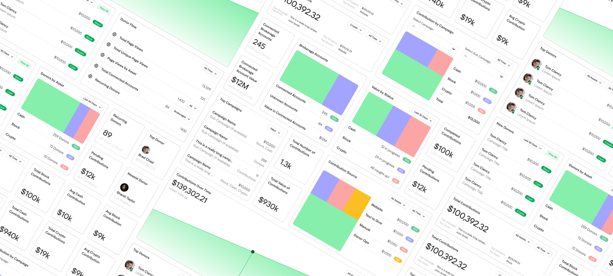
Struggle: Problem and Approach
Our customers appreciated our product but found it difficult to justify the subscription price. The core challenge was to decrease churn and enhance Overflow’s perceived value. We hypothesized that by improving the ease of tracking and analyzing stock donations on the dashboard, raising awareness about potential donation value, and gamifying the dashboard features, we could achieve these objectives.
We faced constraints such as limited sprints for design, research, and development, and the necessity to use our existing Dashboard product. We also had to consider the workload implications for Design System updates.
Transformation: Results and Future Steps
We validated our approach through conversations with our Customer Success and Sales teams and user testing. The prototype of our new dashboard became a compelling selling point, resulting in a closing of additional 27% of clients. Our customers realized the potential of their donor base, confirming the need for a more robust dashboard analytics system.
As we look to the future, we're considering how to tailor the analytics page to different user personas and what additional information needs to be included. This case study shows our team's dedication to understanding user needs and improving our product to deliver tangible results.
—