Designed and launched the end to end multimodal experience for post-purchase order tracking on Echo Show devices.
Partners: 2 Product Managers, 1 Researcher, 2 Engineers
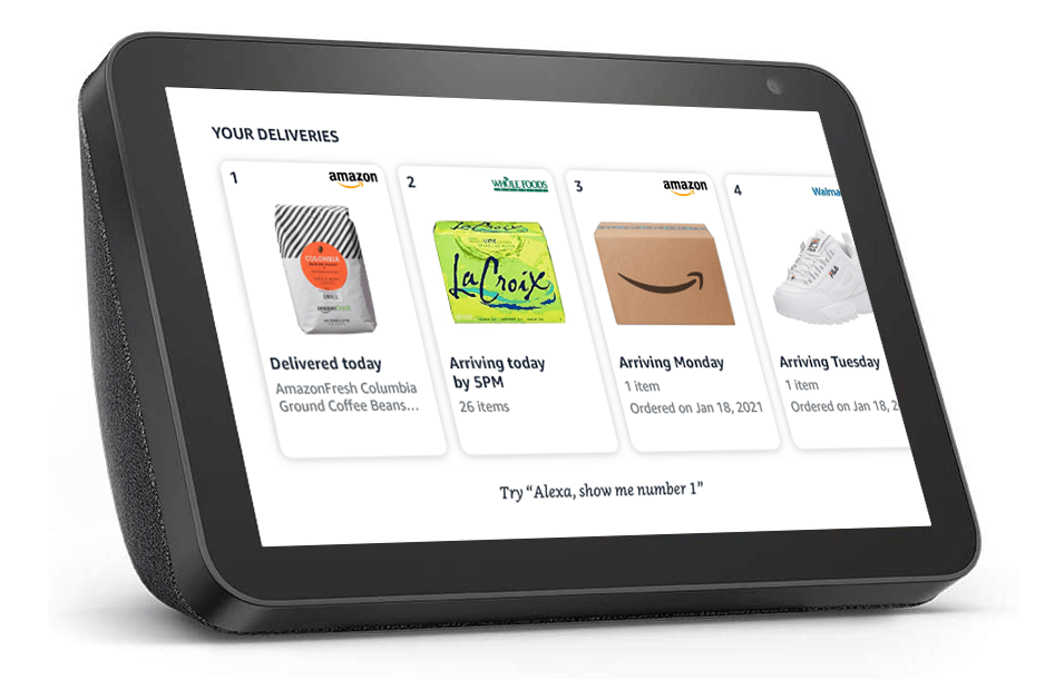
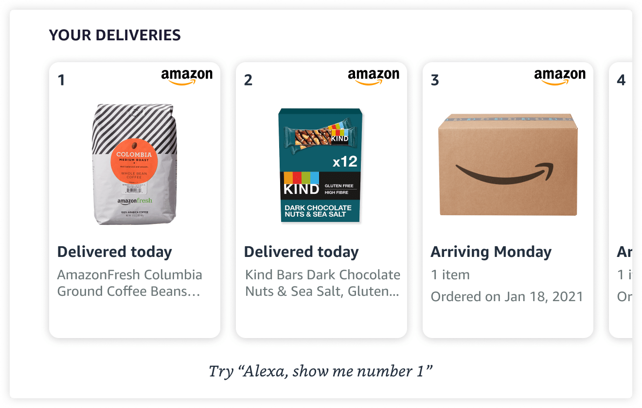
Here's the final experience on an Echo Show 5 & 10:
-
1.4 million monthly active users of "Alexa, where's my stuff" worldwide.
-
5 million monthly order tracking interactions take place with Alexa.
-
Experience is available on all Alexa Echo devices from Echo Dot, Echo Show 5/8/10/15, Fire TV, + new devices.
The goal: Redesign the order tracking experience on Echo Show devices to give users more information about their orders, and provide clear follow-on actions.
Opportunity Areas
After an initial analysis of the old user experience, I defined opportunity areas:
-
Consistent visuals with other Alexa Shopping experiences.
-
Consistent information architecture (IA) based on what users are familiar with on Amazon.com or Amazon app.
-
Engaging follow-on actions for a richer order tracking experience.
-
Improve voice experience & provide helpful information about order tracking.
Here is how I explored the opportunity areas...
1. Consistent visuals
Made an inventory of all the components I would need, and checked whether they existed in our design library.
-
Product image ✅
-
Text strings ✅
-
Delivery status
-
Estimated time of arrival
-
Package carrier, i.e. UPS
-
Delivery location
-
Order details
-
-
Alexa "Try hints" ✅
-
Store Logos ✅
-
Ordinals ✅
2. Consistent information architecture
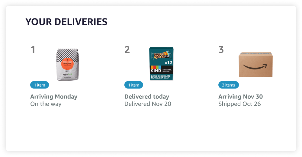
Amazon.com lists items you've ordered individually. This is important when a user wants to take item-specific actions such as returning an item or viewing details for one item. Our old experience grouped items based on whether they arrived in the same delivery box, which worked but is not scalable for follow-on actions.
-
I split groups of packages into item-by-item cards even if they arrived in the same box.
-
This made it easier to build item-specific follow-on actions, and was more scalable for future features.
-
This update also has interesting implications on the voice experience since the old voice experience grouped items... stay tuned!
3. Engaging follow-on actions
The old experience was not interactive, so users couldn't tap or interact further by voice. I explored & tested different options with my user research partner in a usability study for follow-on actions a user could take to continue their order tracking journey with Alexa.
I sought answers for these questions:
-
What level of information do users care to see in the UI?
-
Where do users expect to be taken to when they tap an order card?
-
How much information do users really care to hear in the VUI?
And discovered...
What level of information do users care to see in the UI?
Participants appreciated that the UI had all the important information they wanted up front, i.e. Delivery Status, Product Image, etc...
"This page shows me mostly what I want to know. I think I could ask, or click on them to view more information if I wanted to." – P8
Where do users expect to be taken to when they tap an order card?
Participants had a strong preference of seeing an order details page over a product details page if they clicked for more information from the Your Deliveries main screen, but were unsure why they would click at all.
"I thought it was going to go right into the order details, rather than the product details. Why would I want to add to cart or buy it now when I’ve already bought it?" – P1
How much information do users really care to hear in the VUI?
Participants wanted shorter audio experiences with the option to ask for more information; especially when they owned a device with a screen — where information was already being shown visually.
"Just tell me what I need to hear." – P5
4. Improve voice (VUI) experience
Leveraged insights from both the usability study & user testing survey with 15 participants to validate redesigning the voice experience for Where's My Stuff since we observed overwhelming feedback that the old experience was not satisfactory.
In addition, the old voice experience did not align with the new information architecture of splitting items out of groups.
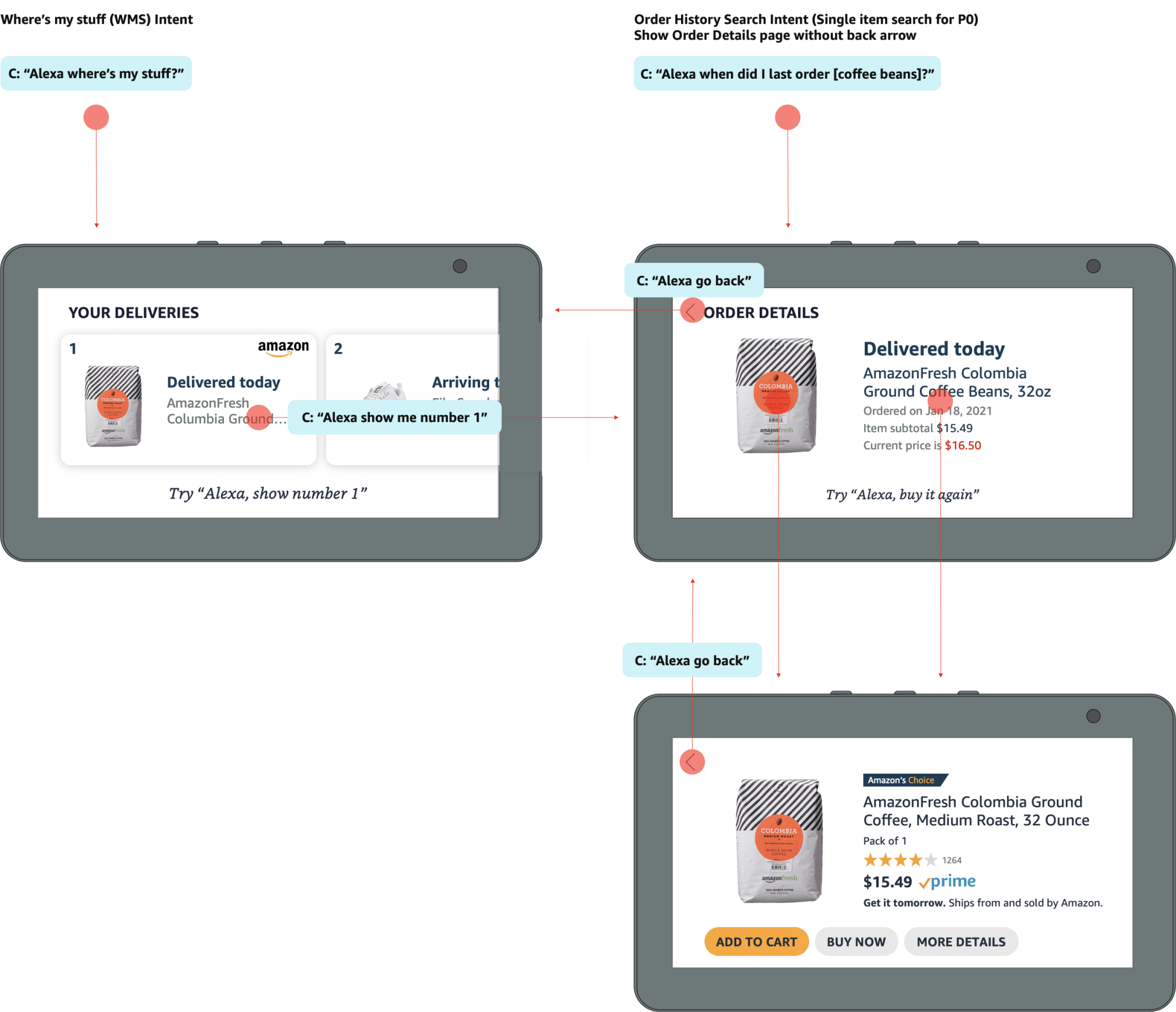
Handoff — User flow diagram
I mapped out how the screens relate to each other so that my engineering partners could easily see the end to end flow.
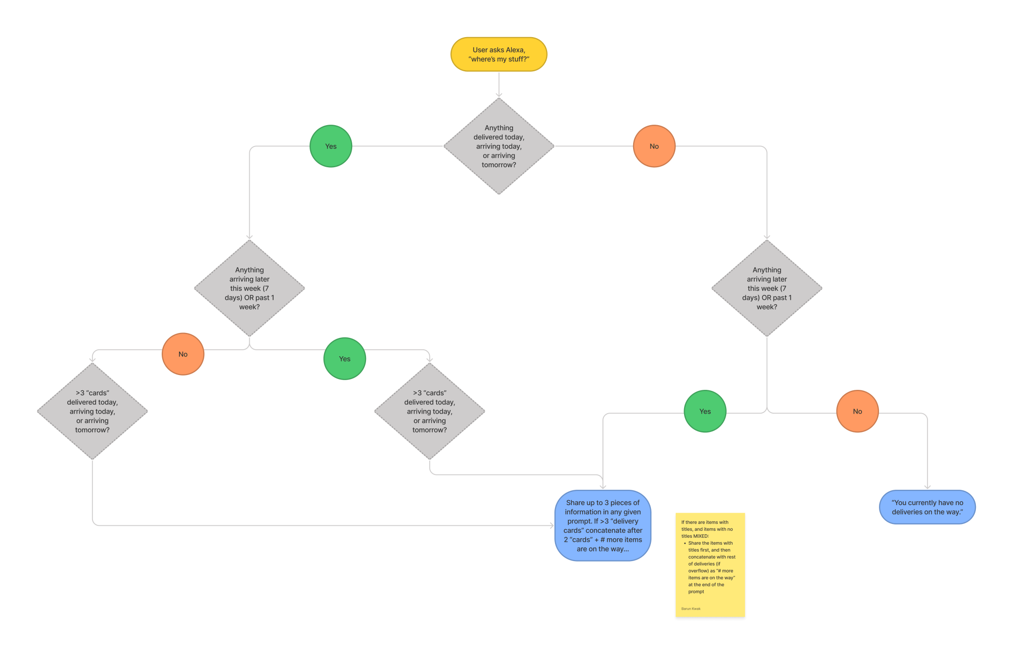
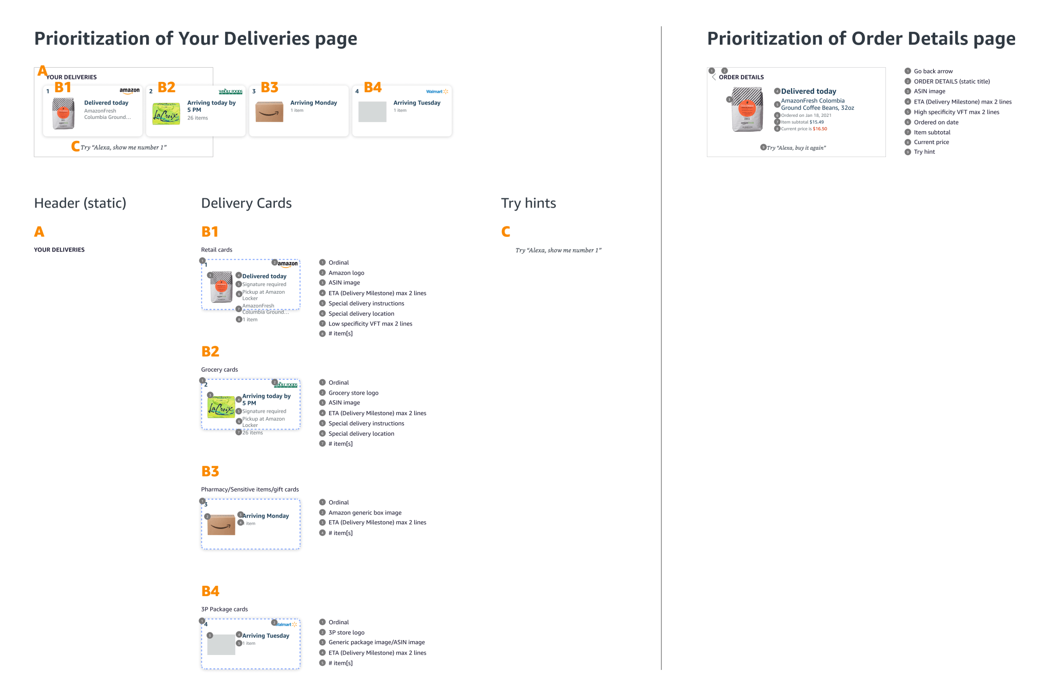
Handoff — Information Hierarchy
I defined the hierarchy of information in design specs so engineering partners could code logic for what information would take precedence when there is more information to share than screen space.
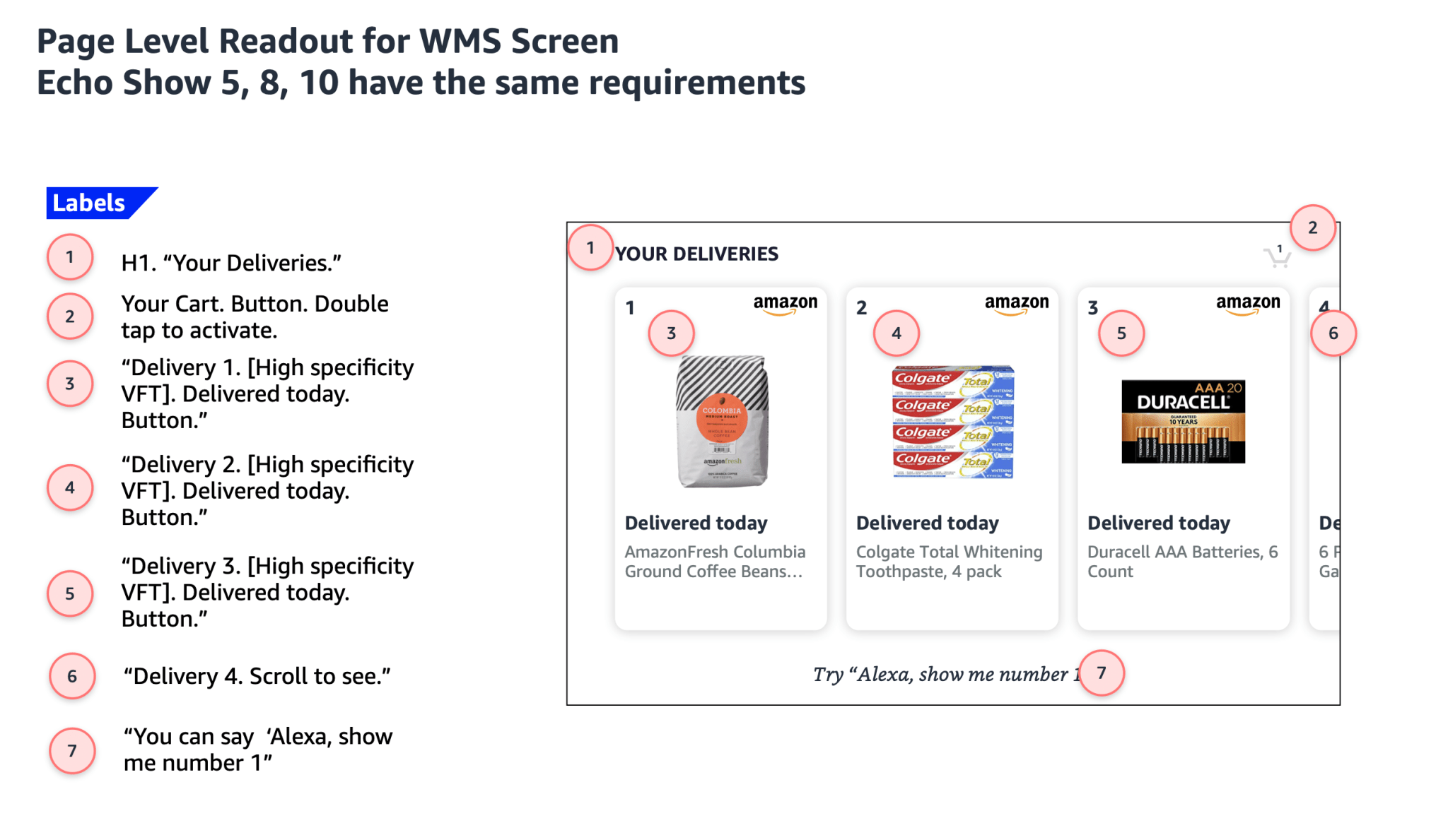
Accessibility
I designed the screen reader accessibility specs to ensure that our team is creating experiences that are inclusive to blind users.
Results
Metrics
-
Launched in October 2022
-
Observed around 10 bps reduction multi-turn error rate (MT-ER) from CX quality team’s manual annotations. In addition to multi-turn metrics. Also observed +750 bps on our responses coverage metrics and +700 bps on our responses’ precision metrics based on engineering team’s manual annotation.
-
Customer satisfaction increased by 1000 bps from 67% to 77% . There was improvement of 190 bps in terms of Multi-Turn CX improvements as customer got more details on their orders and shipments at item level.
If I had more time I would...
-
Explore a live map tracking for deliveries.
-
Explore how to show relationships between items arriving at the same time.
-
Explore showing the photo the delivery driver takes at moment of delivery.
Highlights
-
Updated the UI to be consistent with Alexa Shopping & Amazon.com.
-
Conducted 2 research studies to validate UX decisions.
-
Created a more efficient VUI architecture for order tracking.
-
Wore multiple hats (Designer, PM) throughout the whole process.
-
Successful collaboration and handoff of final design with engineering partners.
The Final Design