Hey folks, this case study is about how I designed for quick-commerce during my product design internship at DavaNinja!
An overview:
DavaNinja, a medicine delivery app from Mumbai, promises to deliver medicines from local pharmacies within 60 minutes. The app is available for download on the App Store and Google Play Store.
Here's what I worked on as a product design intern:
Redesigning the Product Page:
-
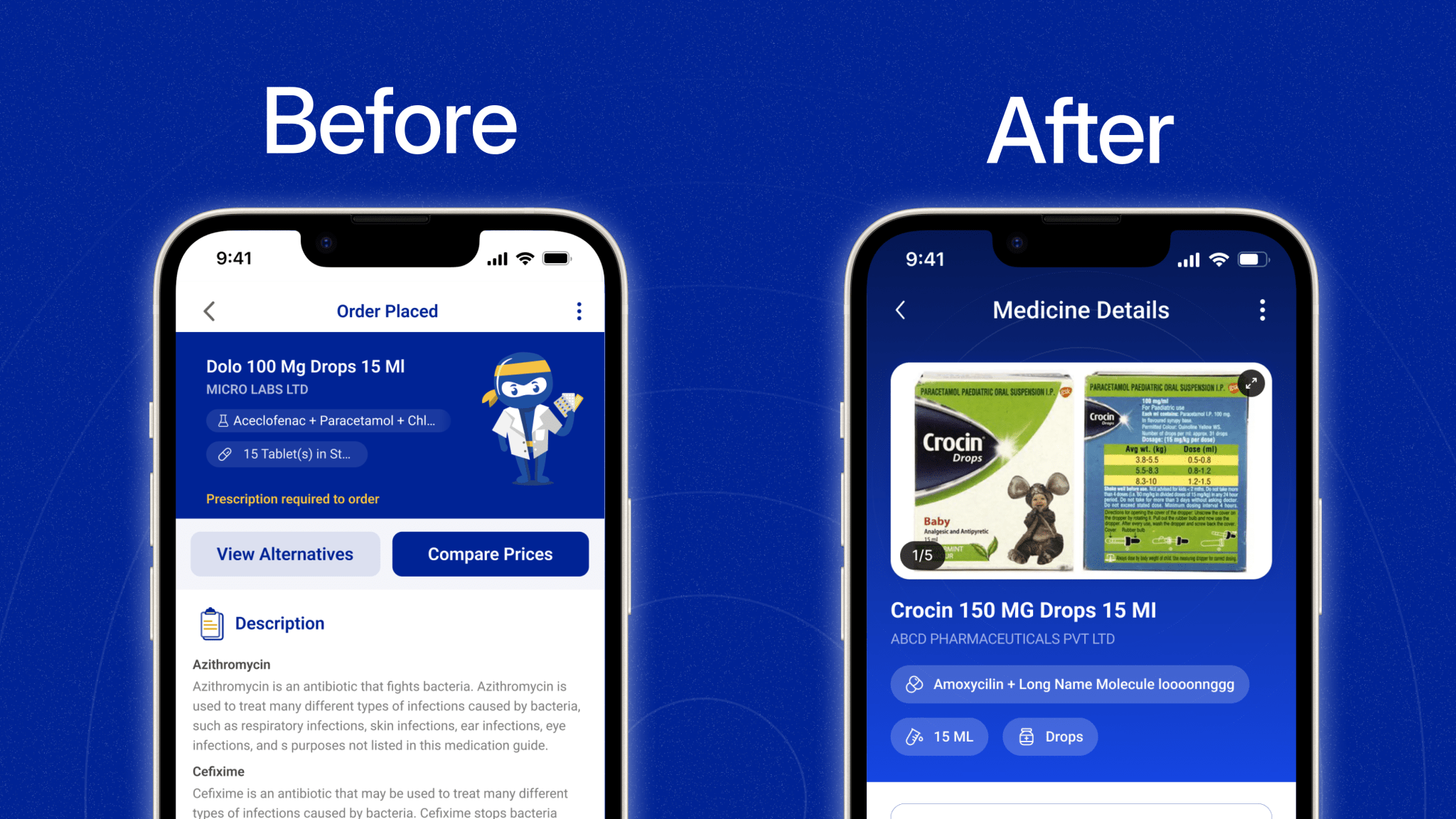
As my first task in the company, I was given the responsibility of revamping the product page
-
I felt eager to dive into this stint and get my hands dirty.
-
The main challenge that I faced here was prioritising the information and displaying it
The next thing that I did was audit the current design and figure out the main issues in the design that could lead to a drop-off.
Problem Statement:
Users are spending significant amounts of time on the screen but are unable to convert effectively.
Some of our observations
- We noticed that users usually tend to order new medicines with the ones they already had at home for easier identification
- Since there were no product images present in the old design, it made it harder for the users to order medicines which led to a drop-off.
Auditing the current design

Who are we designing it for?
Our research showed that people between age range 25-34 (54%) used our app the most.
64% of our users bought medicines once a month and usually stocked them for an entire month
Visual
To start, I made some iterations in Figma
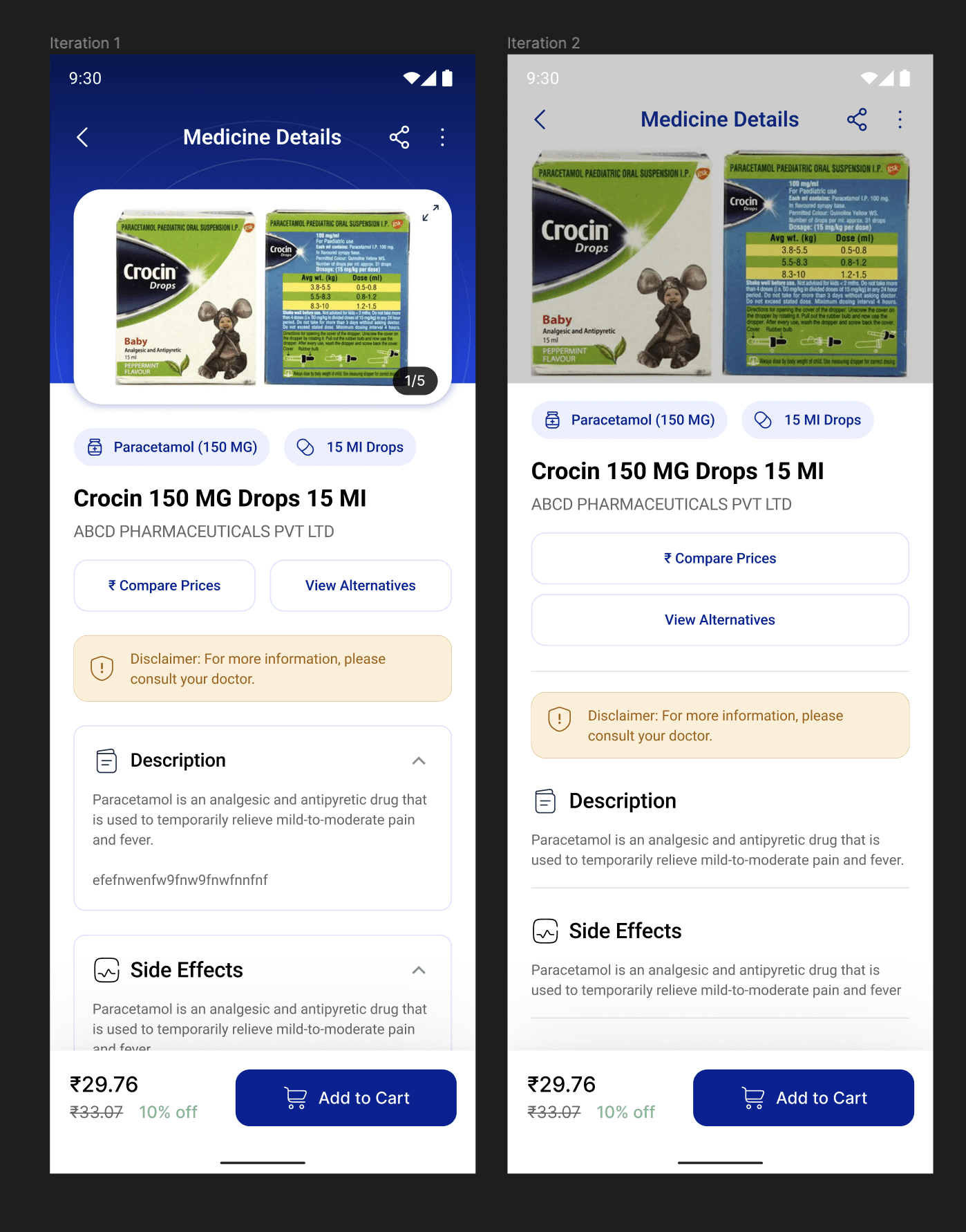
As you can see here in both of the approaches, I tried 2 layouts, but the feedback which I received from my product manager was that the description of the medicines can tend to get lengthy and disclaimer was too prominent which can lead to drop-offs.
Here was the final iteration which I arrived at:
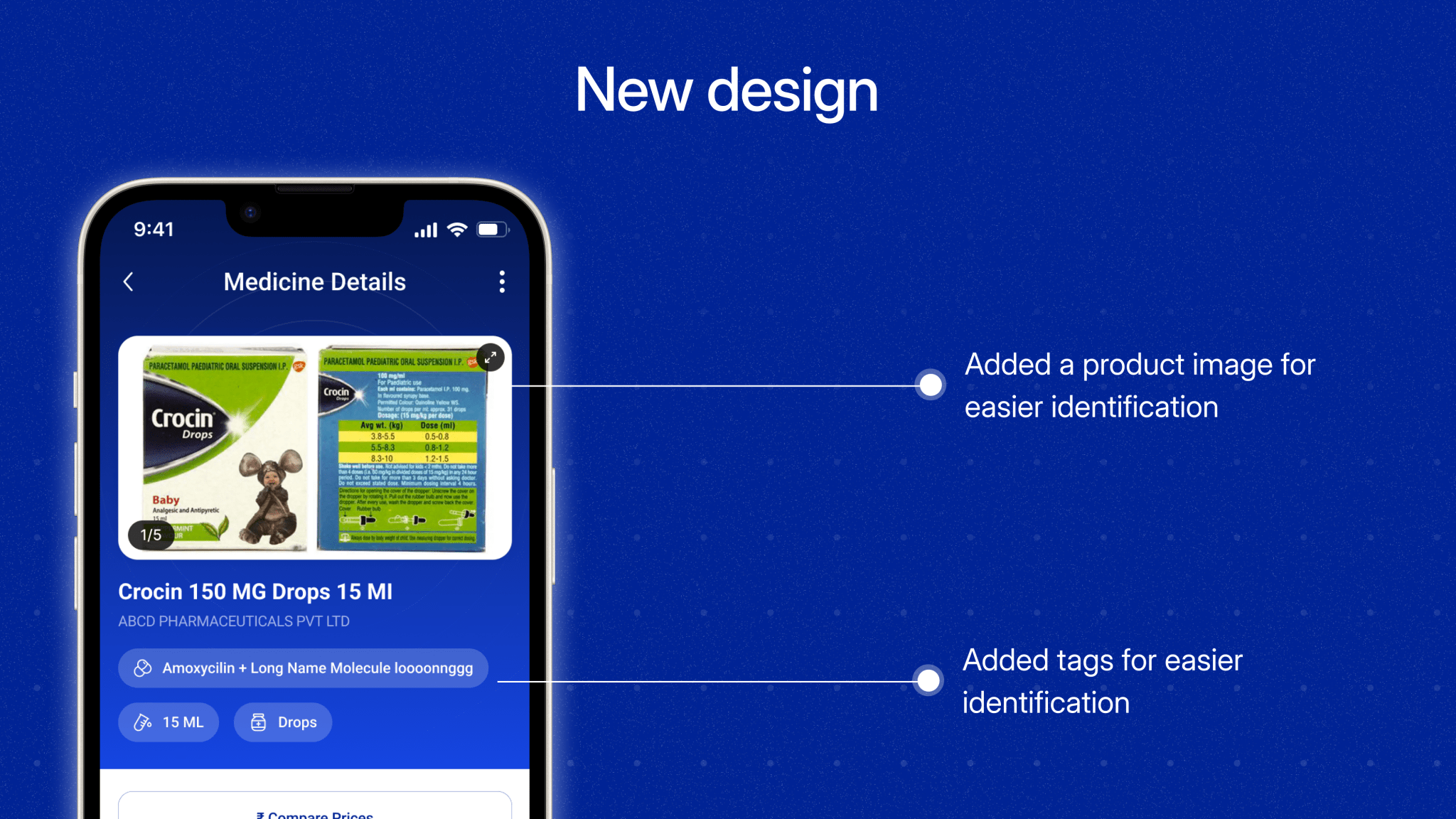
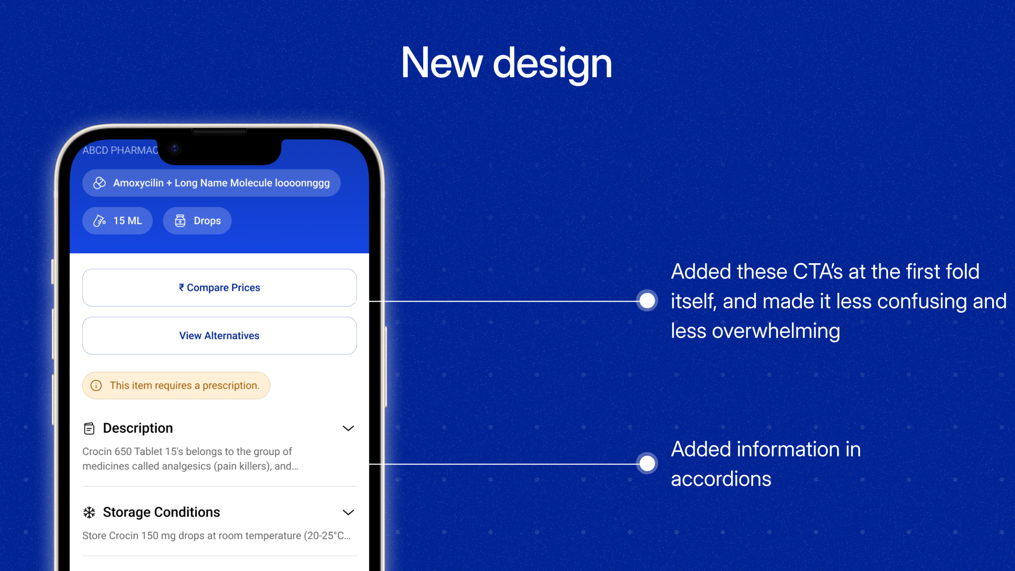
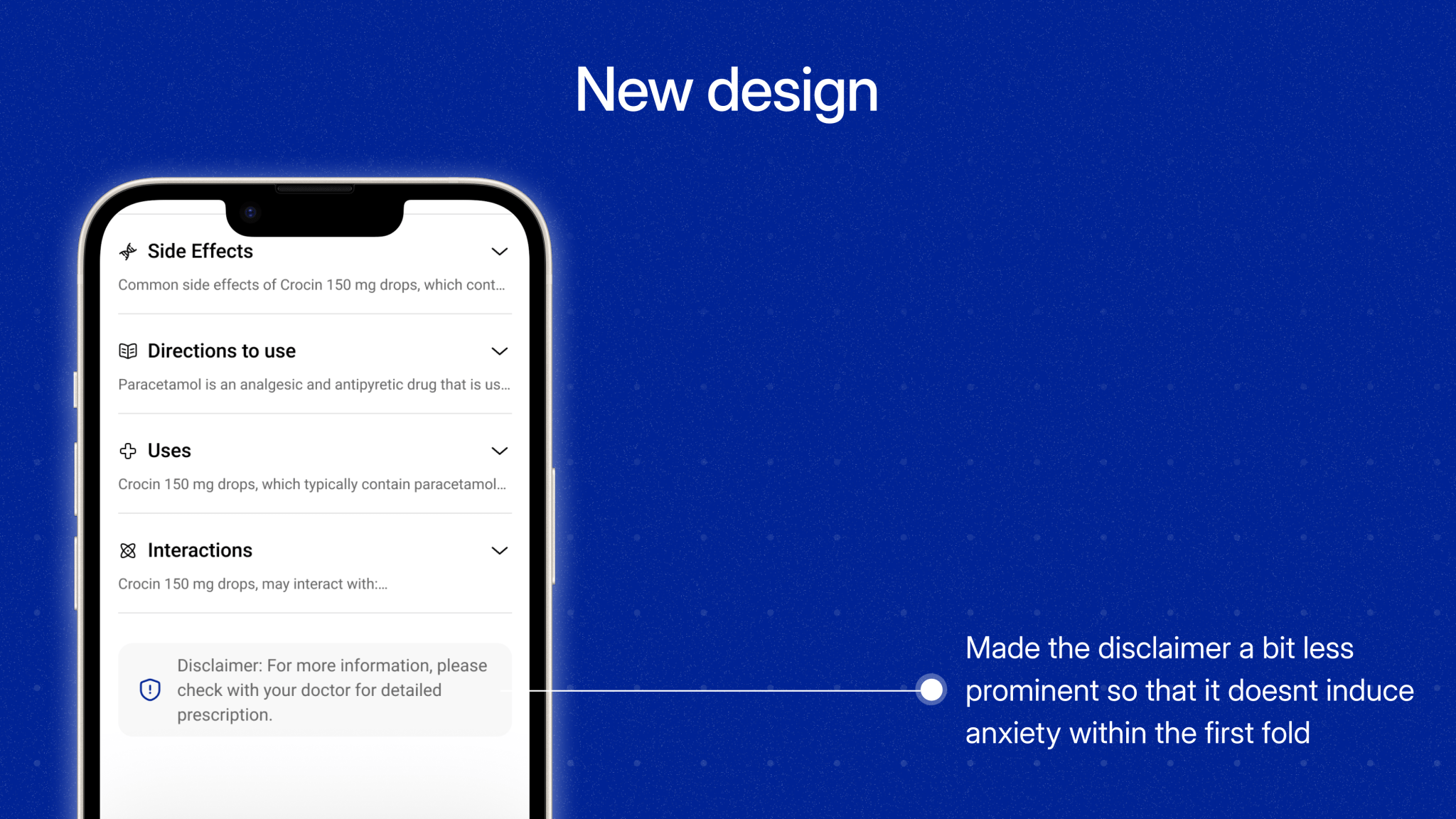
In this iteration, I included the brand colours to maintain visual consistency. I also implemented the feedback from stakeholders by including some lines of the description and solved an edge case if the molecule name was long.
Impact
This design led to an increase in conversion from product screen to users placing the order from 16% to 42% over a span of 3 months.
Conclusion & Learnings
As the sole designer on this project, I was responsible for creating everything from scratch, pixel by pixel. This hands-on approach gave me valuable insights into product development, and I enjoyed crafting every part of it.
Like reading this? check out some of my work on
Twitter
