
When we started building the Foundations for the TBCx Design system, one of our first challenges was reimagining the color system. Although some attractive colors were used across the products, we realized they lacked proper structure, scalability, and accessibility to support our rapidly growing multi-brand design system.
Let’s talk about how we approached the problem and the solutions we came up with along the way.
Before diving into the actual work, we took the time to analyze and identify all the criteria that the new color system had to meet.
Accessible — Color scales in the new system needed to be accessible, with consistent contrast jumps between steps, allowing designers to have confidence in the contrast between colors when using them in UI.
Structured and scalable — Since TBCX is a multi-brand design system with a growing number of products and brands, the system needed to have a defined process for adding new brand colors and generating consistent scales.
Versatile but not overwhelming — Colors needed to have enough variations to cover all the use cases without having an overwhelming number of choices.
Built around the main brand color — The system also needed to be centered around the main brand color, ensuring that the hues complemented it well and neutral colors had a subtle touch of the brand’s color influence.
Selecting hues
The brand color has a hue of 196. To generate harmonious colors around it, we divided the 360° color wheel by 20, resulting in 18. After adding and subtracting 18° to 196°, we were left with 19 new hues spaced evenly on the color wheel, centered around the brand color.

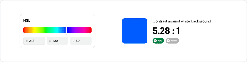
Problems with using HSL
Initially, we tried generating color scales using HSL color space. But soon we encountered significant challenges.
Our goal was to create consistent and predictable color scales.
-
We needed each scale to have 10 variants labeled from “color 10” to “color 100.” Steps from 10 to 50 with accessible contrast against white, and steps from 50 to 100 against black.
-
Each step in the scale needed to maintain the same contrast against a white background as its counterparts in other color scales. For example, the contrast of blue 30 against white needed to match the contrast of green 30, red 30, yellow 30, and so on.
-
In addition, we wanted color scales to have what we called the “mirror effect.” This meant that if a specific step, like blue 20, was used in light mode, blue 80 needed to automatically work well in dark mode.
Achieving this level of consistency using HSL was impossible because it didn’t account for how human eyes perceive color. Adjusting the hue or saturation often resulted in changes in how brightly colors were perceived by the human eye, particularly when working with hues like yellow and green.
Using HSLuv to get consistent contrast jumps between color steps
After some research, we discovered HSLuv, a perceptually uniform color space. Unlike HSL, changing hue or saturation property when using HSLuv doesn’t affect the lightness of the color, therefore the contrast ratio remains almost the same. This allowed us to implement all of the above requirements with ease.
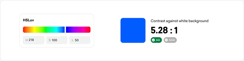
HSLuv’s perceptual uniformity allowed us to define lightness values that had coherent contrast ratios across all scales. We came up with 10 lightness values and used them to generate scales for each of the selected hues.

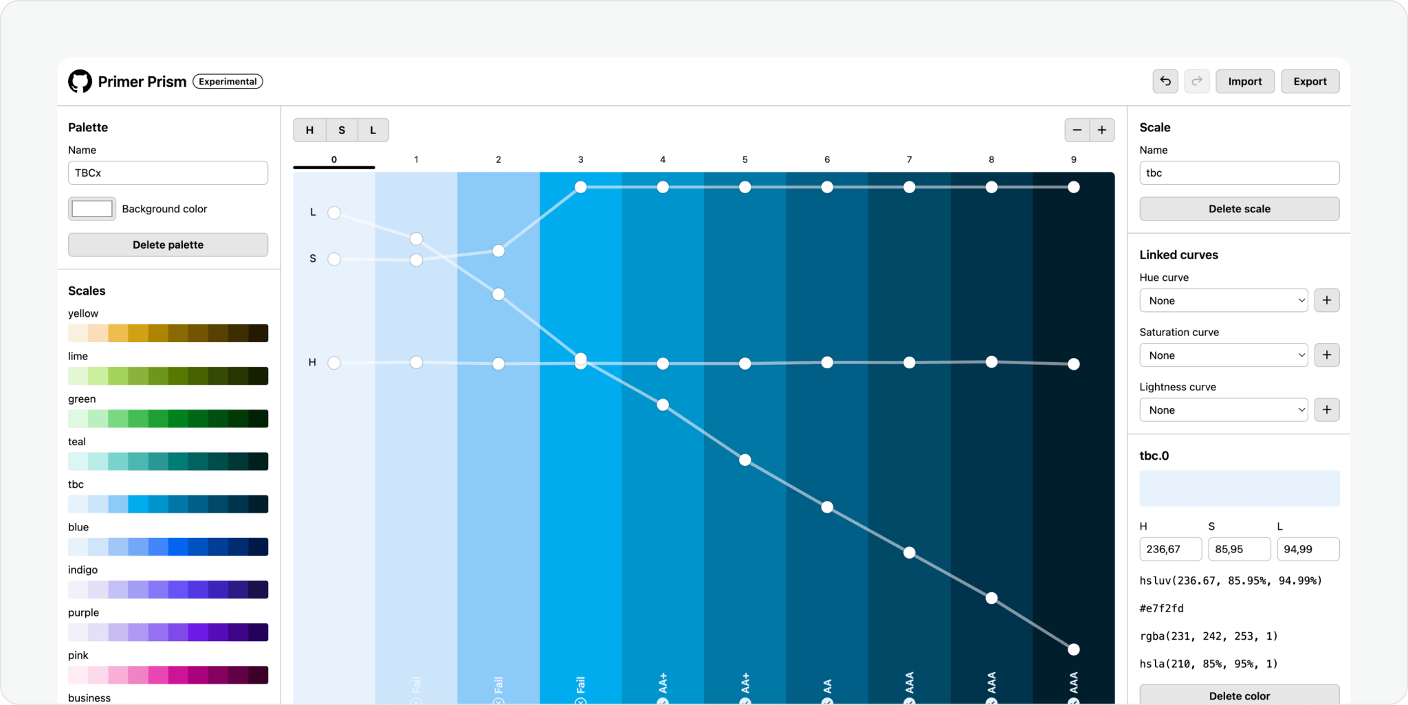
To generate the scales efficiently, we used Primer Prism by Github. It not only supported our chosen color space but also provided an intuitive UI to visualize the hue, saturation, and lightness transitions between steps. After this, we were left with 10 color scales (1 brand and 9 extended palette colors).
Matching brand colors with generated scales
Although we were happy with the results, one challenge remained: integrating our brand colors into the scales. Since the scales were generated by applying hues to predefined lightness values, none of the scale steps aligned perfectly with our brand color hex.
To fix this, we compared the lightness value of our brand color to each scale variant and replaced the closest one with the brand color. For example, the HSLuv lightness value of the TBC brand color (#00ADEE) is 66. The closest match in the scale, was tbc-40 (#33B0EE), with a lightness of 68. So we replaced tbc-40 with our brand color.
Fitting brand color into the scale
There are several sub-brands in TBC, so we repeated the same process for all of them.
Abney effect
When it came to testing our colors by applying them to real UI, we noticed that they looked a bit too artificial, and lacked genuineness. After hours of digging into the color theory, we finally got an answer.
Appears that in the real world, some colors tend to shift perceived hue when white light is added to them. This is called the Abney effect. But the real question was in what way and by how much are different colors affected by this phenomenon?
Thankfully it is 2024 and we got Chat GPT. We asked it to explain how different colors would be affected by this phenomenon and this is what we got:
-
Cool hues (blue, cyan): Gradually shift the hue toward warmer tones (e.g., cyan to green or blue to violet).
-
Warm hues (red, orange): Shift slightly toward yellow or pink as lightness increases.
-
Green hues: Drift toward yellow with increased lightness.
-
Yellow hues: Typically require minimal adjustment; yellow stays perceptually stable.
With this knowledge, we made subtle adjustments to the hues in each color scale, and finally, everything looked perfect.
Results
In the end of the project, we have a color system that meets all our initial requirements and more.
-
We have a color system with 5 brand and 9 additional color scales. That will be versatile enough to support all of the digital products across TBC.
-
We got accessibility baked in, with consistent contrast jumps. Designers know exactly which color variants are accessible on white and dark texts.
-
The color system has a clear structure and rules if there is a need for it to be extended. By using a 10–100 naming convention we have room for new color variants to be added.
-
The color system has enough variants for both light and dark themes.