
ProFair Games is a dynamic and innovative company at the forefront of the betting game development industry. My journey at ProFair has been an incredibly fulfilling one, marked by growth and innovation. I initially joined the company as an Art Director, but within a month, I was entrusted with the role of Project Manager simultaneously. Just five months later, I received a promotion to become the Creative Director. This journey wasn't just about job titles; it was about our collective pursuit of something remarkable—an effort that would define the next chapter for the iGaming industry.
Rebrand

The Problems Identified:
Bland Branding: A significant portion of companies in our industry suffered from dull and forgettable branding, which left them lost in the crowd.
Excessive Playfulness: On the other hand, some companies leaned too heavily into childlike aesthetics, potentially alienating mature audiences and undermining trust.
Trustworthiness Concerns: Apart from the legal part, the visuals needed to look trustworthy to our clients. Establishing trust was paramount.
The Logo Choice:
In the quest to give ProFair Games a fresh look, I went on a creative adventure that brought me to a symbol with deep meaning – the spinning-top. It wasn't a random pick; it was like finding the perfect outfit that strikes the right balance between dressing up seriously and having fun at a party – all while making sure everyone trusts your fashion sense.
Timeless Entertainment: The inspiration for the spinning-top initially came to me from the movie "Inception." However, I quickly realized that the concept in the film was too complex for our branding needs. Still, the spinning-top remained a powerful symbol of timeless entertainment, reflecting our desire to create a brand with enduring appeal.
Connection to Betting Games: The spinning-top's symbolic connection to the industry was undeniable. It eloquently captured the essence of betting games – the thrill of spinning wheels, slots, and the excitement of chance.
Serious and Playful: What made the spinning-top a perfect fit was its ability to be both serious and playful. It represented our aspiration to find equilibrium between professionalism and entertainment. It acknowledged the gravity of betting while honoring the sheer joy of playing.
Trustworthiness: Crucially, the spinning-top exuded an aura of trustworthiness. Its classic and universally recognized nature reassured players that we were a reputable choice, with a clear meaning behind the branding.
Process:
When it came to rebranding, I began by sketching various versions of the spinning-top logo concept, experimenting with different shapes, sizes, and styles.
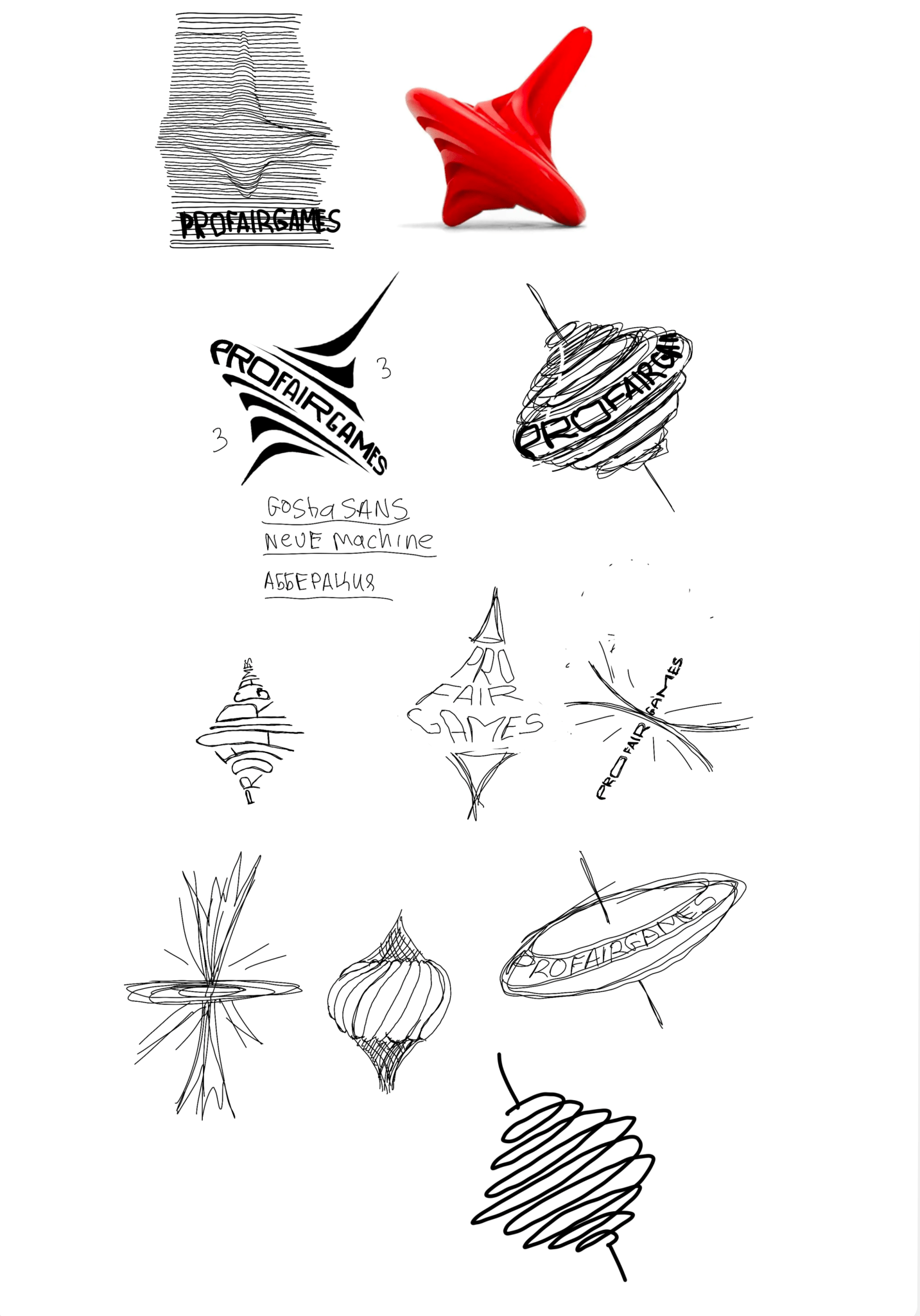

Main Concepts:
Cyborg:
The first concept involved a spinning-top logo designed with a futuristic, cyborg-like twist. This idea fused the timeless appeal of the spinning-top with a modern touch, symbolizing our commitment to innovation in gaming. It paved the way for a broader exploration of the cyborg theme, shaping our brand identity,

Waves:
Drawing inspiration from my passion for science, the next two concepts explored the logo's design in the styles of longitudinal and transverse waves. These representations featured our logo created using these waveforms, with the first concept resembling longitudinal waves and the second embodying transverse waves. This approach served as a reference to both hearing and vision, reflecting our commitment to immersive gaming experiences that engage players on multiple sensory levels.


Windmill:
The next version was the distinctive shape by combining two elements: a diagonally positioned spinning-top at its core and playful, bubbly edges surrounding it. This design concept drew inspiration from the windmill toy. It captured the essence of motion and whimsy, evoking a sense of playful energy.

Logomark:
In the next iteration, I opted for a simplified logomark of the spinning-top. This design featured sharp, clean edges, conveying a more serious and professional brand image. This approach represented a departure from the previous playful concepts, focusing on a sleek and minimalistic aesthetic that reinforced our commitment to a more serious and focused gaming experience.

Main:
The ultimate and central version of our rebranded logo featured a fusion of the simplified spinning-top logomark alongside a more abstract and slightly tilted shape, directing its angle towards the upper right corner. This directional choice was not arbitrary; it was grounded in the psychology of design, where such a direction is commonly associated with evoking feelings of sympathy and hope in users.


The Final Choice:
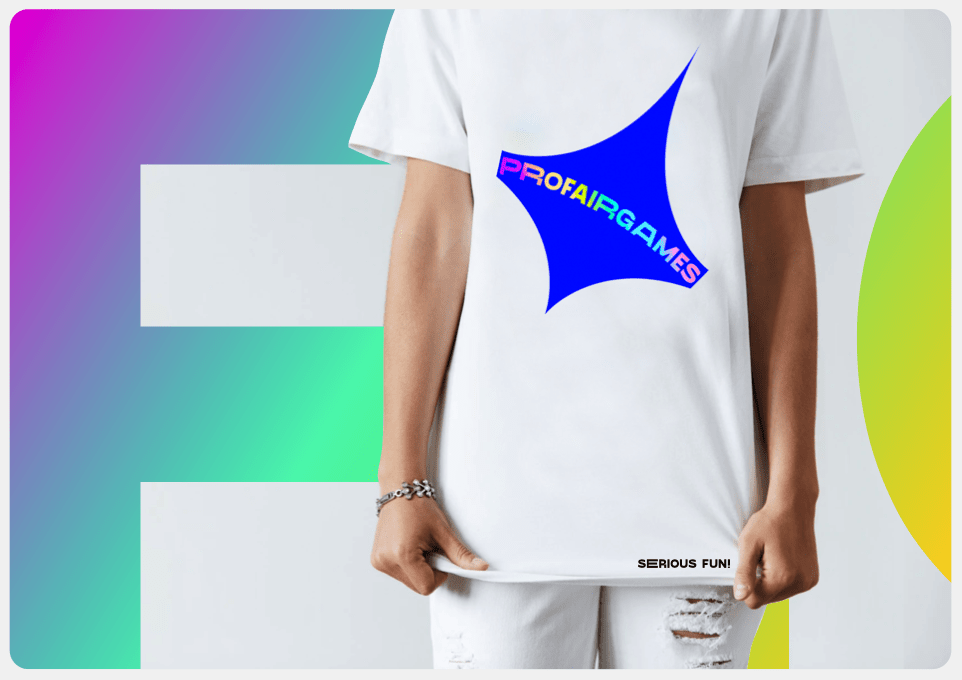
After carefully considering feedback and engaging in an extensive process of creative thought, I made the decision to go with the logomark option as the central element of the rebranding effort. However, I departed from the initial notion of solely using the mark. Instead, I opted to retain the company title alongside the logomark and developed several versions that seamlessly integrated both elements. This choice aimed to strike a harmonious balance between visual simplicity and clarity, ensuring that our brand was not only appealing but also readily recognizable.


First Mock:
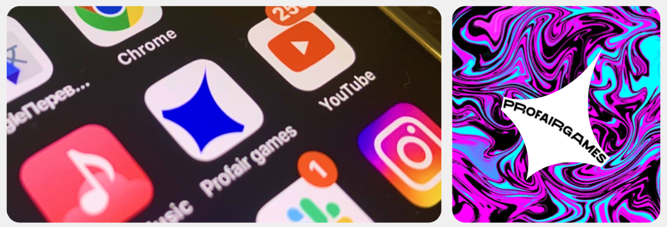
Building on the chosen logomark and title integration, I proceeded to experiment with kerning and create the first mock-up of the logo in practical usage. This mock-up allowed us to visualize how the logo would appear in various real-world scenarios, such as on websites, marketing materials, etc.

Final Branding Options:
The Joker:
For the final logo, I took a step by creating two distinctive versions of our branding. The first version drew inspiration from the Y2K internet era and had a playful, Joker-style aesthetic. It incorporated repeated corners and elements, reminiscent of the windows in Windows XP, capturing a sense of nostalgia. The colors and overall vibe were influenced by the Joker style, infusing a sense of excitement and unpredictability into our brand, setting us apart as an innovative and forward-thinking player in the gaming industry. However, it was important to exercise caution in working with this design to strike the right balance. It needed to be engaging and playful without becoming overwhelming, ensuring that our branding remained approachable and trustworthy while embracing this bold, contemporary aesthetic.


Cards:
Transitioning from the initial logo concept that predated our rebrand – the spades icon – I made the strategic decision to retain the card game concept. In the second development, we continued with this theme, but with a more serene and refined approach. This version incorporated elements such as the Queen of Hearts, adding a touch of elegance and sophistication to our brand. Ultimately, this choice resonated most with our vision and was the final decision that we embraced, perfectly encapsulating the essence of ProFair Games.


Color Choices:
In selecting our brand colors, I aimed to create a vibrant and memorable visual identity that would resonate with our target audience. Here's the rationale behind each color choice:
Shocking Pink: Shocking pink is a bold and attention-grabbing color, symbolizing energy and excitement. It reflects the thrill and adrenaline rush associated with gaming, instantly drawing users into the world of ProFair.
Aqua Green: Aqua green provides a refreshing and calming contrast to the high-energy pink. It signifies reliability and trustworthiness, emphasizing our commitment to fair play and transparent gaming experiences.
Cadmium Yellow: Cadmium yellow adds a touch of warmth and optimism to our brand. It symbolizes joy and positivity, reflecting the enjoyment and satisfaction our games aim to deliver.
Bright Blue: Bright blue, a color often associated with trust and professionalism, reinforces our commitment to maintaining a reputable and trustworthy gaming platform.
White: White serves as a backdrop, providing a sense of clarity and simplicity. It complements the other vibrant colors, ensuring our branding remains clean and accessible.
Collectively, these colors create a harmonious and visually appealing palette that strikes a balance between the excitement of gaming and the trustworthiness that users seek in a gaming platform. They convey our brand's essence effectively and help the brand stand out in the competitive gaming industry.
The Font:
As for the font, "GoshaSans" was a deliberate and considered decision in our branding process. This font brings a unique blend of modernity and sophistication to our visual identity. Its clean lines and contemporary design align well with our goal of presenting a professional and trustworthy image.
Branding Conclusion:
I took the rebranding process to this advanced stage, carefully crafting the visual identity of ProFair Games. However, after my departure from the company, I handed over the branding and design to be further developed. This transition ensured that the brand's essence and vision I had meticulously established would continue to evolve in capable hands, reflecting the dynamic nature of the gaming industry and the company's growth.
The Games:
As the Creative Director, I led a fantastic team of 11 designers from around the world, providing guidance and feedback as we worked together. While much of our UX design work is under wraps due to the NDA, I'm excited to share a glimpse of our creative process.
During my time at the company, I had the chance to come up with and guide the development of seven distinct games, leading them from concept to creation. Since I can't reveal all the details, I'll focus on a game series that received high praise from our investors. It stood out for its innovative approach and unique qualities, highlighting the diverse and creative work we did in game development.
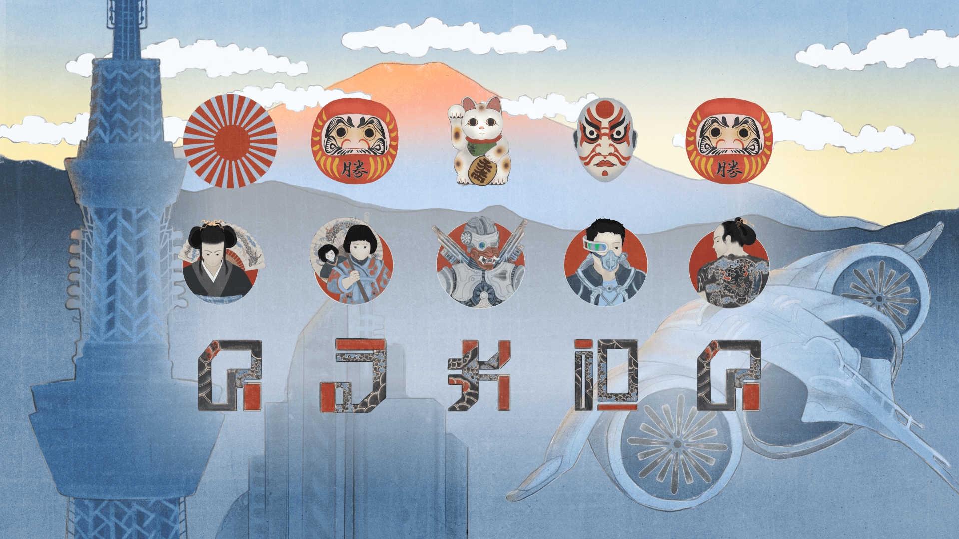
The 2525 Series:
I introduced games that would be a part of our Year 2525 series, where we explored Korean and Japanese cultures in a futuristic context. Despite their unique cultural focuses, these games shared key elements that tied them together.
Both games were set in the year 2525, giving players a glimpse into a shared future. They had similar interfaces, but their designs paid homage to their respective cultures.
One common feature was the use of captivating manga and manhwa intros, setting the stage for bonus games.
But what truly united them was the inclusion of moral dilemmas. These challenges engaged players emotionally, making them think about the choices they made.
In "K-Drama," it was about the complex relationship between humans and robots, while "Chronicles of Japan" explored preserving traditions at a cost.
To make it more enticing for clients, I came up with a sales strategy. If they featured both games, they'd get a special discount. This not only emphasized the connection between the games but also provided clients with added value.
The Year 2525 series celebrated cultural diversity and showcased the power of storytelling in game development. It aimed to engage players on a personal level, making their gaming experience more immersive and thought-provoking.
Romance Rebooted: A 2525 K-Drama (or K-Drama: 2525)
"K-Drama 2525" was a standout game concept that centered around a futuristic love story between a human boy and a cyborg girl, featuring the boy's mother to be agains their relationship. To make the game even more engaging, we used a unique storytelling approach inspired by Korean Manga, known as Manhwa Style. This style was used to create visually captivating storyboards that introduced players to the characters and set the stage for the main and bonus games. These storyboards provided players with a vivid and immersive narrative experience, allowing them to delve into the world of the game and connect with the characters on a deeper level.
In my role, I was ensuring the quality and consistency of our creative materials. I provided feedback to the team and, in cases of unforeseen challenges or emergencies (force majeure situations), I was hands-on in designing the materials myself. This proactive approach allowed us to maintain the high standards we set for our creative output and ensured that our projects continued to progress smoothly, even in challenging circumstances.


Horimono Heroes: Chronicles of Japan, 2525 (or Chronicles of Japan: 2525)
"Chronicles of Japan: 2525" was another captivating game concept in our portfolio. The game's storyline unfolded in a future where Japan had fallen under the control of robot troops, compelling Japanese citizens to seek refuge in the depths of the metro. They strived to preserve their traditions, including the art of Horimono tattoos, which played a central role in the game's narrative.
What set this game apart was its immersive design, which fully embraced Japanese traditional art styles. The visual elements, inspired by Japanese cultural aesthetics, added a layer of authenticity to the game, making it a visually stunning and culturally rich gaming experience. Additionally, we introduced manga-style storyboards to the game. These manga storyboards provided a dynamic and visually engaging narrative framework for the game's storyline.
Takeaway:
As a takeaway, I'm delighted to share a link to an article that I authored for the UX Collective. In this article, I delve into the intricacies of iGaming User Experience, You can access the article here.
For more games & a detailed creative process behind them:
While I can't divulge more detailed information publicly, I'm more than willing to provide a free walkthrough on Pensight for anyone interested in delving deeper into my work and creative process.
Through closed calls, I have the permission to share a more comprehensive view of the games I've been involved in, offering the details for those eager to learn more about my creative process. Feel free to reach out, and I'd be delighted to provide a more in-depth exploration of my creative journey.