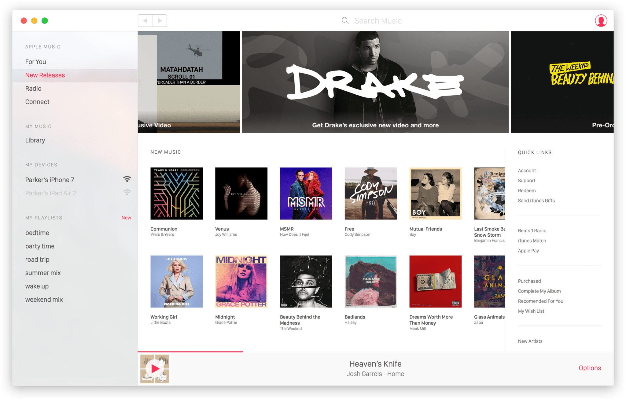
I wanted the app to maintain a level of elegance, while remaining extremely simple and easy to use. The primary navigation had the simplicity of the Apple Music app, while the secondary navigation had everything you'd come to expect from iTunes.

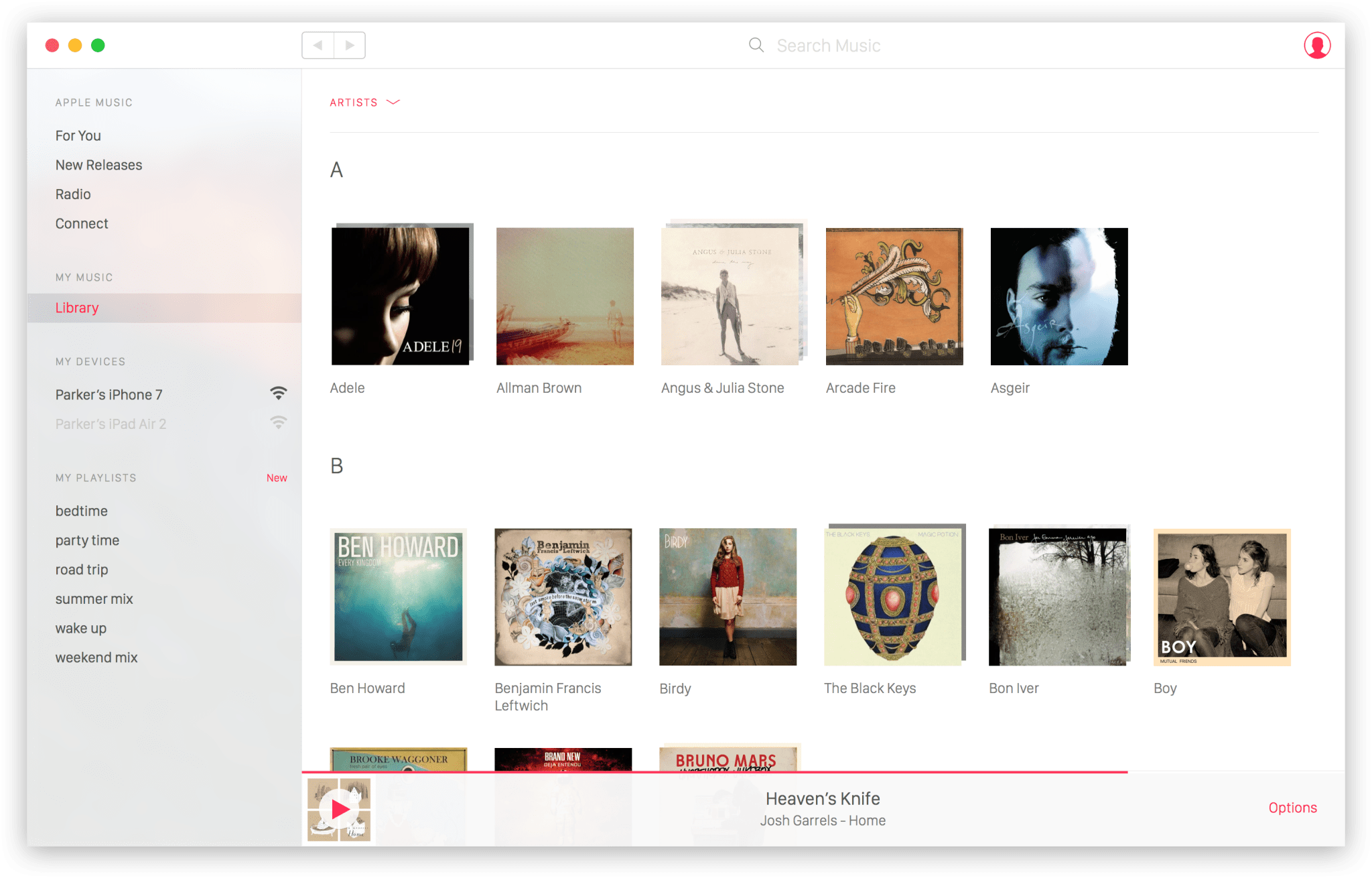
I always felt that Artists and their Albums could be easier to navigate, so I created "album stacks" that would allow you to browse Artists without clutter.

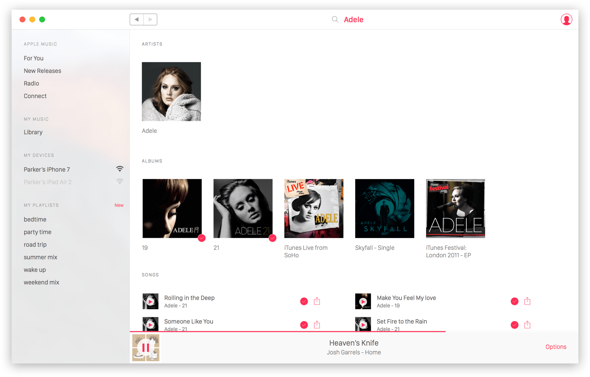
Last, search had been updated in the Apple Music app, so I wanted to take the best parts of that experience and also provide a simple way of seeing music you already had in your library.

