
For the launch of our first mobile app, there was no design system in place. We were building everything from the ground up, and there was no established standards or shared patterns. When we first launched our driver app in 2021, this lack of a unified design system quickly became apparent. Without a cohesive framework to guide us, the Lytx experience became fragmented and lacked cohesion.
Objectives
Our immediate focus was on establishing a unified foundation through the development of a comprehensive style and component library. This endeavor aimed to achieve three key objectives:
-
Establish a Single Source of Truth: Create a centralized repository of design specifications to foster clarity and productivity for both designers and developers.
-
Drive Cross-Product Consistency: Ensure a unified, high-quality user experience across all Lytx products.
-
Enhance Efficiency: Empower designers and developers with a library of pre-built components, streamlining their workflows and reducing development time.
Design Process
The process for this project involved researching existing design systems, taking inventory of our existing components, defining new styles and components, and integrating the new design system into our existing designs. As part of this effort, there were a few key requirements.
-
Light and Dark Themes: Define color styles for both light and dark themes to accommodate user engagement during different times of day.
-
Responsive Components: Ensure that components adapt seamlessly to the wide range of devices used by drivers.
-
Lean Design System: Given our limited time and resources, prioritize a lean design system that enables rapid value creation and resource optimization.
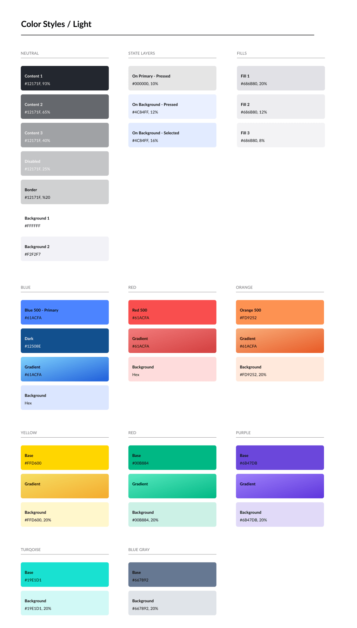
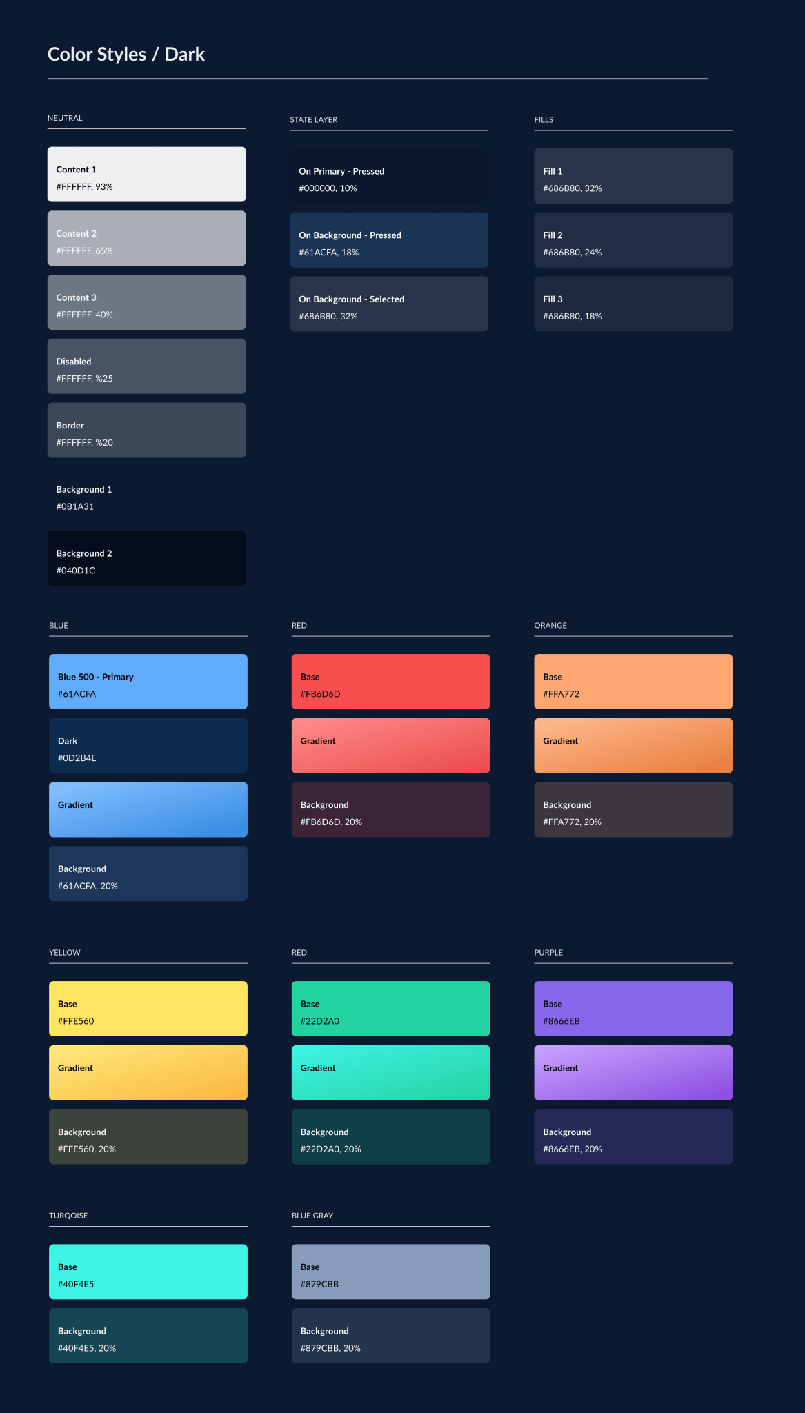
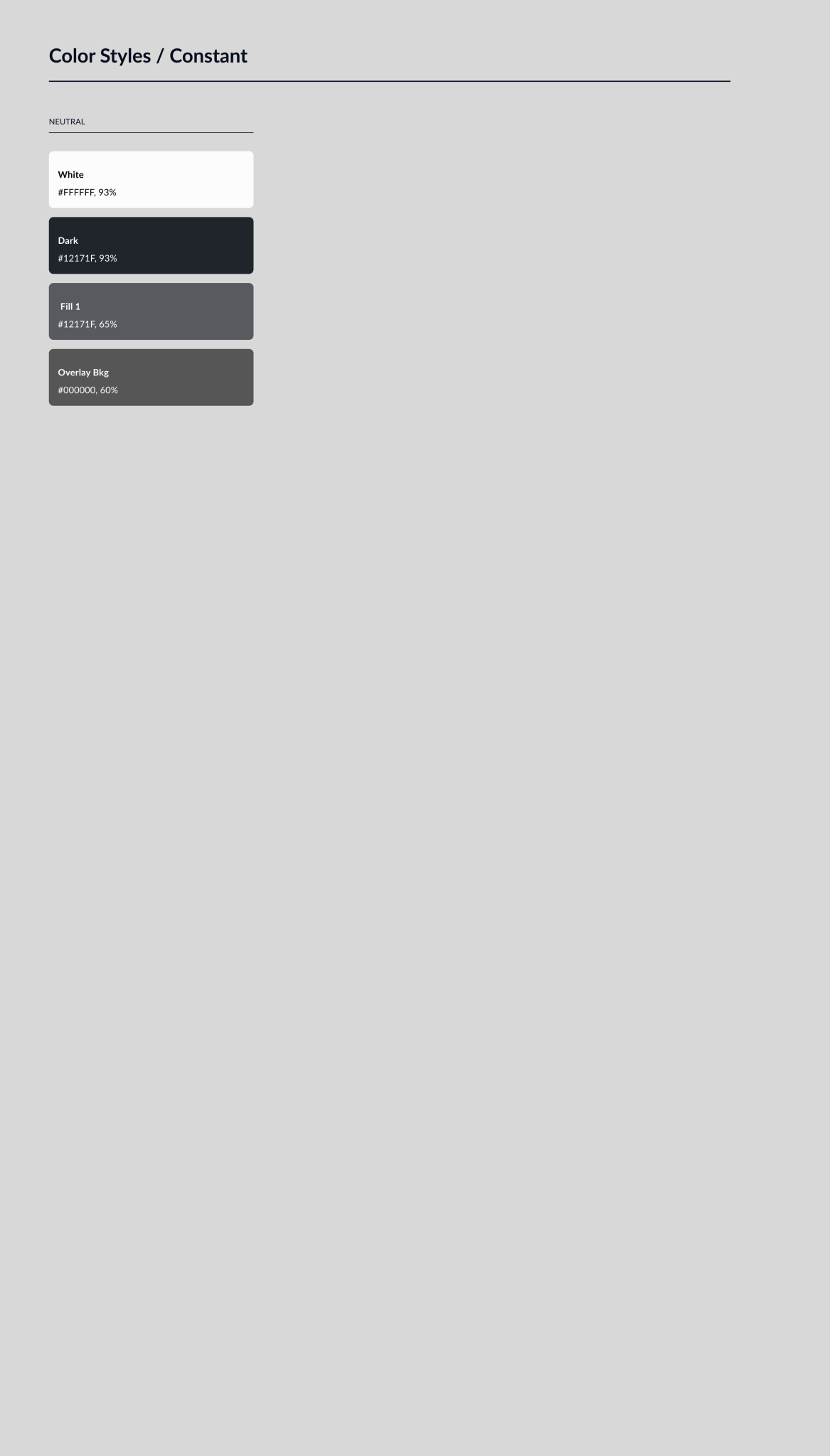
Colors
The color palette of the Lytx design system was carefully crafted to align with our core web product, ensuring a cohesive experience across our entire ecosystem. We mapped out light and dark color schemes to guarantee a seamless transition between the two modes. To streamline the design process for both modes, we utilized the Appearance plugin.
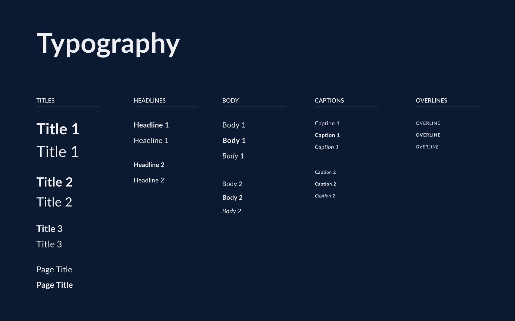
Typography
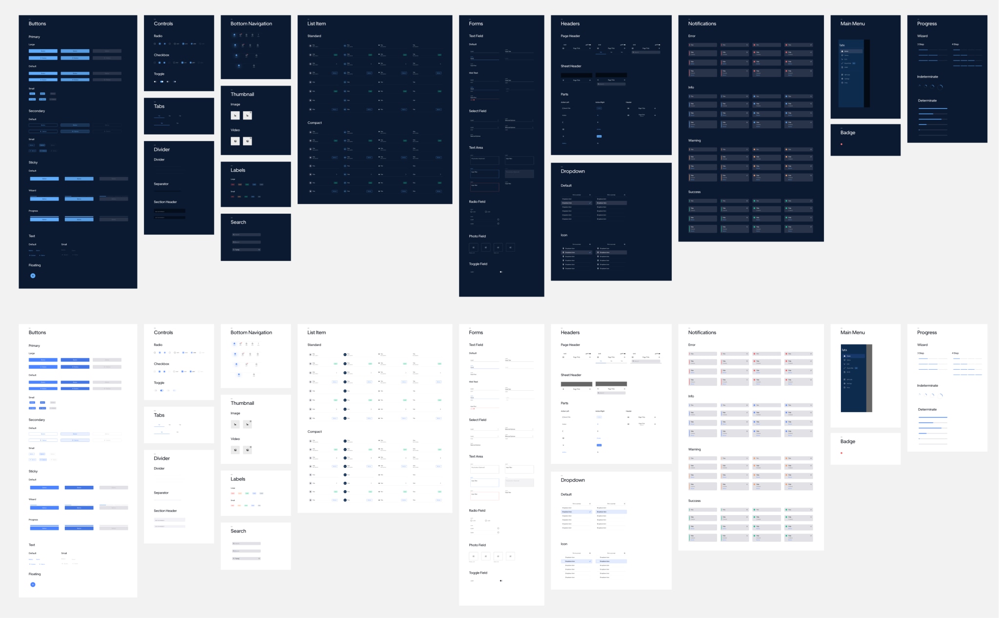
Component Library
The component library serves as a repository of reusable UI elements that empower our designers and developers to create consistent and high-quality experiences. We leveraged Figma's variant feature to efficiently manage component variations and auto-layout to ensure responsiveness across different devices.
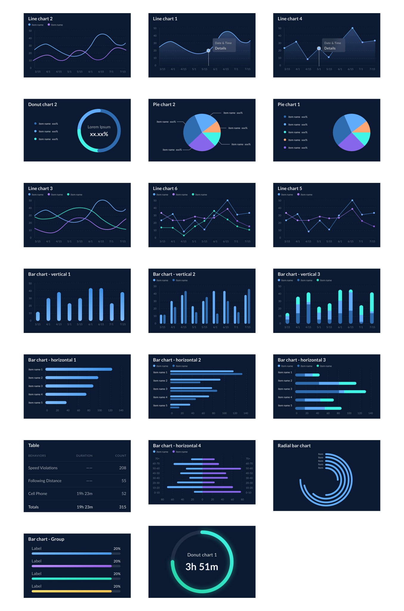
Data Visuals
Data visualization components were thoughtfully designed to effectively communicate complex information in an intuitive and visually appealing manner. These components catered to a variety of data types and scenarios, enhancing the overall user experience.
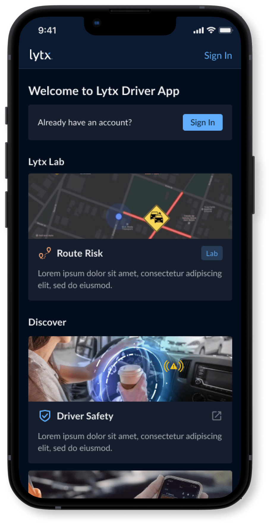
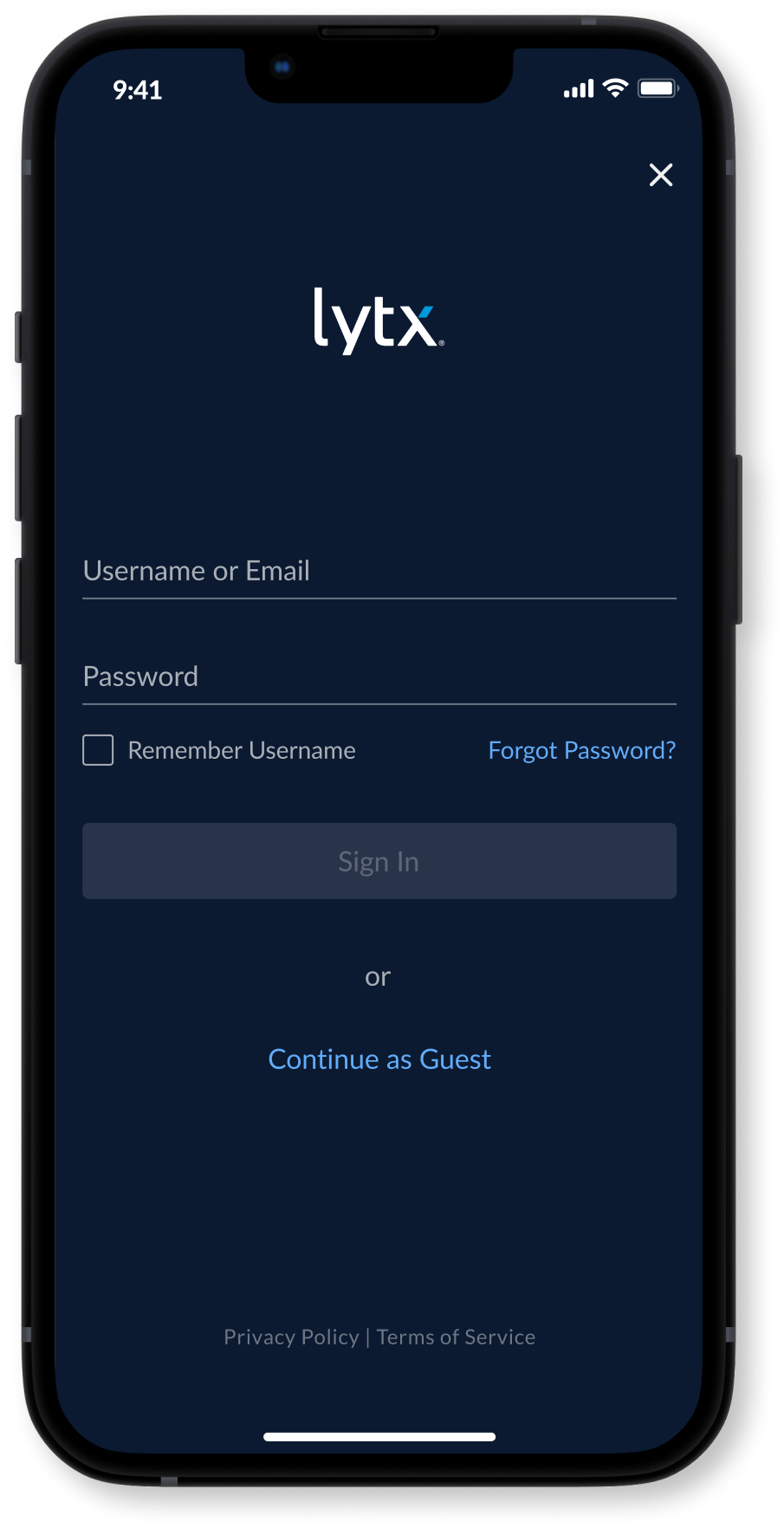
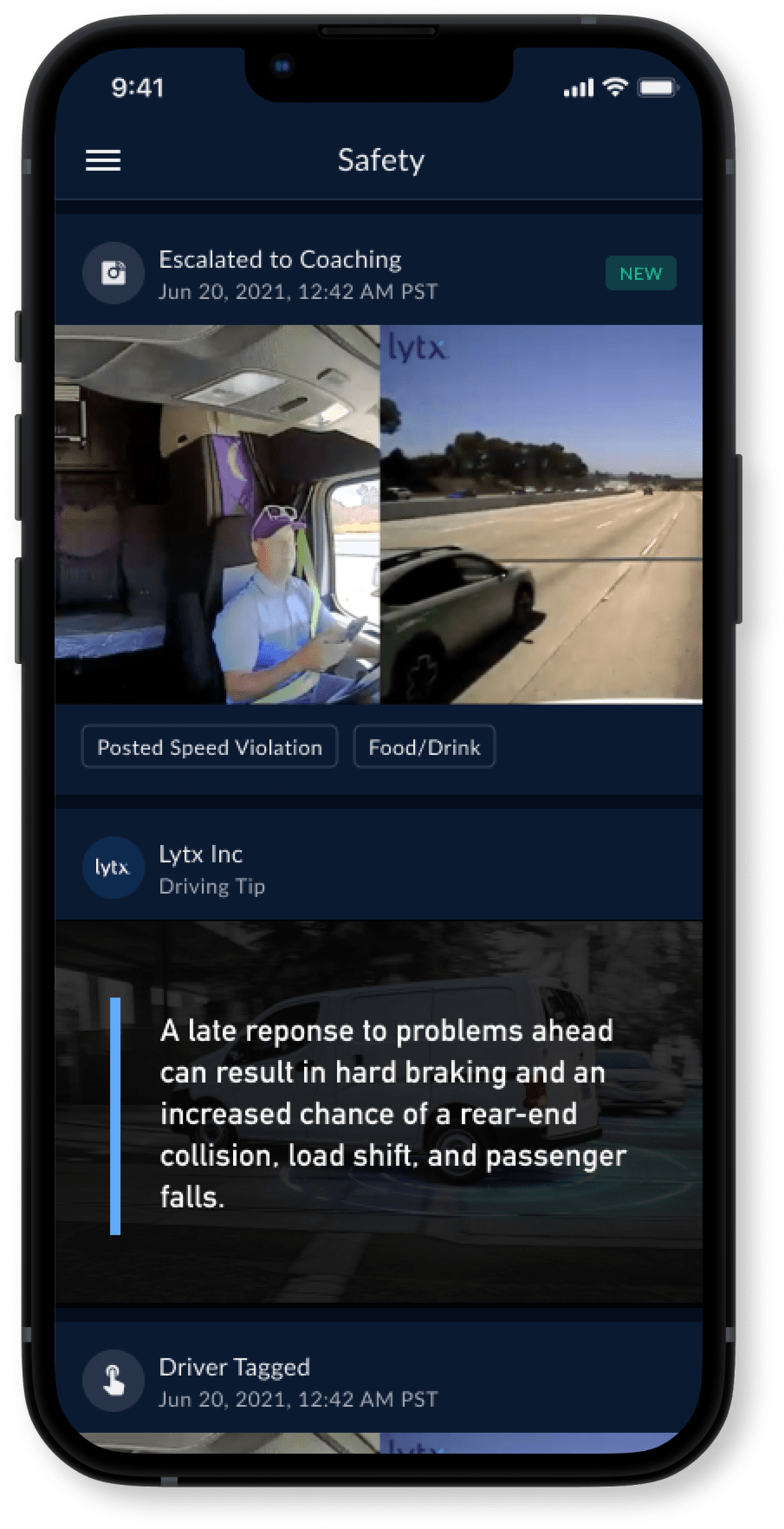
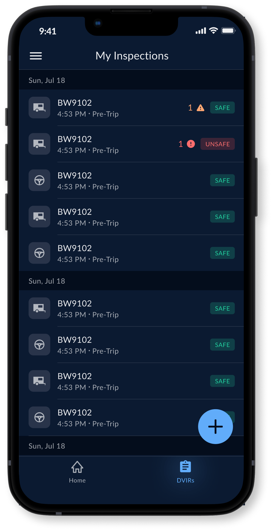
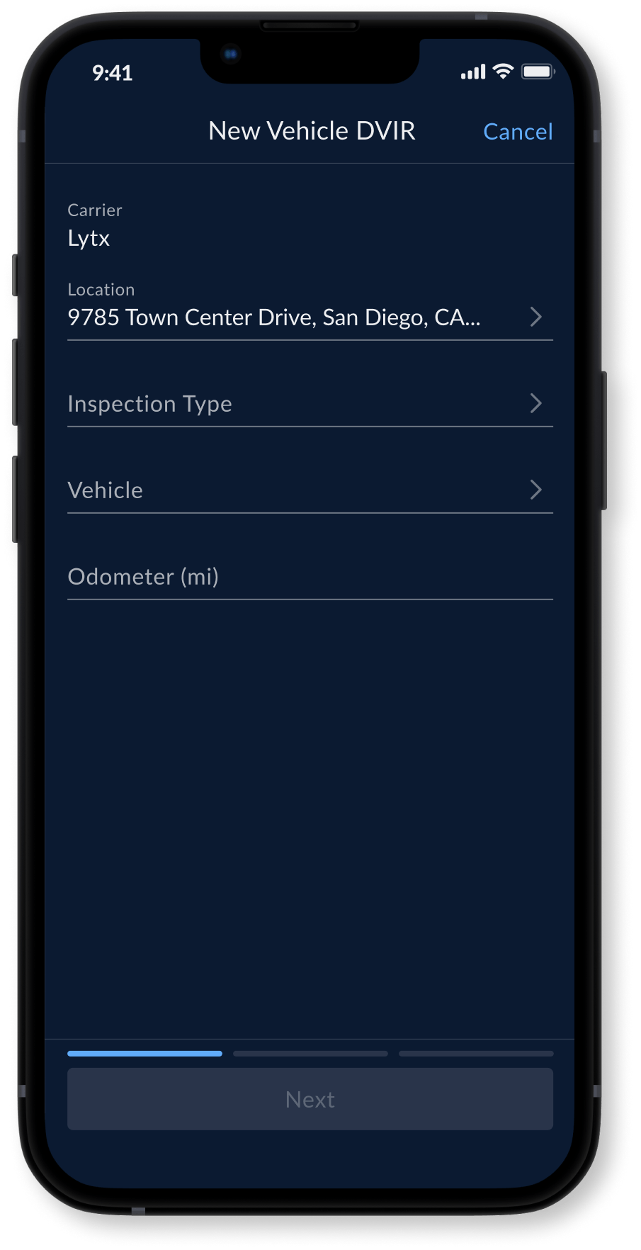
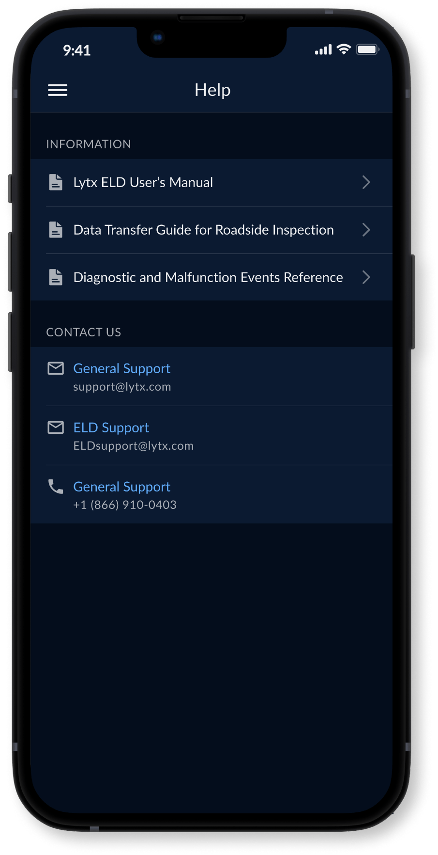
New Screens

Next Steps
Our investment in a new design system has already yielded significant benefits. Our team's velocity has increased, and we're shipping high-quality, visually consistent features. While we have established a solid foundation, our journey is far from over. We are committed to continuous improvement and have identified several key areas for further development:
-
Component Library Expansion: We will continuously expand our component library as our product evolves, ensuring it remains comprehensive and up-to-date.
-
Documentation and Guidelines: We will meticulously document guidelines and best practices for each component to ensure clarity, consistency, and adherence to accessibility standards.
-
Storybook Integration: We will implement Storybook to streamline UI development, testing, and sharing of components, further enhancing our design system's efficiency and effectiveness.
Reflection
-
Treat as a Project: Approach your design system as a dedicated project, conducting thorough research, iterating on designs, and collaborating with engineers and stakeholders.
-
Creative Freedom: Your design system should not stifle creativity or limit your design choices. Instead, it should serve as a flexible framework that empowers you to create innovative and user-centric experiences.
-
Atomic Design: Build components from the ground up, starting with atoms and assembling them to construct more complex components. This approach ensures consistency and scalability.