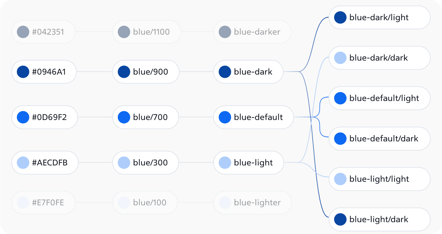
This image effectively showcases our approach to managing blue color tokens within the design system, ensuring a consistent and cohesive visual experience.
- Key Points:
- Hex Codes: Each color is explicitly defined by its hexadecimal value (e.g., `#042351`).
- Token Names: Colors are distinctly assigned unique token names (e.g., `blue/1100`, `blue-darker`) for effortless reference and updates.
- Light and Dark Modes: The system robustly supports both themes, with tokens like `blue-dark/light` and `blue-dark/dark` dynamically adapting to different modes.
- Hierarchy: Tokens are meticulously organized hierarchically to represent various shades of blue, ensuring unwavering consistency.
- Significant Advantages:
- Consistency: Standardized tokens unequivocally ensure a unified look across interfaces.
- Efficiency: Rapid application and modification of colors unequivocally streamline the workflow.
- Flexibility: Effortless updates to the design system consistently propagate automatically.
- Accessibility: Robust support for light and dark modes enhances user experience. significantly
Types of Tokes:
In VirtualUI, I have implemented 2 types of tokens (excluding typography):
- Color tokens
These tokens consist of Brand & Semantic Colors: Blue, Red, Orange, Green, Purple, and Neutral. When we need any of these colors in the UI, we use color tokens as shown in Image 1. The naming structure of these tokens is straightforward. More detailed images of the naming and usage of these tokens will be provided in the following sections.
- Element tokens
These tokens are widely used, from buttons to backgrounds. Element tokens are a simplified version of component tokens due to the reduced number of tokens required to maintain. Element tokens are divided into 5 types:
- Surface (6 tokens)
- Text (4 tokens)
- Icon (4 tokens)
- Border - Separator (4 tokens)
- Special (3 tokens)
Why did I choose these specific types? After months of research, I identified a method to reduce the number of tokens used by grouping them to create a straightforward approach. Now, even non-designers can easily understand where to use each token. My primary goal was to make this design system universally accessible and simple to use. With these tokens, I have unequivocally achieved it!
Usage of Tokens:
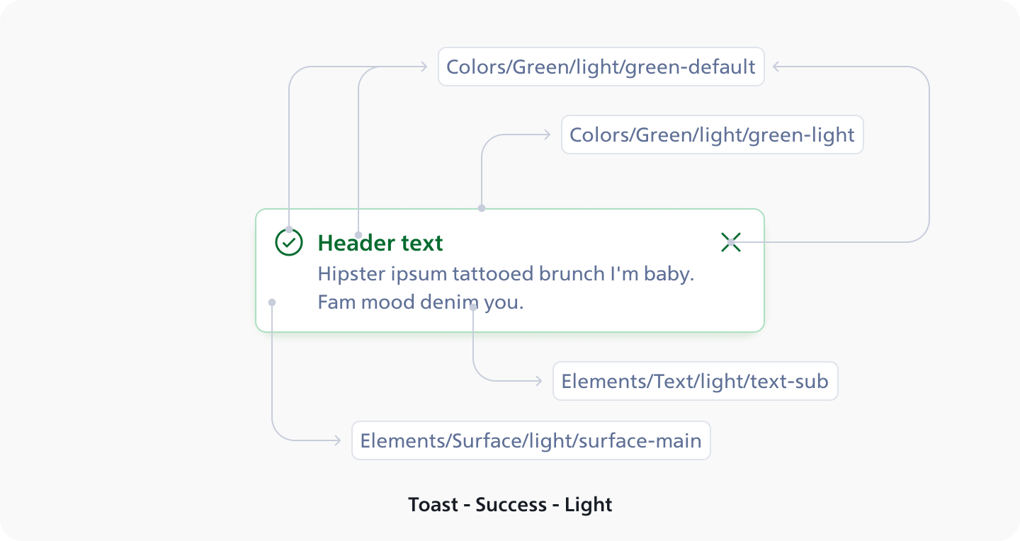
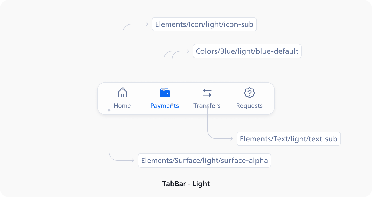
Colors and Element tokens can be used for the same purposes such as borders and backgrounds. In the two token usage examples provided, the primary consideration is backgrounds. VirtualUI features six different background types:
- Surface-dark
- Surface-dark-helper
- Surface-bg
- Surface-main
- Surface-main-helper
- Surface-alpha
Now, the reason behind having six different surface tokens will be explained.
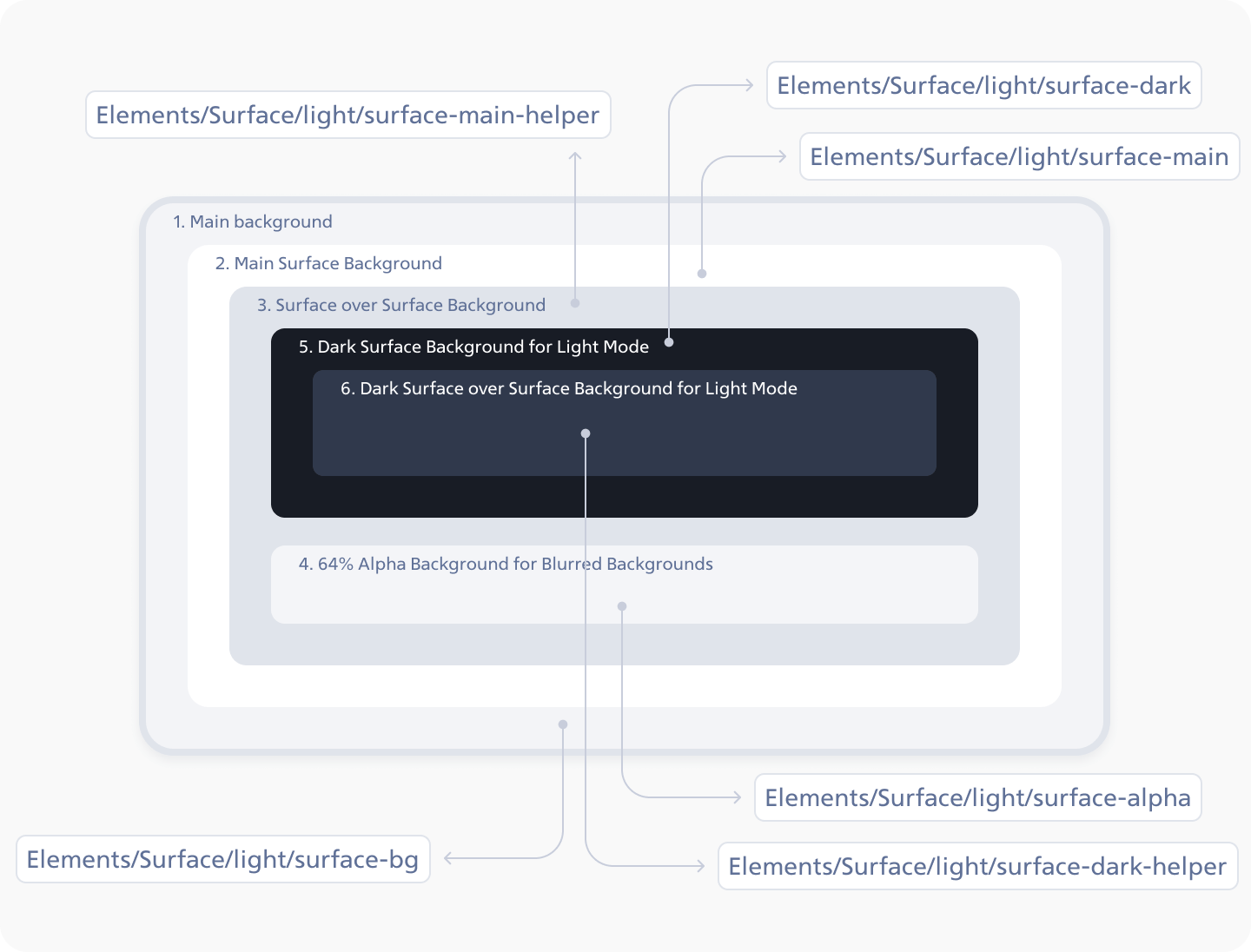
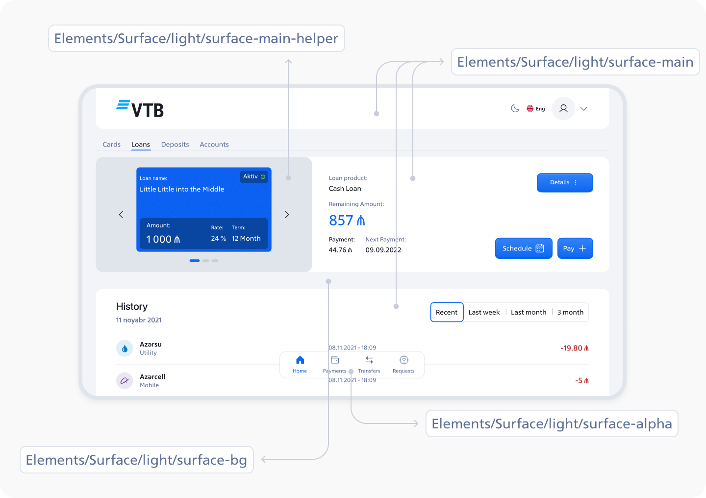
As you see above, each token has its own use cases. Let's explain these use cases in more detail: Each token has its own specific use case:
1. Main Background:
This token is strictly used for absolute backgrounds with a z index of 0.
2. Main Surface Background:
Exclusively used for the main container, such as the header background or history section, with a z index of 1.
3. Surface over Surface Background:
This token is used when a container needs to be placed over the main container, for example, for the cards view in the cards section, with a z index of 2.
4. 64% Alpha Background for Blurred Backgrounds:
This token adds a touch of glamour to the UI with a 64% transparent background, such as for the tab bar, with a z index of 10 (possibly).
5. Dark Surface Background for Light Mode:
These background colors may not be currently in use, but are planned for future use as more features are added, with a z index of 1.
6. Dark Surface over Surface Background for Light Mode:
Similar to token 3, this token is also used for a container over the main container, if the main container is using token 5, with a z index of 2.
Conclusion:
By implementing tokens in VirtualUI and embracing the design language of Bank VTB Azerbaijan, we have successfully established a more centralized, polished, and user-friendly color system. This has significantly enhanced our flexibility and streamlined the process of creating, modifying, and updating products, both in Figma and during development. If you require a design system for your project or company or need assistance with your current design system, do not hesitate to schedule a call with me.
