
For my Human Computer Interaction Final project, I wanted to improve a tool that I have used frequently and think is important, so I chose Khan Academy. To see the full deck click here.
Challenge:
Khan Academy is a great resource, in part because of the depth and breadth of its available content. Khan Academy has content ranging from pre-k to college levels, and even ‘life skills’ courses, in over 30 different languages. This amount of content is amazing for their users but it can also be overwhelming. I set out to create a tool to help users better navigate through this content.
Steps Taken:
-
Understanding Khan Academy
-
Understanding the User
-
Design Motivation
-
Design Prototypes
Understanding Khan Academy
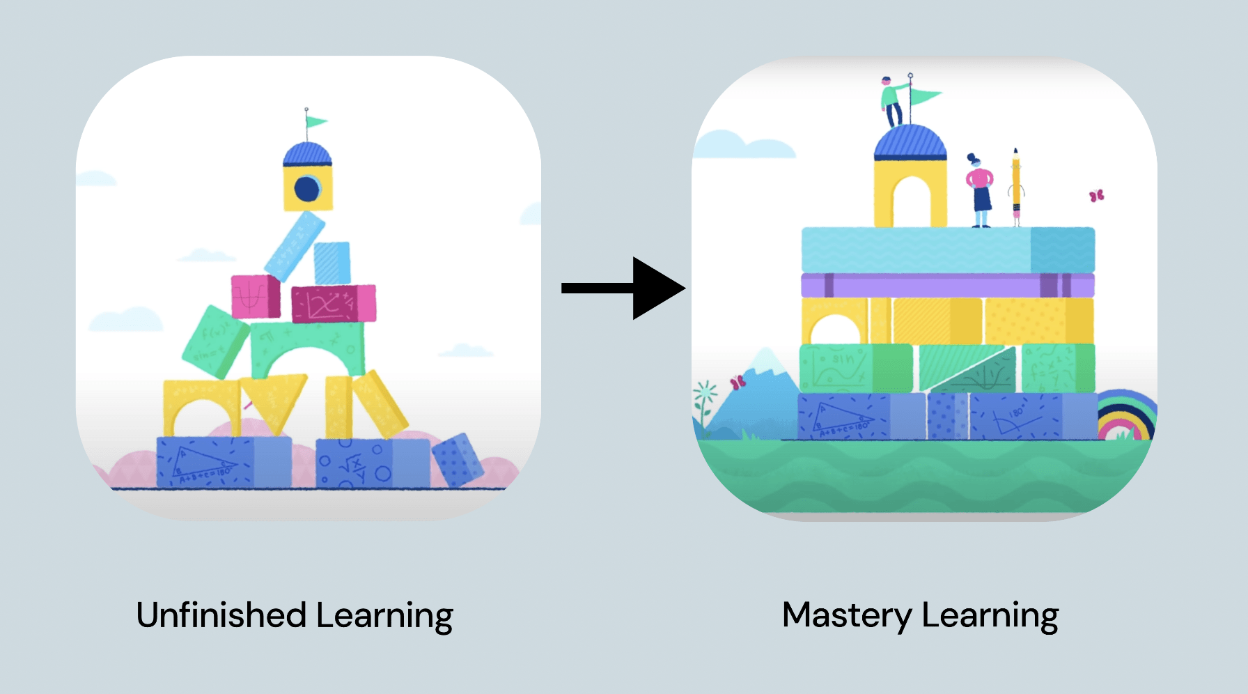
Khan Academy's mission statement is to “Provide a free world class education for anyone, anywhere”. Khan Academy’s curricula are based on a ‘Mastery Learning’ system. Mastery Learning simply means allowing a student to continue to work on a concept until they can master that concept or skill. This requires personalized curricula, based on students gaps in understanding. They target "unfinished learners", or students who haven’t mastered critical core skills. Khan Academy believes that learning is a aggregate, one level cannot be reached without total comprehension of the previous. Khan Academy also emphasizes students who wouldn’t normally have the resources to get a complete and world-class education.
Understanding the User
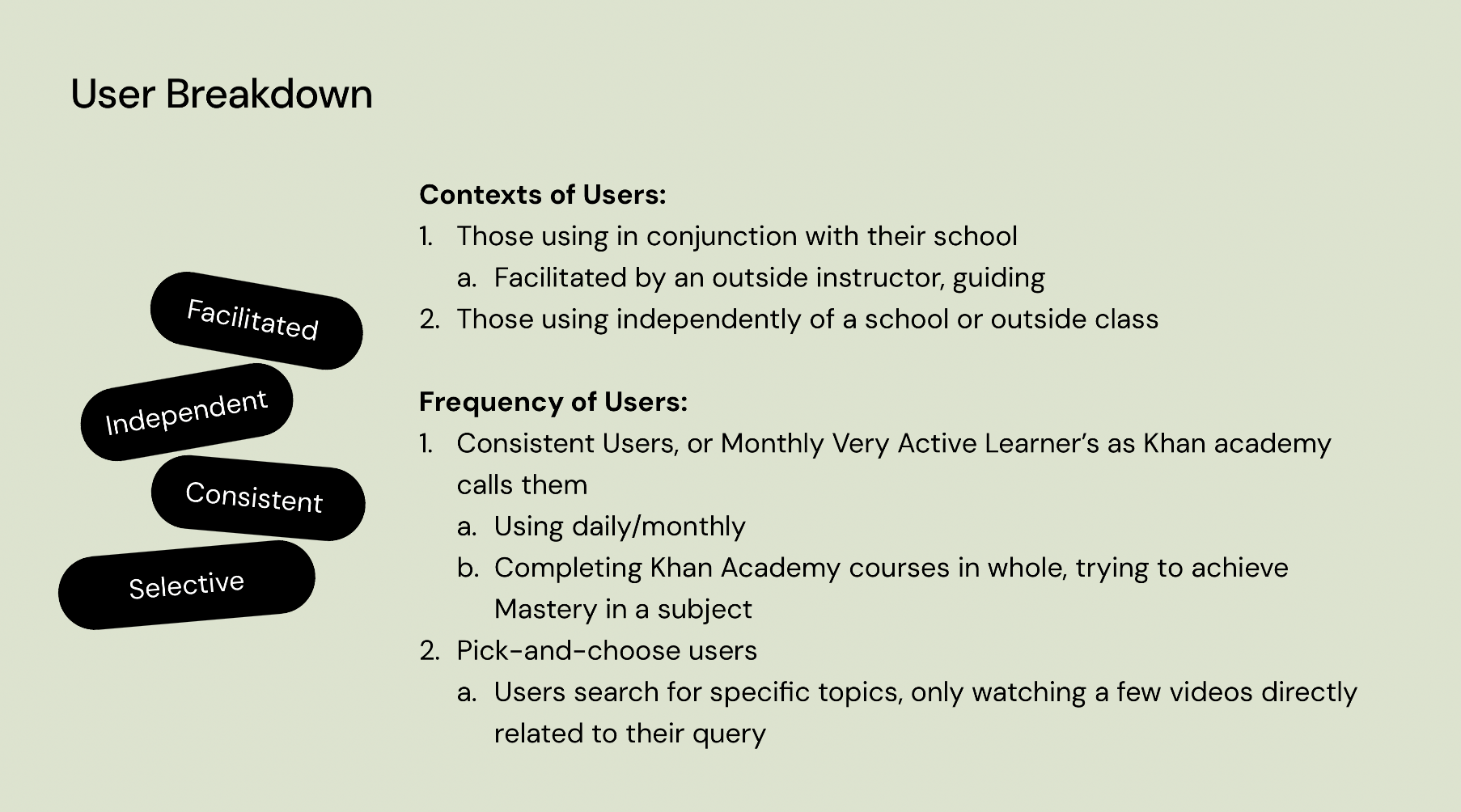
I can break down the users of Khan Academy(the learners that is, what I am focusing on) into 2 groups:
Using in conjunction with their schools, organized by the teacher or district
- The instructor is facilitating the use of its materials, and guiding students along the process.
Using independently of a school, working alone
These groups can be further divided into those who use it consistently and those who don’t.
-
Consistent Users, or Monthly Very Active Learners as Khan Academy calls them, are users who are following and completing courses in whole. Whether facilitated by an outside instructor or not, their aim is to achieve mastery in a subject.
-
Pick-and-choose users, are users that are looking for support in specific areas;
-
selecting 1 or just a small set of videos on a specific topic.
-
they were left confused by a class in school, or want to review basic concepts for a more advanced subject.
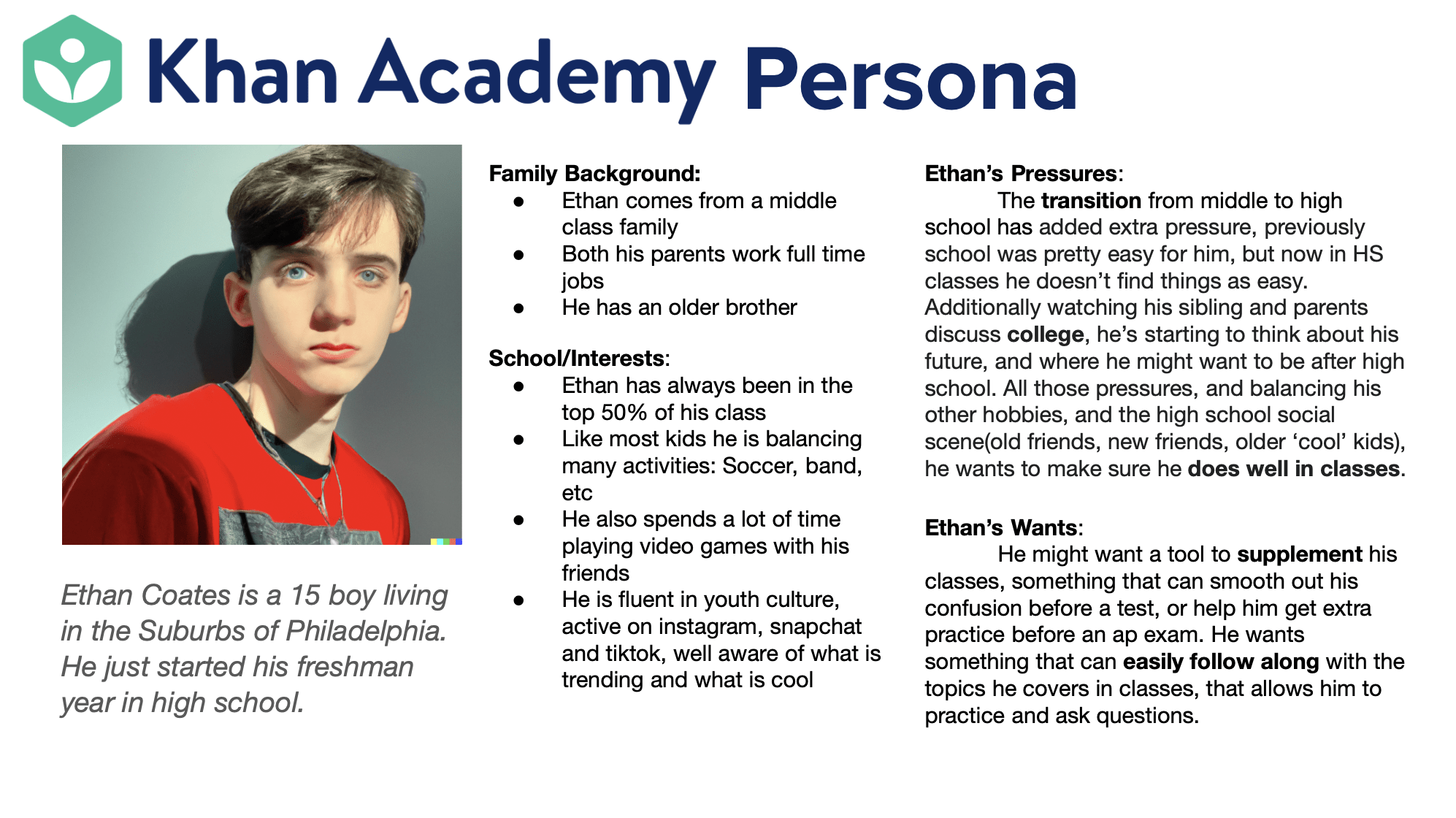
I developed a sample user persona to better understand one of Khan’s user groups.
Motivating the Design
Knowing about the goals of Khan Academy as well as the user will motivate my design decisions.
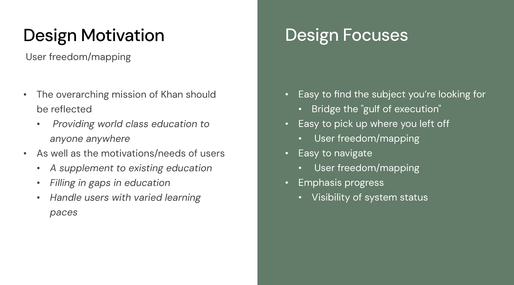
I also found where the Khan Academy UX comes up short in providing for its users.
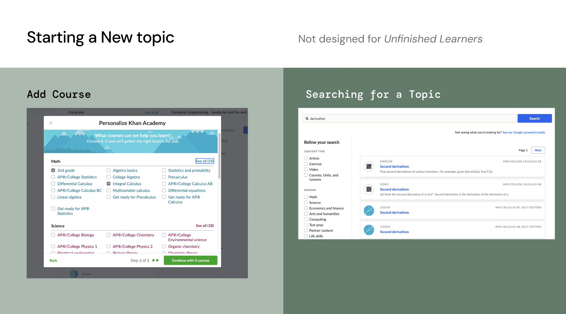
Let’s say the user selects add new course. They are met with this pop-up window, where they can choose from Khan Academy’s long list of courses. This might be fine if you knew the exact name of the course you wanted to take, but if users aren’t being told what course to select, it may not line up with their other education source. And what about unfinished learners? If you’re in 9th grade math, but have gaps in your previous math knowledge how will Khan Academy help you achieve Mastery Learning? What if you want to start from the middle of a course? Or a specific topic? That’s the drawback of having so much content, having to filter through it. If you were to click on a subject you would have to attempt to search through litany of courses, and the numerous units within each course.
Or, you could try the Search function. Look at the results for the simple search term ‘derivative’. First of all, the results are not correct, a student wanting to learn about derivatives isn’t going to be helped with content about second derivatives. 2nd, all the types of content Khan Academy produces are shown together: lessons, exercises, videos, articles. This is very ambiguous for a user. Where do you start? Do you click on lessons, videos, exercises, or articles? It's not clear at all. And remember that unfinished learners don’t know what they don’t know. That will only add to the ambiguity. For instance, they are struggling with derivatives, but they have never heard of a riemann sum, or the fundamental theorem of calculus.
Designing Prototypes
With these motivations in mind, I've made a number of changes to the dashboard:
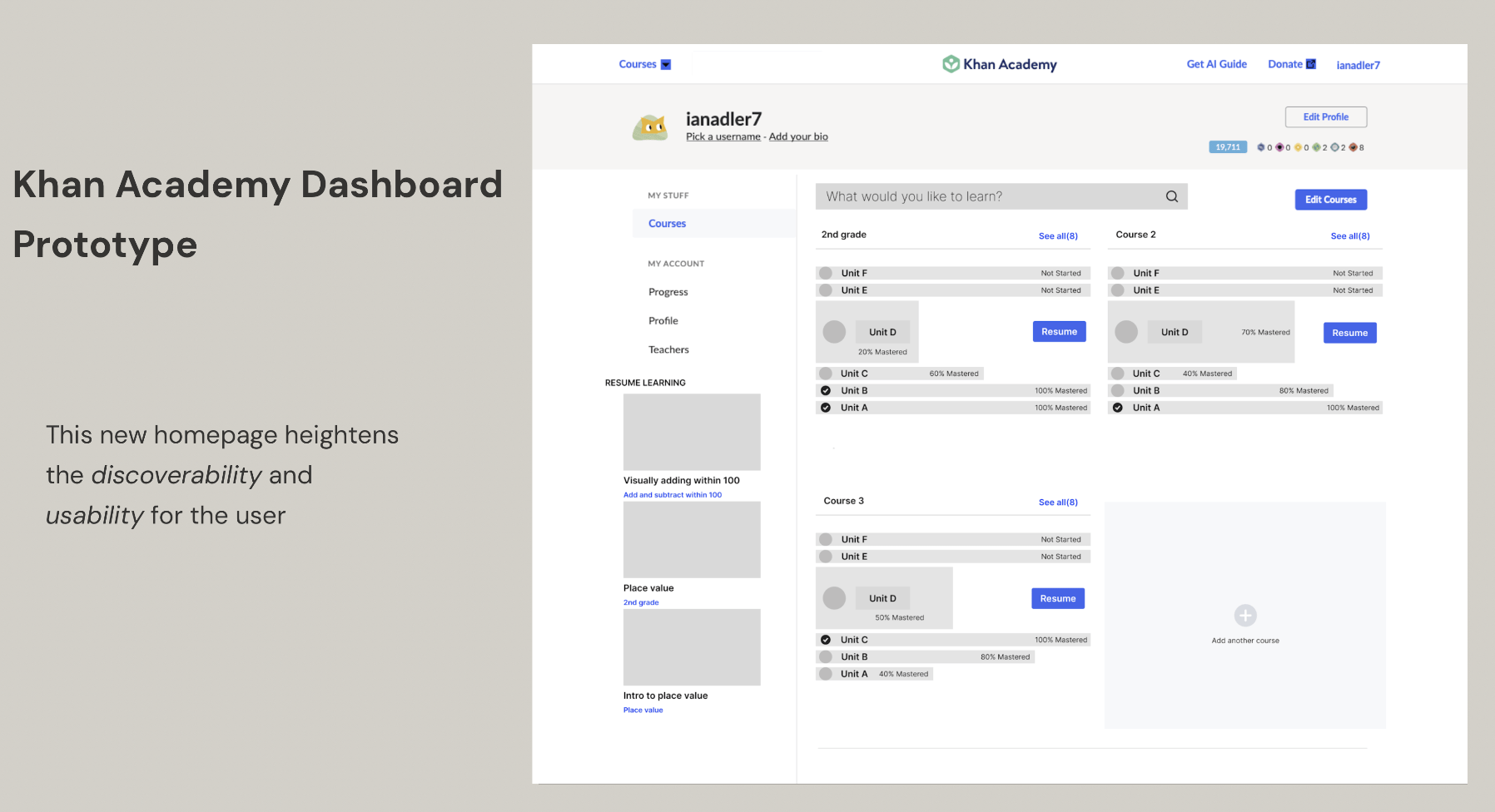
First I've made the search bar bigger and more prominent, to more clearly signify the search function. I've also made the Resume Learning videos more discoverable.
The new course panels have a visual language that heavily emphasize progress, making the system status clear. Right away the user understands how much they've completed of each unit, without even having to read the percentages, the progress bars indicate how far the user has gotten. The layout of the course panel also reflects the ideas of Mastery Learning. If users move through the units without having fully mastered the content, the bars will appear unbalanced, indicating unfinished learning, and gaps in knowledge.
In addition to redesigning the dashboard, I designed a new user journey for starting a new learning topic, using AI.
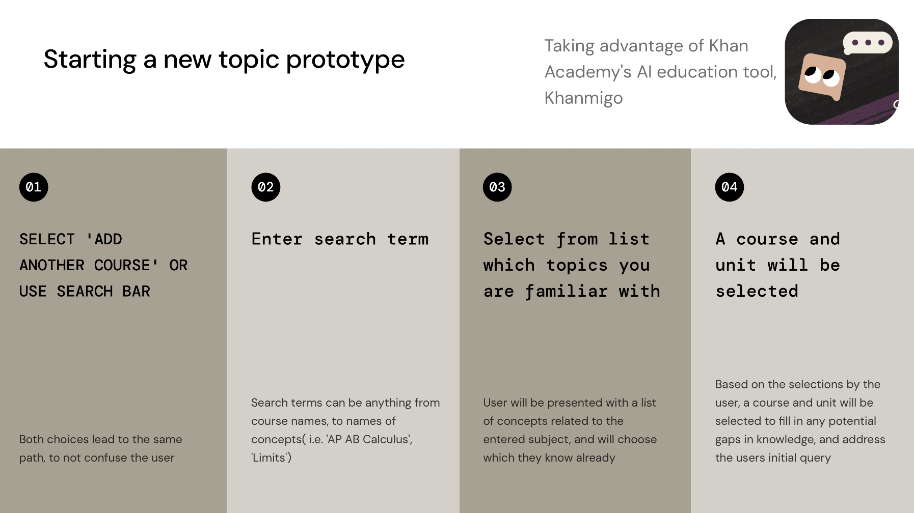
Right now Khan Academy is leveraging AI technology to create a one-on-one tutor, called Khanmigo for users: answering their questions, giving suggestions, prompting deeper thinking, basically just facilitating deeper learning. But I think their AI tool has even more potential, specifically as a way to help users find the content they need. This will help users bridge that gulf of execution by directing them to a starting place, rather than forcing them to find it on their own.
I created a paper prototype to test the design:
And a wireframe:

These proposed UX changes make it easier for users to find the information they need and in doing so would further Khan Academy's mission of creating Mastery Learning in their users.