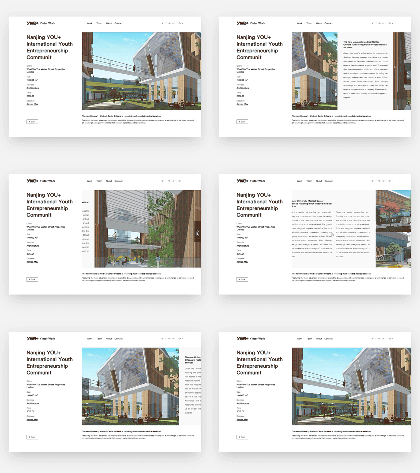
After receiving the photos of their work intended for the website, I found them to be exquisite, each with its unique proportions. Consequently, in designing their website, I focused on two key considerations.
Firstly, I aimed to reduce the prominence of the UI elements by minimizing colour variations and font sizes, thereby directing the user's attention towards the website's content itself. Particularly, since the photos played a central role, this approach ensured they remained the focal point.
Secondly, I abandoned the practice of using fixed image widths, as some images with certain proportions would appear excessively elongated. Instead, I opted out of vertical scrolling on the detail pages and designed a window in which photos scroll horizontally, effectively addressing this issue.

