
Designed and launched multiple Vidyard products to simplify the complexity of video recording and sharing on the web.
Background
When I joined Vidyard, customers were having a hard time intuitively using it, as it didn't work the way people expected a video platform to work. Not much thought was put into the information architecture, the primary workflows, the visual hierarchy, or any design patterns throughout the platform. Vidyard was simply too complex and aesthetically dated for what they Vidyard was hoping to achieve with a PLG model.
What followed were multiple projects that I worked on to raise the bar for user experience as well as visually update the entire platform.
Here are some of them.
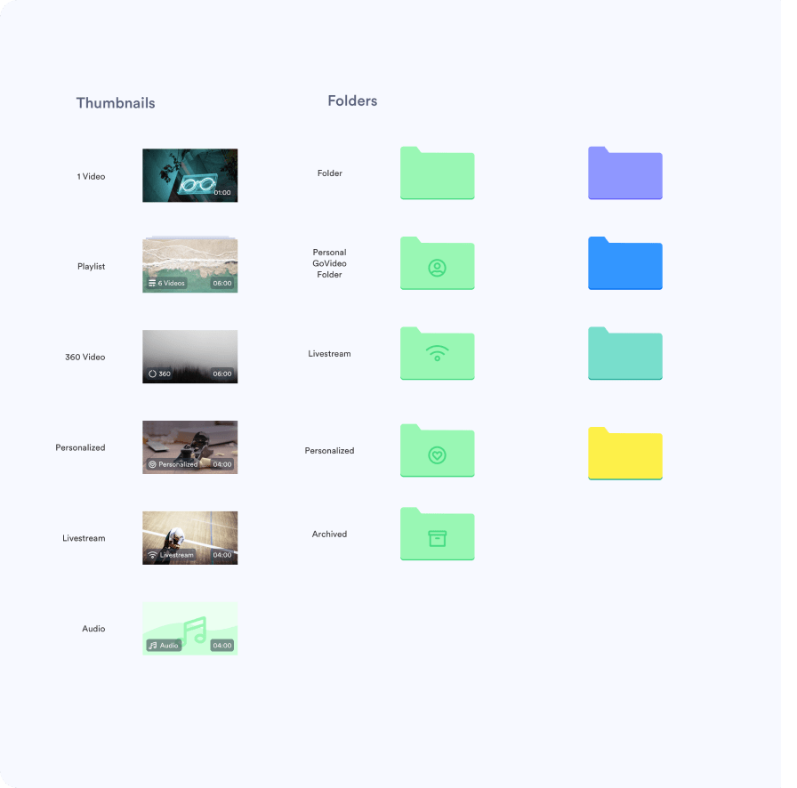
A new design system & a new easy-to-use Vidyard
When I joined, I immediately started working on a brand-new design system. Vidyard lacked consistency in user experience and visual direction within the product, and we needed a shared language to make the product more intuitive and coherent.
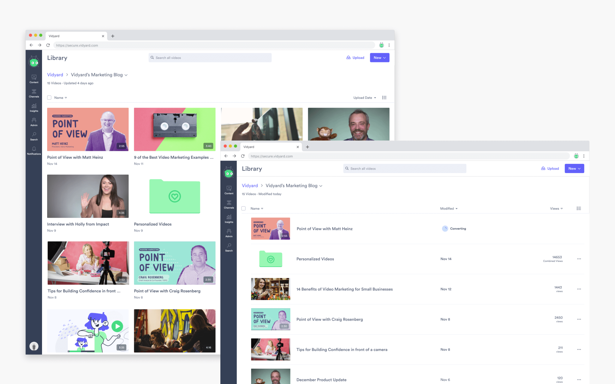
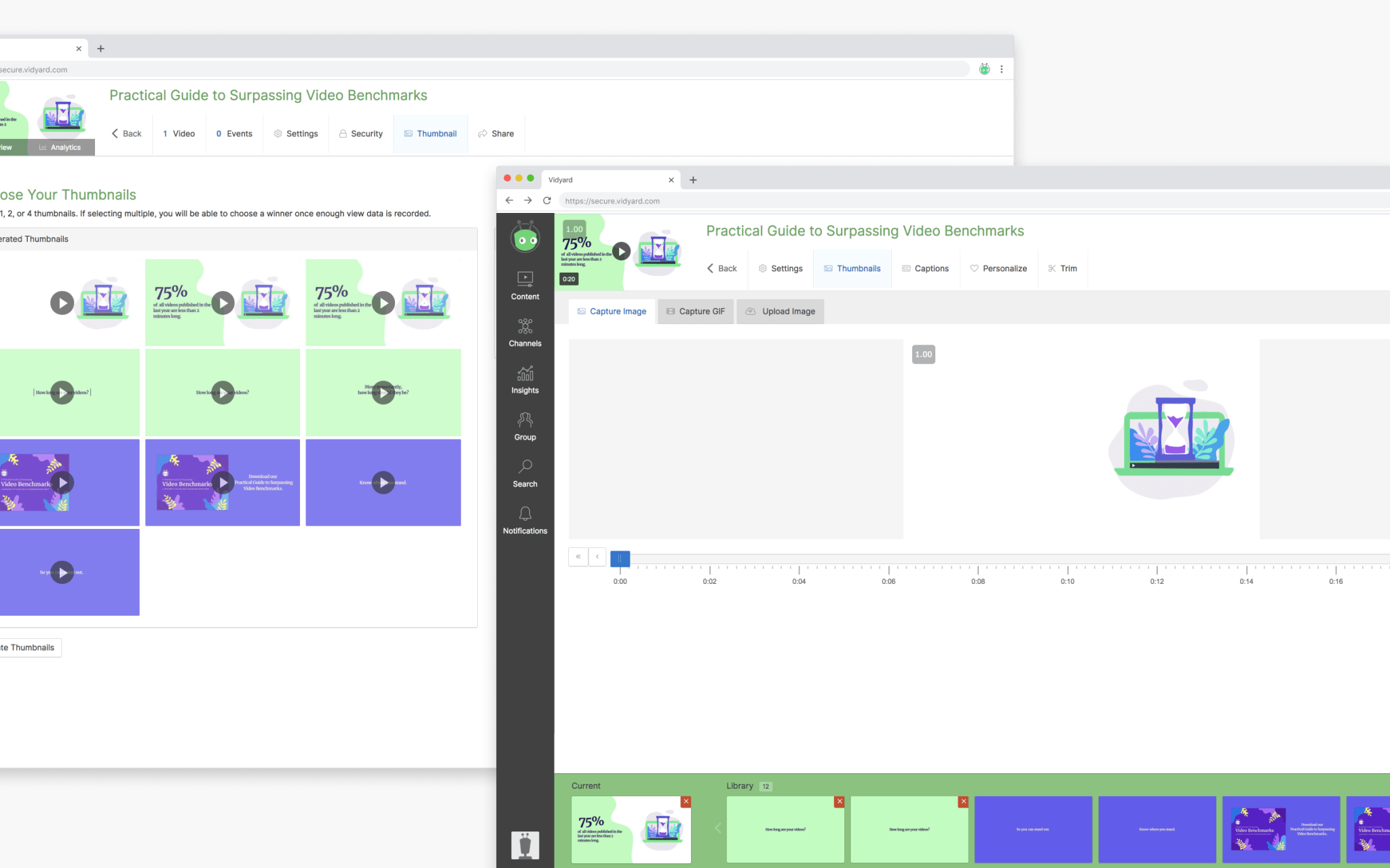
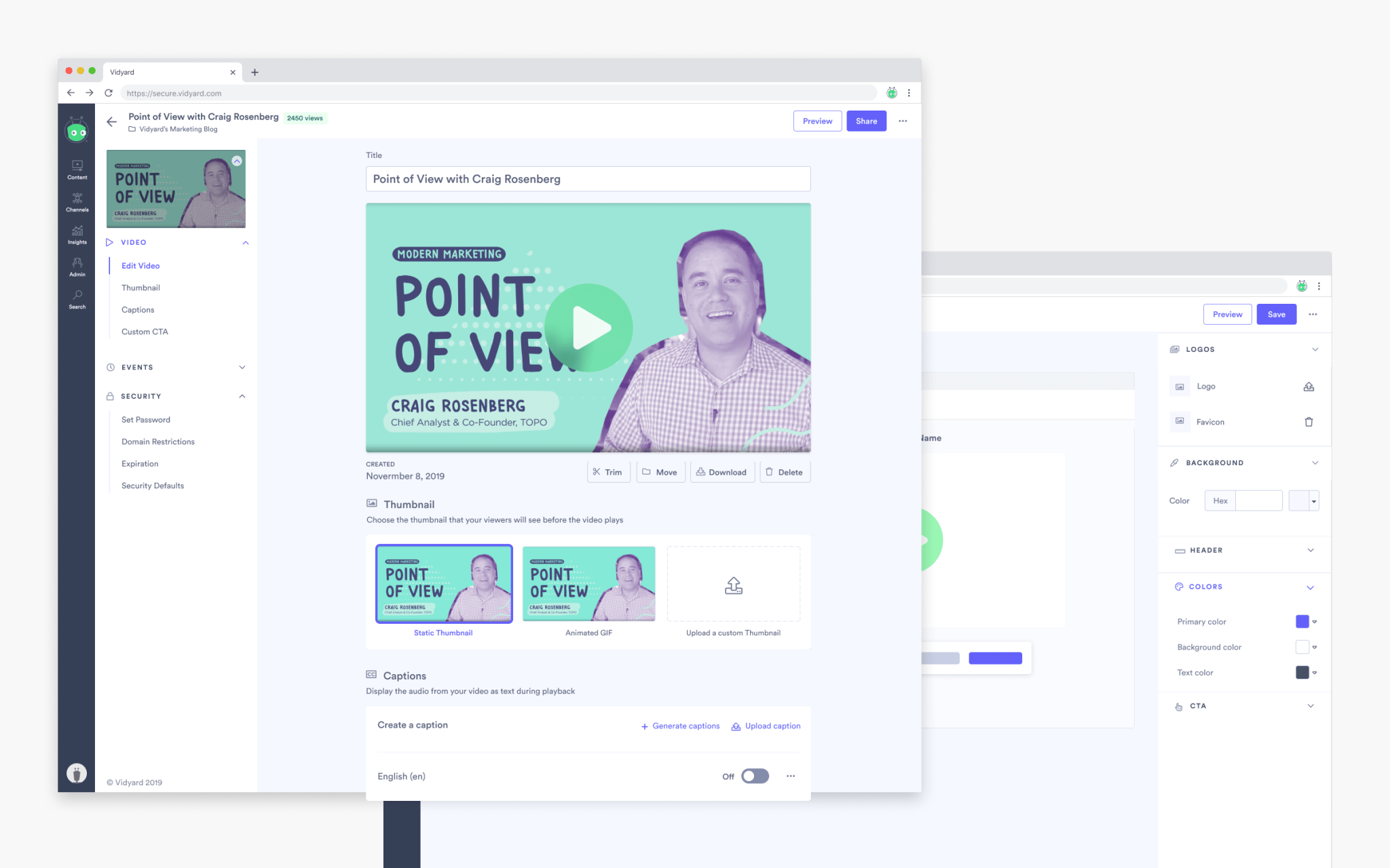
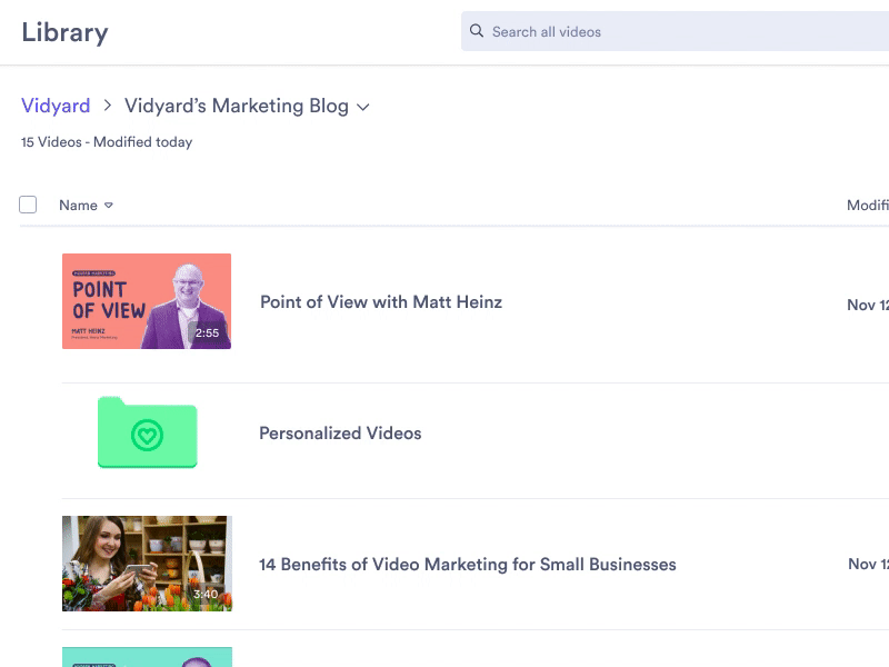
Here are some before-and-after comparisons demonstrating the impact of the design system across the platform.
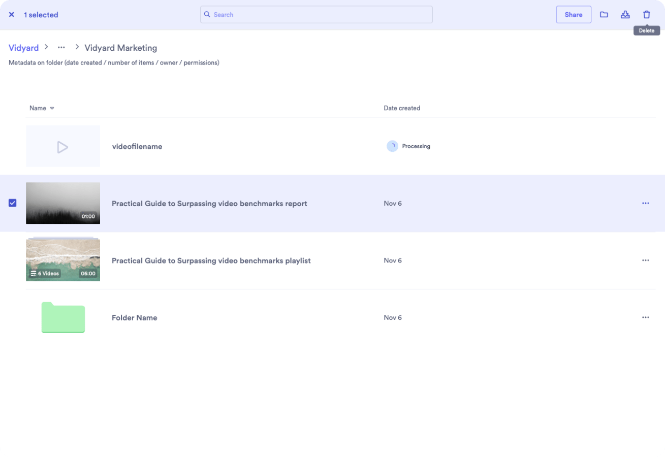
Video Library
Video Edit Page
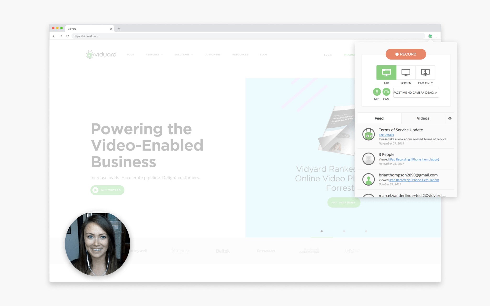
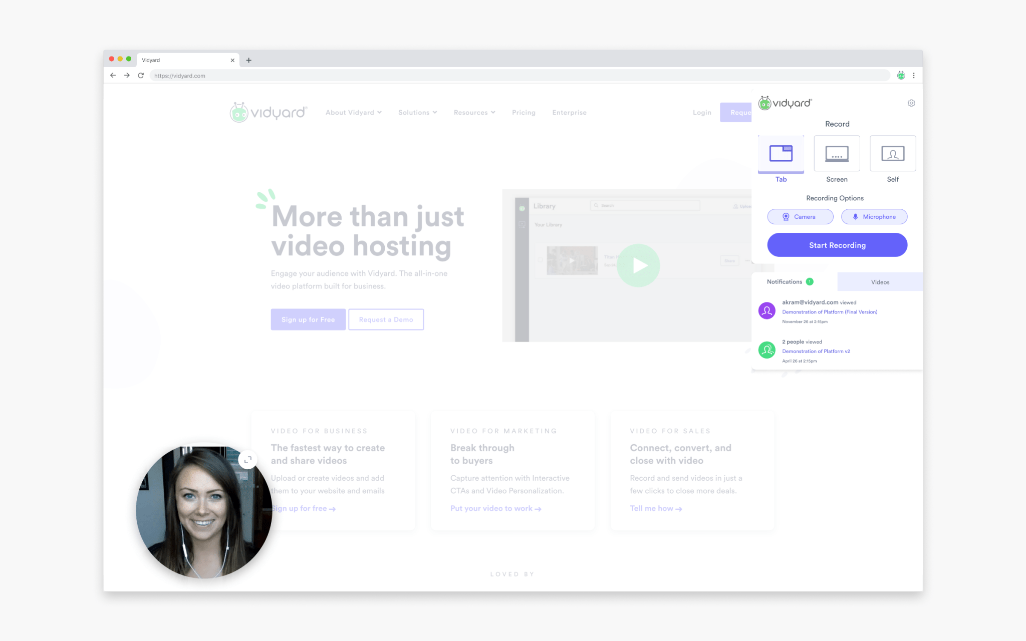
Chrome Extension
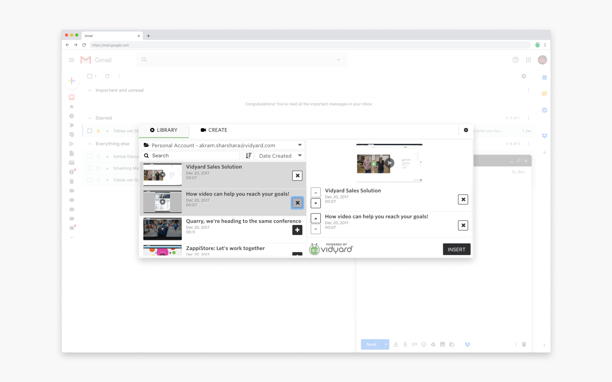
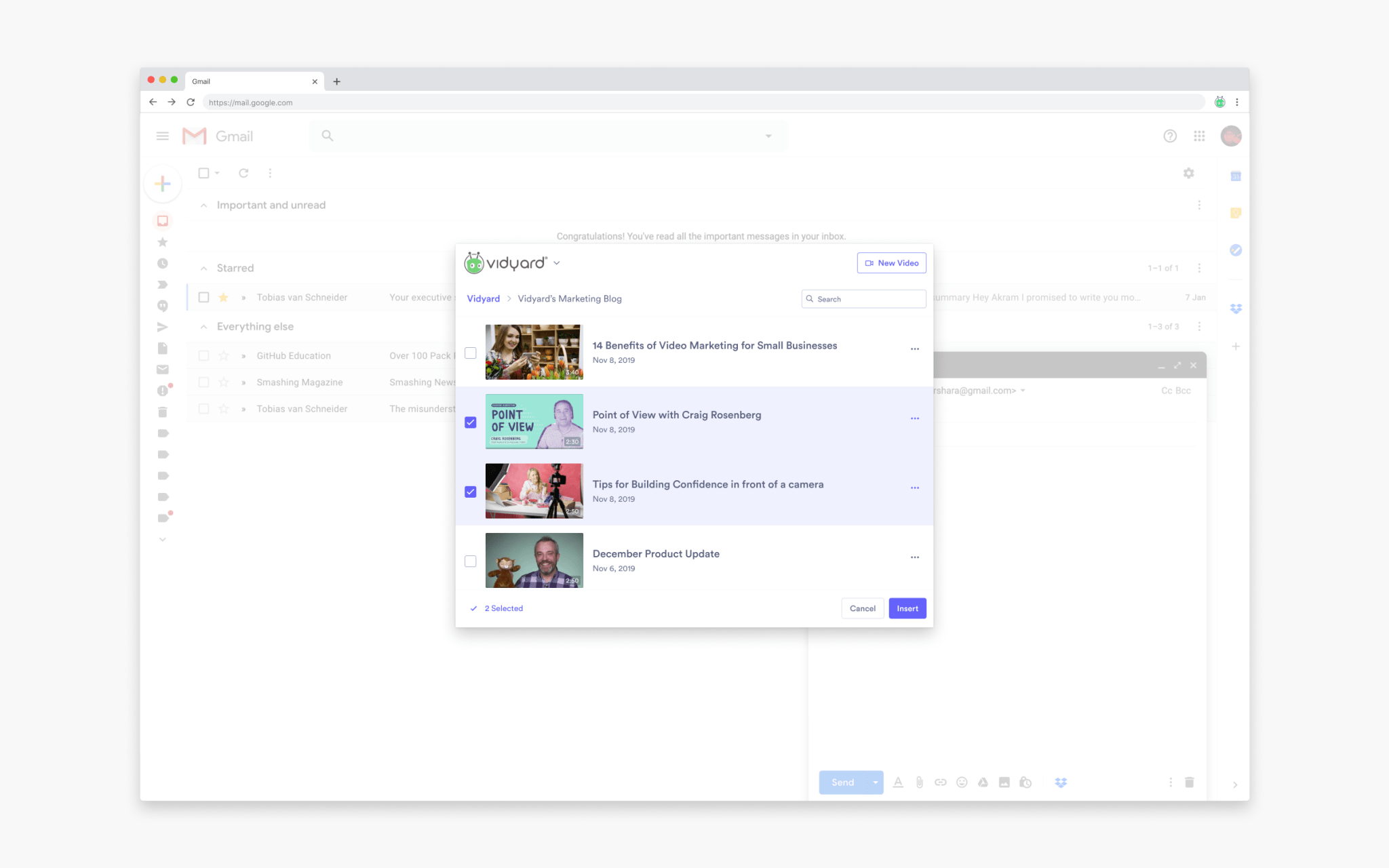
Embedded Vidyard - a mini window into the Vidyard library that was integrated into HubSpot, LinkedIn, and Gmail.
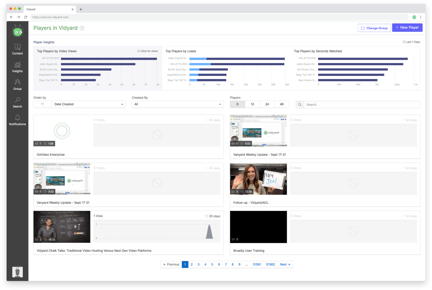
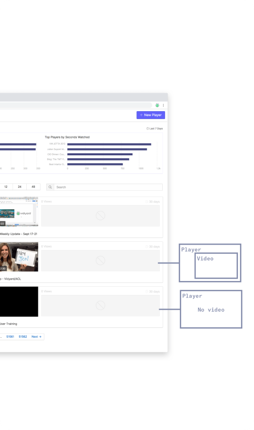
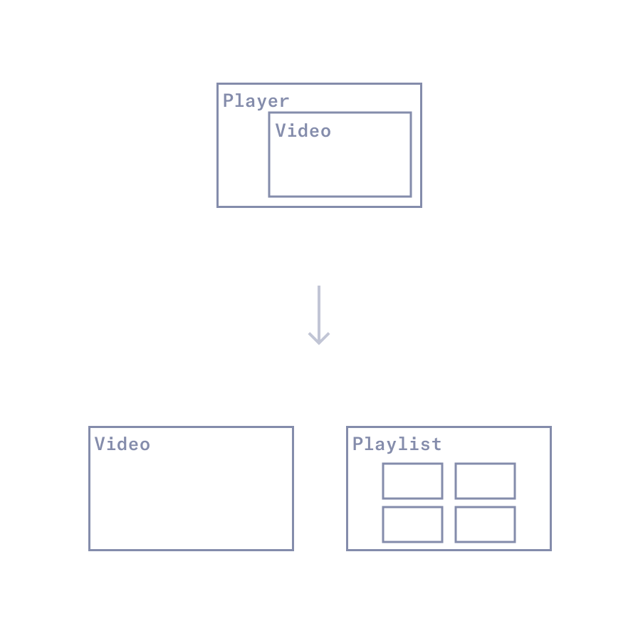
Updating the information architecture
In Vidyard, there were instances where users could embed or share an empty video player (video container) without an actual video. This 'player-first' architecture proved confusing for many customers and led to numerous instances of users sharing broken video links.
Revamping the entire Vidyard infrastructure was a time-consuming and effort-intensive process, requiring getting the right people in the same room, as well as getting senior leadership to agree on the changes. However, the primary goal was to enhance the user experience and simplify the platform to align with users' mental models.
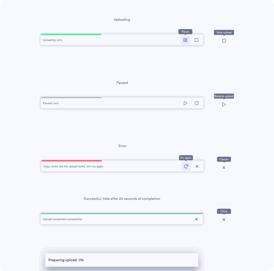
Little Details
Some little design details ✌🏼
Conceptual Desktop App
I also worked on early stage concepts for the desktop app and how it could work. Lots of quality of life features were introduced here to make recording a video that much easier.
This is a video of me going through the conceptual designs. Recommend watching at 1.5x
Other work not seen here
I've shared a small selection of total works here, but I also worked on:
-
The Vidyard Mobile App
-
Self-serve sign-up and onboarding
-
Free and Pro level features, feature-gating and upgrade paths/payment processing
Thanks for reading 🙂