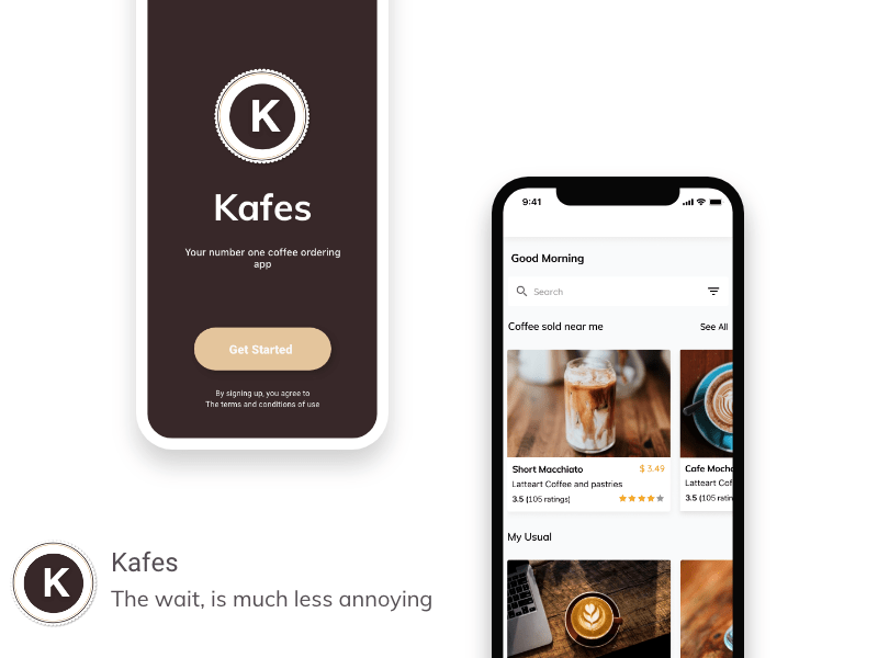
This case study contains the interface I redesigned in May 2020 as I improved on my UI design skills.
APPROACH
-
Identifying the target audience
-
Designing, prototyping, and testing user flows and interactions.
-
Iterating design based on feedback and creating final deliverables.
According to statistics, coffee is amongst the top widely consumed beverages globally. However, one problem persists when getting coffee -- waiting in a queue. More often than not, users have to wait for unspecified periods to get their coffee. Data shows that a person spends an average of 24mins a day making, serving, and drinking coffee at work. It excludes time spent waiting for coffee at coffee shops or cafes. Customers have to wait in long lines before getting their coffee.
To reduce the wait or make it less frustrating - I came up with a mobile app that lets you Pre-order coffee and pick it up or order and have it delivered to you.
THE PROBLEM
According to statistics, coffee is amongst the top widely consumed beverages globally. However, one problem persists when getting coffee -- waiting in a queue. More often than not, users have to wait for unspecified periods to get their coffee. Data shows that a person spends an average of 24mins a day making, serving, and drinking coffee at work. It excludes time spent waiting for coffee at coffee shops or cafes. Customers have to wait in long lines before getting their coffee.
To reduce the wait or make it less frustrating - I came up with a mobile app that lets you Pre-order coffee and pick it up or order and have it delivered to you.
GOAL:
To reduce or make coffee the wait time less frustrating
How?
So I was thinking - As a coffee drinker - if I met a queue at the coffee shop, I would start weighing my options to decide how badly I wanted coffee. I figured if I knew exactly how long I was waiting for, I would stay or go away to come back a few minutes to when it was my turn. It would make the wait bearable for me. I assumed most people would react the same way. However, I did not want to assume, so I asked a few people. The response was as anticipated. Most people agreed that they might stay or leave and be back if they knew long they had to wait. I proposed the following features that would help reduce frustration and improve the experience.
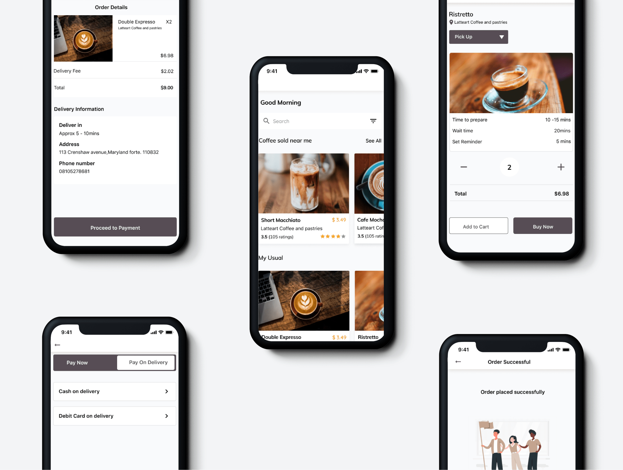
1) Delivery:
Instead of going to the coffee shop to decide whether to wait or come back, the user can order via the app and have the coffee delivered to him. Another scenario would be for the user to get to the coffee shop and immediately decide he can neither wait nor come back. Instead, the user chooses to place an order and deliver it to his specified location. However, whether or not this option is available depends on the coffee shop and its policies.
2) Wait time:
It is the amount of time a user would have to wait till their order is ready. The user can decide to spend the waiting time at the coffee shop. It could be of benefit to the shop. The user might get a snack while waiting, have more time to look around the shop, and maybe buy something of interest. The user can also leave and return later to pick up the order.
3) Timer:
I proposed the timer feature when pre-ordering or choosing to pick up coffee rather than deliver it. With the default time set to 10mins; the app notifies the user that their coffee is ready in 10mins - If the user is lost in work or a conversation or has generally lost track of time.
UNDERSTANDING THE USER
TARGET AUDIENCE: Working-class coffee consumers. Before going on to sketch ideas, I wanted to know more about the product and my users so; I researched the different kinds of coffee and realized that each type of coffee had separate preparation times. This information helped me understand why or what contributed to the waiting time. A coffee shop could not randomly prepare coffee. I also researched when coffee is most consumed and found it in the morning. I hypothesize that because many coffee lovers resume work in the morning, it is likely a reason for the queue and wait time at coffee shops.
COMPETITIONS ANALYSIS:
I also researched to see if there were pre-existing solutions to know how they were solving this problem and discovered that Starbucks just recently released a feature that allowed its users to order and pay for their coffee via the phone and pick it up (does not include delivery option/timer feature) I also found another app, Ordoo, a mobile app for coffee shops that lets users order coffee and pick it up. (does not include delivery option/timer feature)
THE USER
Anna

🗣️ Anna says, "I'd rather spend my coffee waiting time at the office knowing when to go pick it up than to stand on a queue indefinitely and lose productivity for those minutes.
Age: 29
Marital status: Single
Occupation: Sales
Location: Krenshaw
Description: Anna is a very successful sales agent. A Part of her morning ritual is to take a walk to her favorite coffee shop - a few minutes after she gets to her office. She enjoys this walk because it helps her clear her head and go over her plans for the day. However, she does not like the indefinite long wait in a queue. It causes her anxiety, especially when she plans a quick trip. She feels she is wasting time and could be doing something productive.
WALE

Wale says: "We all have those days when you sleep in, irrespective of that i'd still like to have my morning coffee"-
Age: 28
Marital status: Single
Occupation: Developer
Location: Krenshaw
Description:
Wale is late for work and does not have enough time to get ready and wait in line for his coffee. He opens the app on his mobile phone and pre-orders his coffee to be delivered to his office that way; he does not have to stand in a queue.
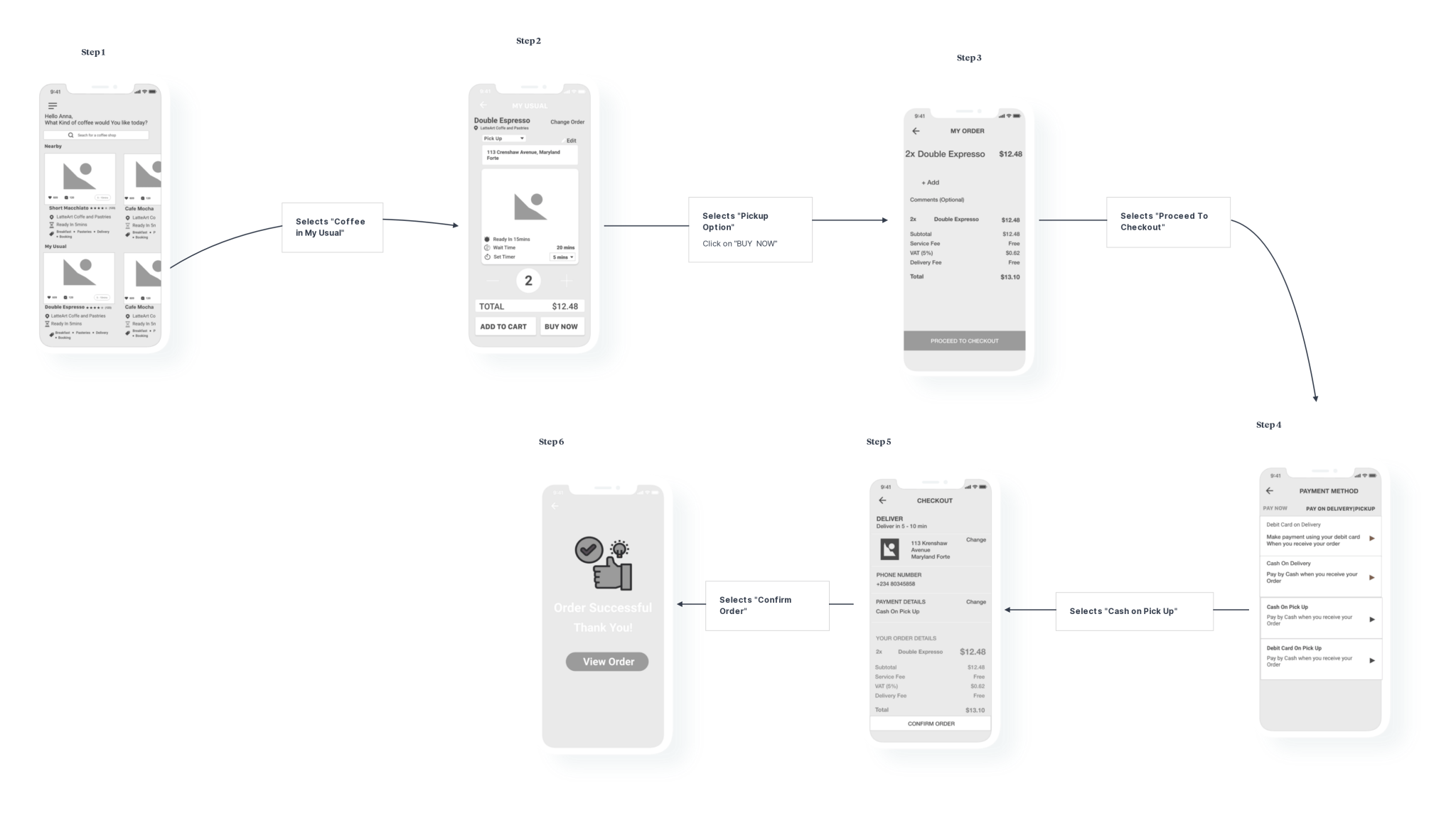
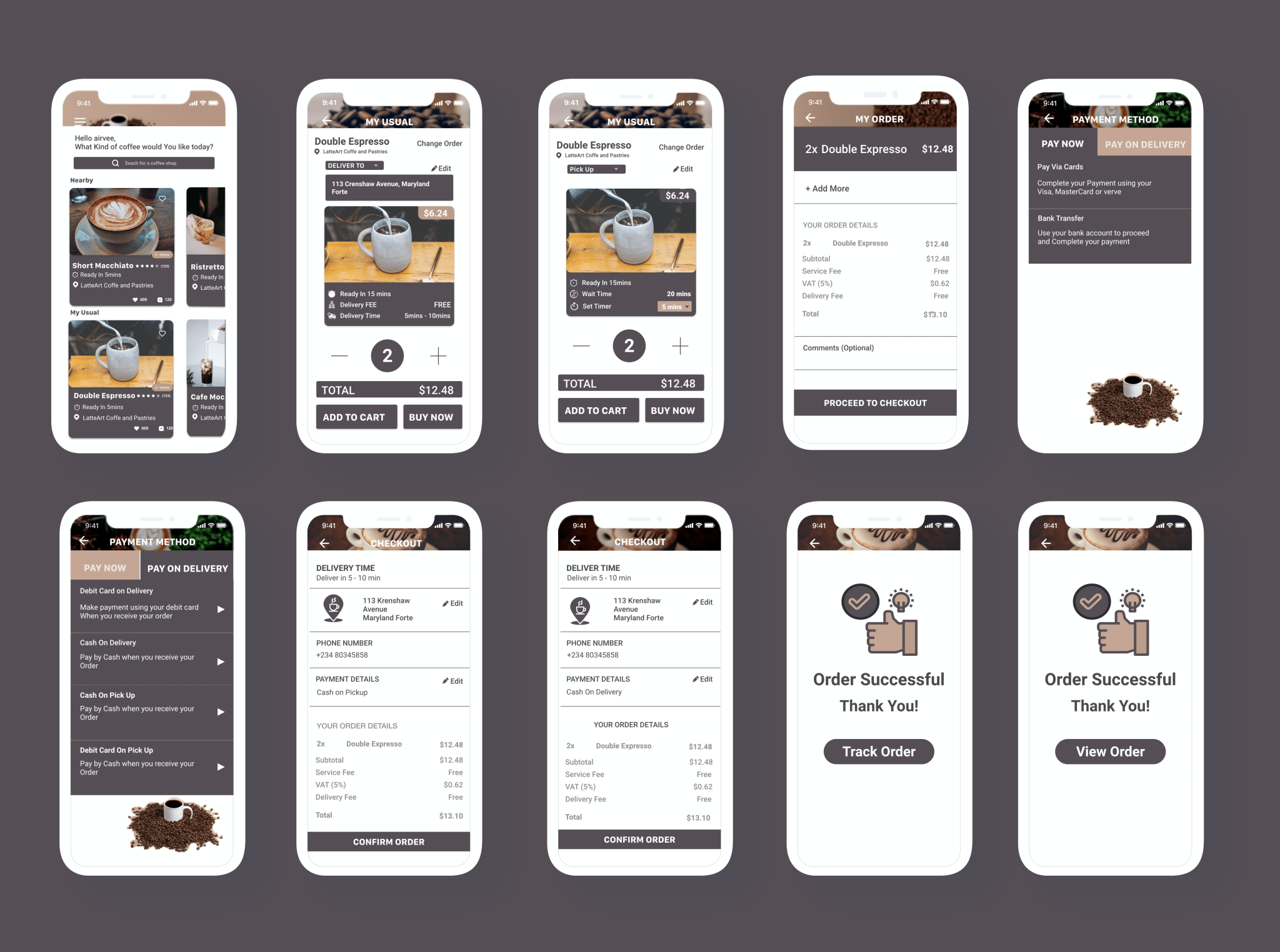
USER FLOW
I came up with the user flow and the user journey map. To highlight the steps the user takes to achieve their goals. Then I listed out the features/elements of each page to keep track of what to include and what not to include.
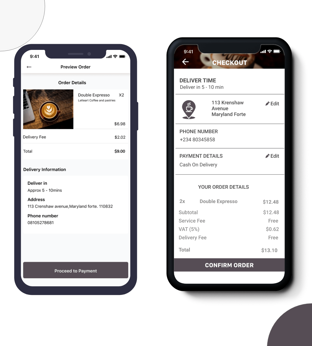
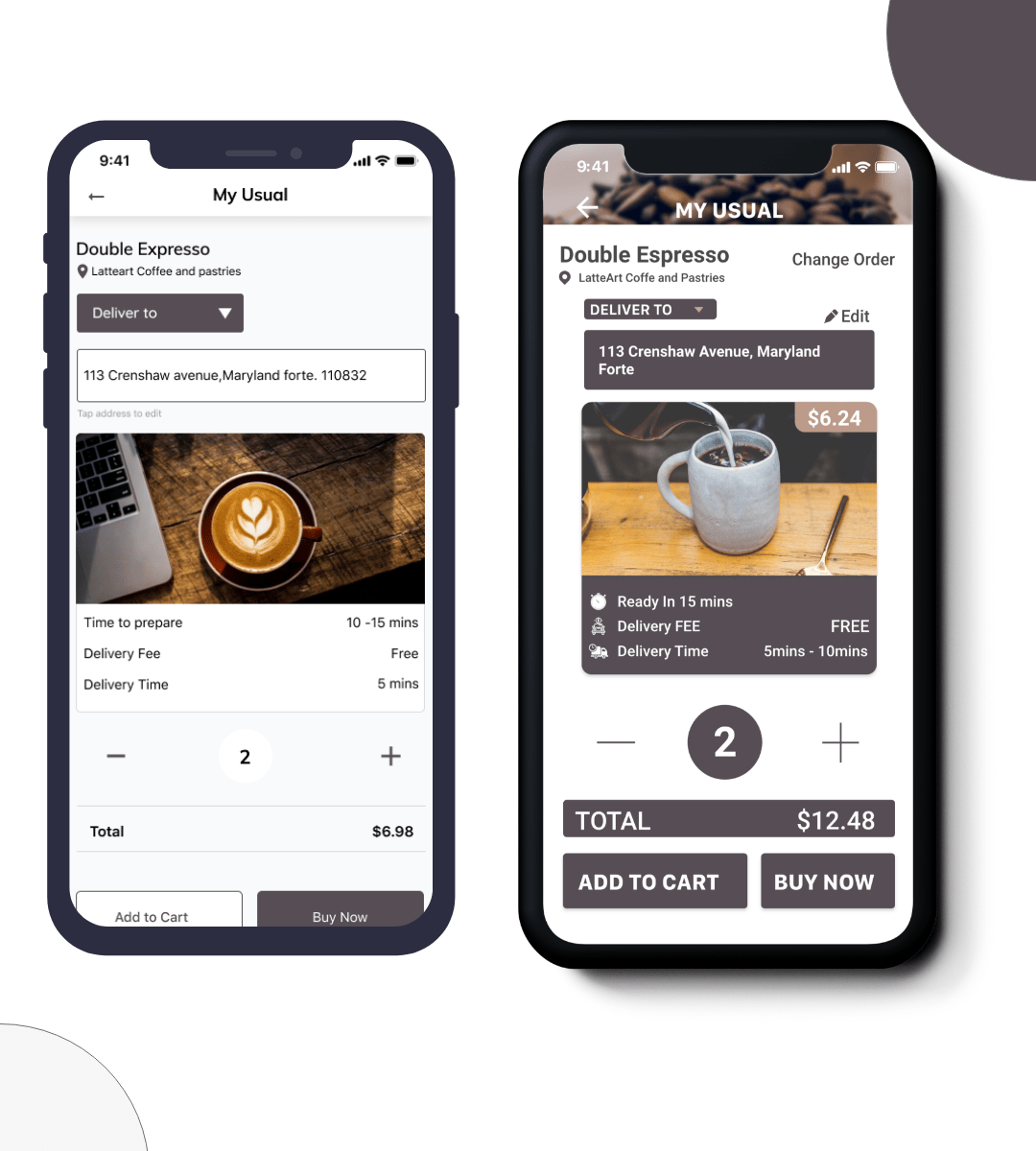
Step 1: User selects preferred coffee in the My Usual session.
Step 2: The user chooses what option they prefer. The options available are delivery and pick-up. Then click on BUY NOW.
Step 3: User previews order details and selects Proceed to checkout.
Step 4: User Selects Preferred Payment method. If payment requires verification, the user verifies the payment.
Step 5: The user previews details with the option to make a few to their address and payment method and then confirm the order.
Step 6: If successful, the user can view the order from this page.
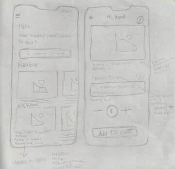
SKETCH & WIREFRAME
At this point, I understood what the app was to do and how to do it. So, I sketched out the ideas that came to mind. While translating my sketch into a wireframe, I realized an issue from the information architecture.
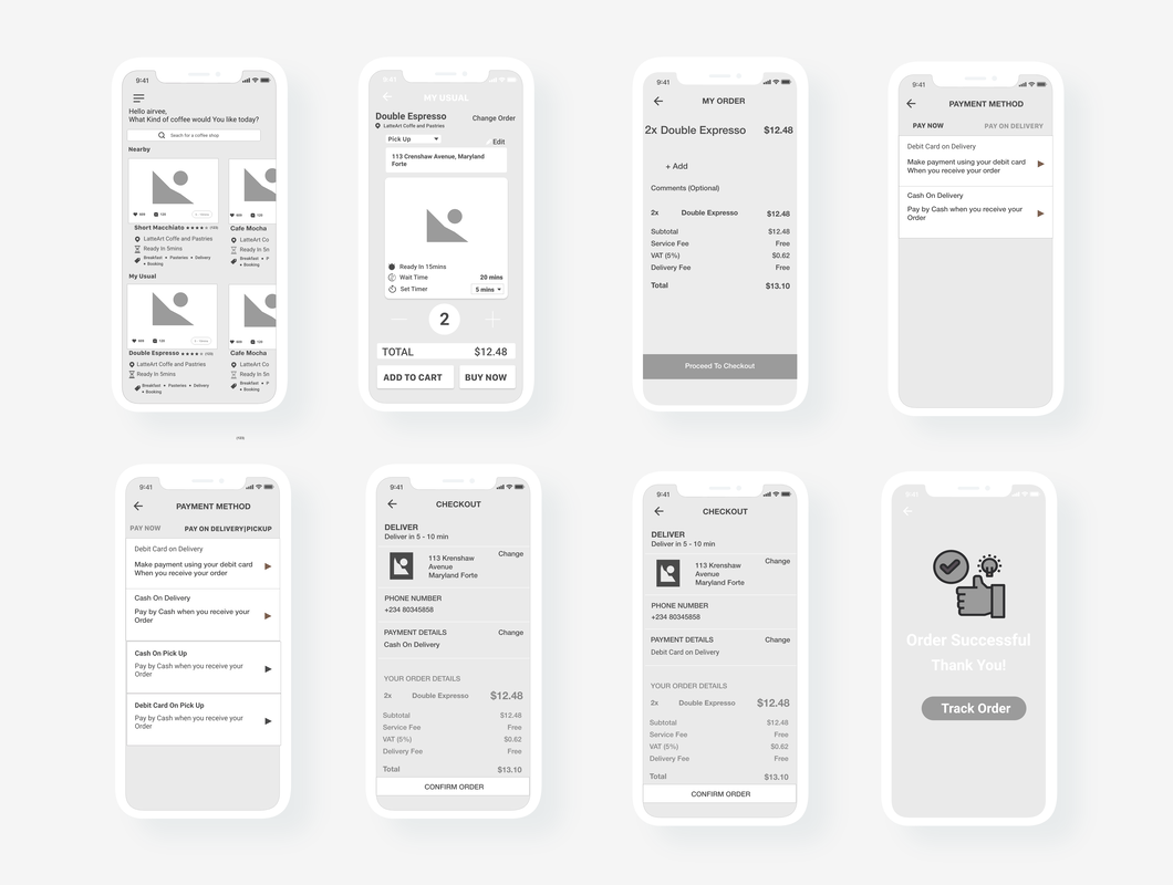
In this case, I made changes to my wireframes and included more features. I changed the position of the delivery-to and pick-up elements to increase visibility since, depending on the option chosen, information about the order changes.
By doing this, I avoided the scenarios where the user could miss out on the change of their Order detail and the confusion it poses when the user previews the order. The user would have to figure out what happened - this could negatively affect their experience.
I also decided to include the "Buy Now" feature while designing the wireframe. I realized from our scenario if the user had chosen her usual, she would probably want to pay for it right away.
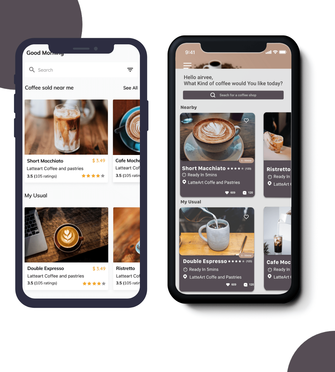
MY USUAL or FAVORITES
I chose to use the term My Usual over favorites. My rationale behind that decision. If a user visits a particular bar pretty often - they would most likely be recognized by the bartender. At that point, the bartender might progress from asking - what can I get you? And instead, ask if you would like to have your usual. The user can add more than one coffee to the my-usual section.
THE UI DESIGN
This design was the first version. I received the following feedback; (yikes - I know)
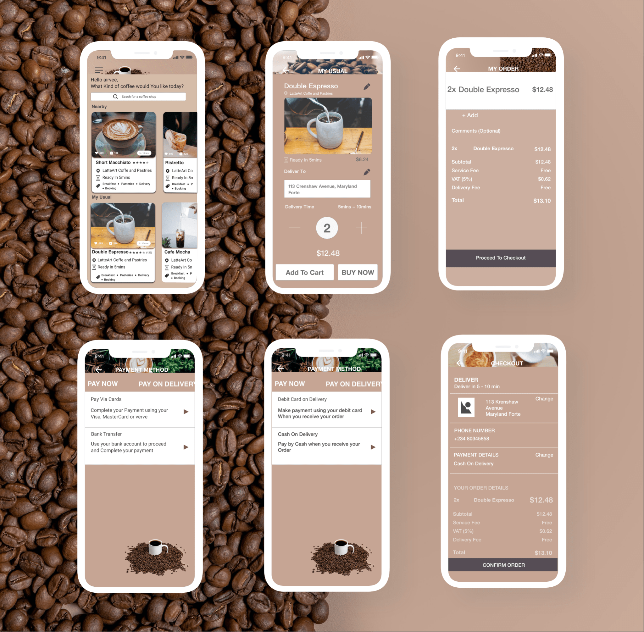
There was enough white space for elements to breathe. To fix this, I re-evaluated the information and realized there was no need to have the Tag information. Taking that out made the design a lot less packed. I also increased the space between the elements. The background image in the status bar area was distracting. I blurred it.
CAPTION: OLD RE-DESIGN
TAKEWAYS
Working on this project reinforced the importance of having a process, following design principles and standards. It was hard for me to evaluate my design. However, knowledge of those principles helped was helpful. Lastly, it reinforced that design is an iterative process considering that I kept finding ways to improve usability while working on the project.
UI REDESIGN IN 2020